ZDesign At Home Favorite Paint Colors
Hi friends!! Well, this post is probably a long time over due for me to share my favorite paint colors around my home! So many of you have been asking for so long that I figured it was finally time for me to put them all into one spot for reference for you. And speaking of for reference…just in case you ever need to know a particular color for a particular room, you can always go to the Home Resources page of my site (see site menu), find the room you are looking for in the drop down menu, and at the top of each page you will see the paint color(s) for each room.
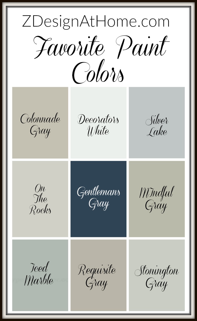
When choosing paint colors I definitely have a process of which I go through. I don’t necessarily just listen to everything I see and read on the internet or on Pinterest about a particular color (even though I love both resources) because paint can have a mind of it’s own once it goes on the wall in your home! Believe me, there are so may variables that it can make your head spin. Not to mention that usually paint will look different in a photo from how it looks in real life. The color of your floors, cabinets, lighting (natural and synthetic), etc., etc., can make a paint color look entirely different in real life from how it looks in someone else’s home and/or especially in a photo. It can also look different on the wall from how it looks on a tiny paint chip from the paint store.
With that said and when it comes time for me to choose a paint color, I always do sample boards. I purchase the smallest sample I can get my hands on (sometimes it will be a quart and other times it may be smaller depending on the brand) and then I purchase foam boards from Target or Wal Mart (in the school supply section). They are usually large so I quarter them (if I need to do multiple samples) so that I can get at least 4 samples out of one board. Once I’ve done my sample boards and they are completely dry, I look at them in all kinds of light over the next few days. If you don’t have a few days to ponder things, I would definitely at least look at them during the day and at night time before making a decision. I also like to do at least 3 samples per room. For some this can get costly but it is always better to be safe than sorry in my book plus, sometimes it ends up being that 3rd color for the win!
So, let’s get started!
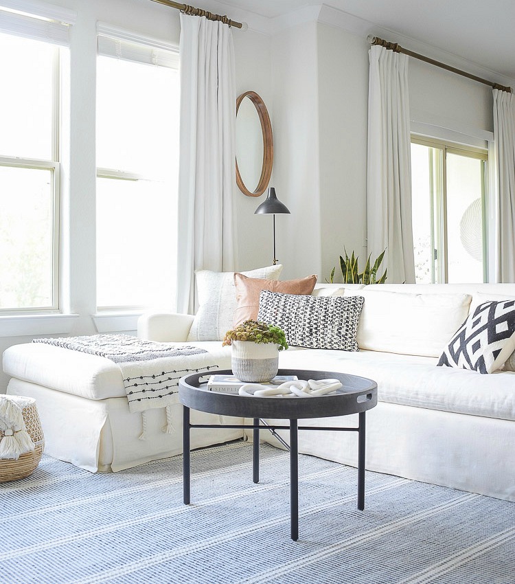
 Our living, casual dining and, kitchen area is Sherwin Williams On The Rocks (SW-7671). This color a light gray that is not too cool and not too warm. It has no weird under tones and is the perfect light gray in my opinion. Like most of my paint colors it looks lighter in my photos than it does in person but it’s definitely got some nice subtle color to it without getting too dark, if you are looking for nice light gray, this is the one!
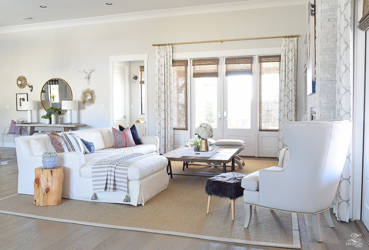
It almost looks white here but if you look down at where the wall meets the trim you will see the contrast between the wall and base boards.
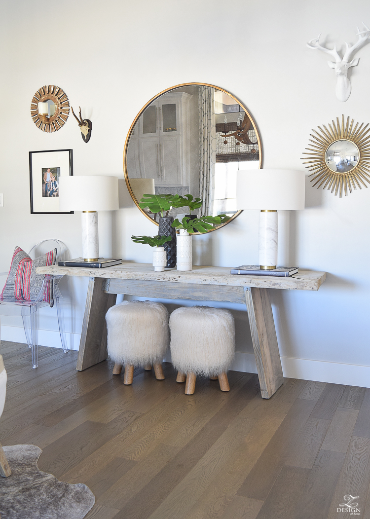
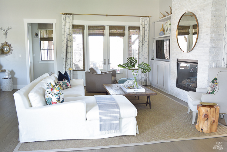
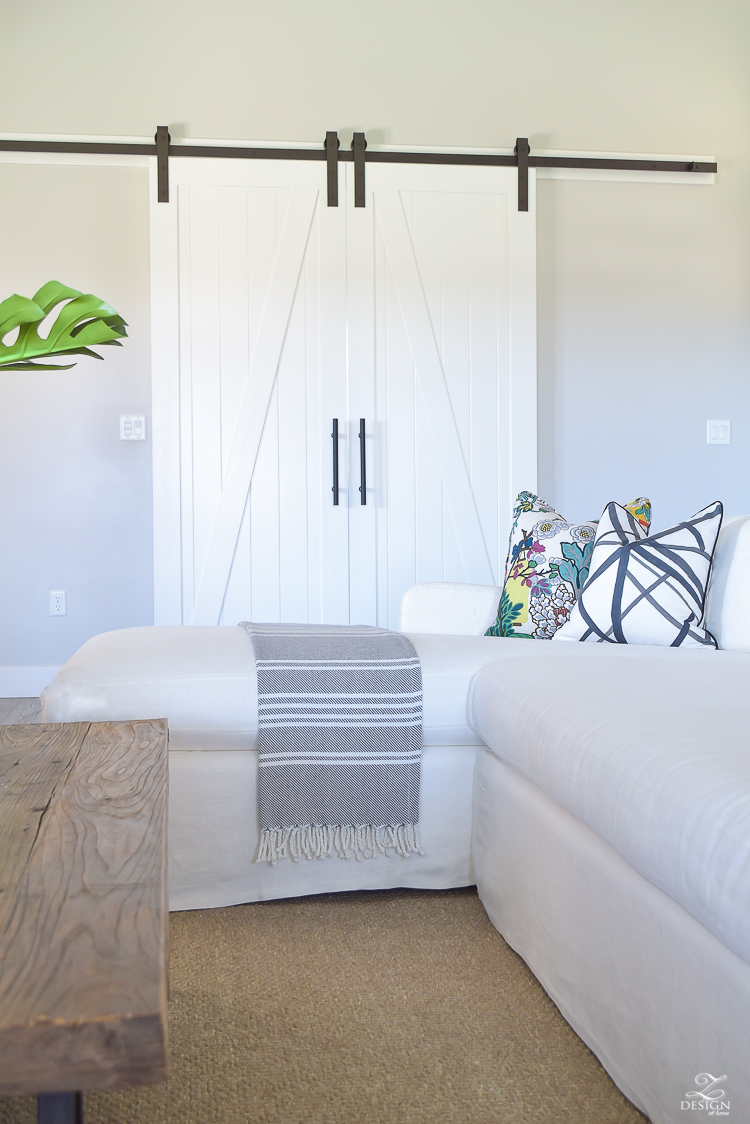
 Decorators White is a great white with no weird undertones. It is also not too stark and won’t ever look yellow. I use it on all of my doors, trim, and white cabinets. You can catch a glimpse here below of On The Rocks on the wall and Decorators White on the barn doors.
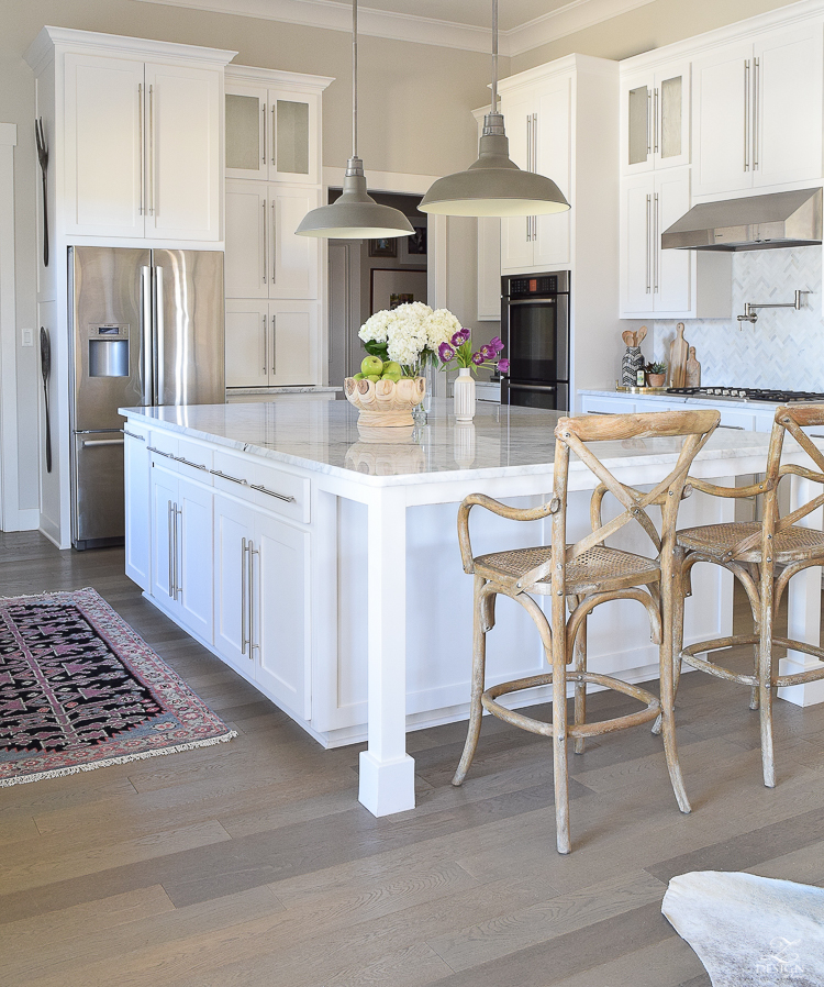
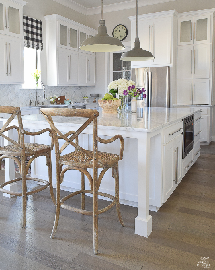
This is also Decorators White on the cabinets and On The Rocks on the walls in the kitchen.

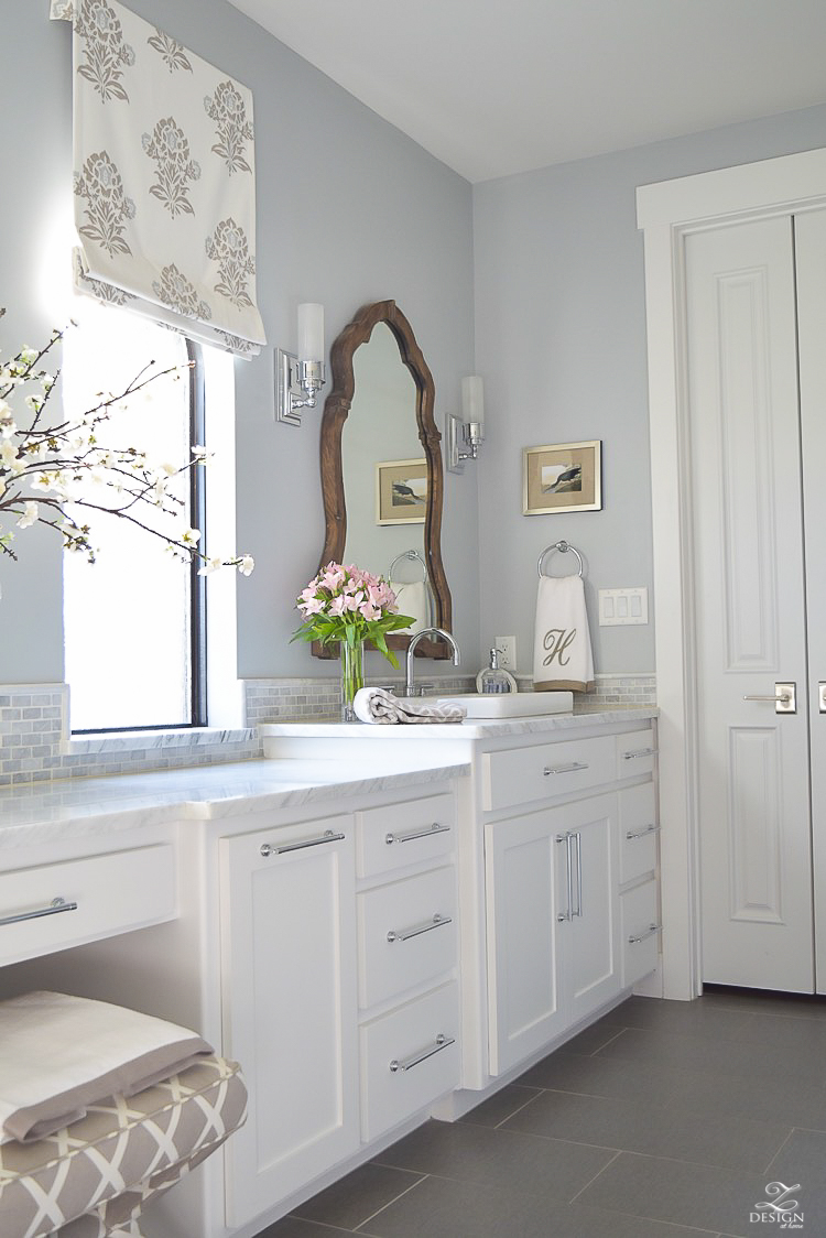
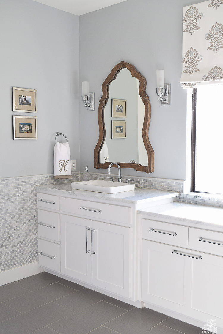
Silver Lake is a beautiful, soothing spa like blue gray that is great for a bathroom and/or en suite. I probably wouldn’t use this anywhere else in the home but the bathroom is the absolute perfect spot for the nice blue/gray color. It evokes a sense of calm that makes for a perfect retreat at the end of a long day. You can also see the Decorators White again on the cabinets, door, and trim.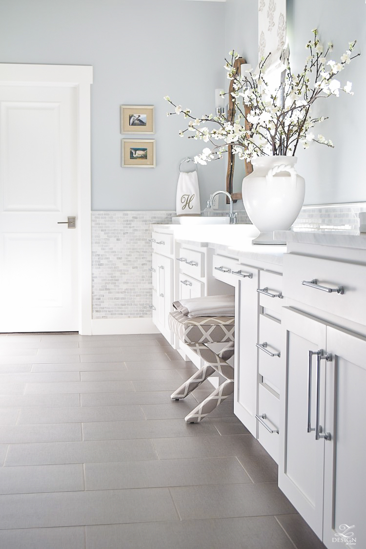
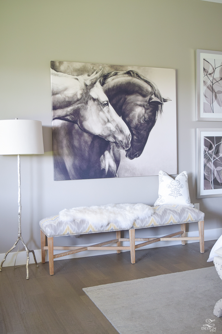
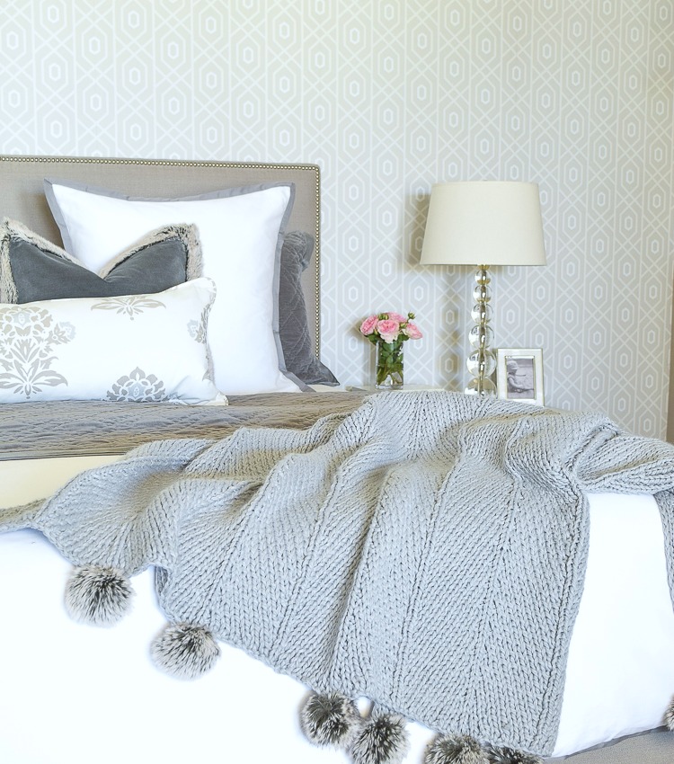
 Requisite Gray is a nice, warm gray that is perfect for just a touch of moodiness in the bedroom to cozy things up at the end of a hard day. This color would also be nice in a study or dining room.
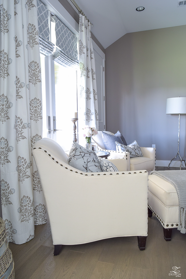
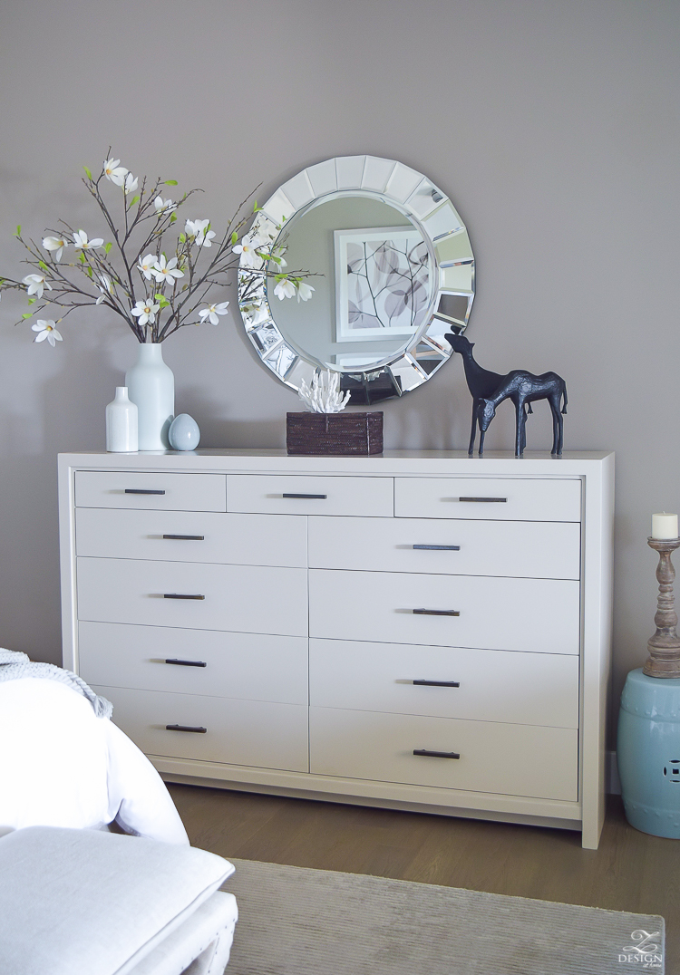
 Mindful gray is a great medium hew gray with no strange undertones. I used it in my dining room in a flat finish and couldn’t be more in love with it. This is a color I will use again and again for projects and could even see some furniture painted in this color.
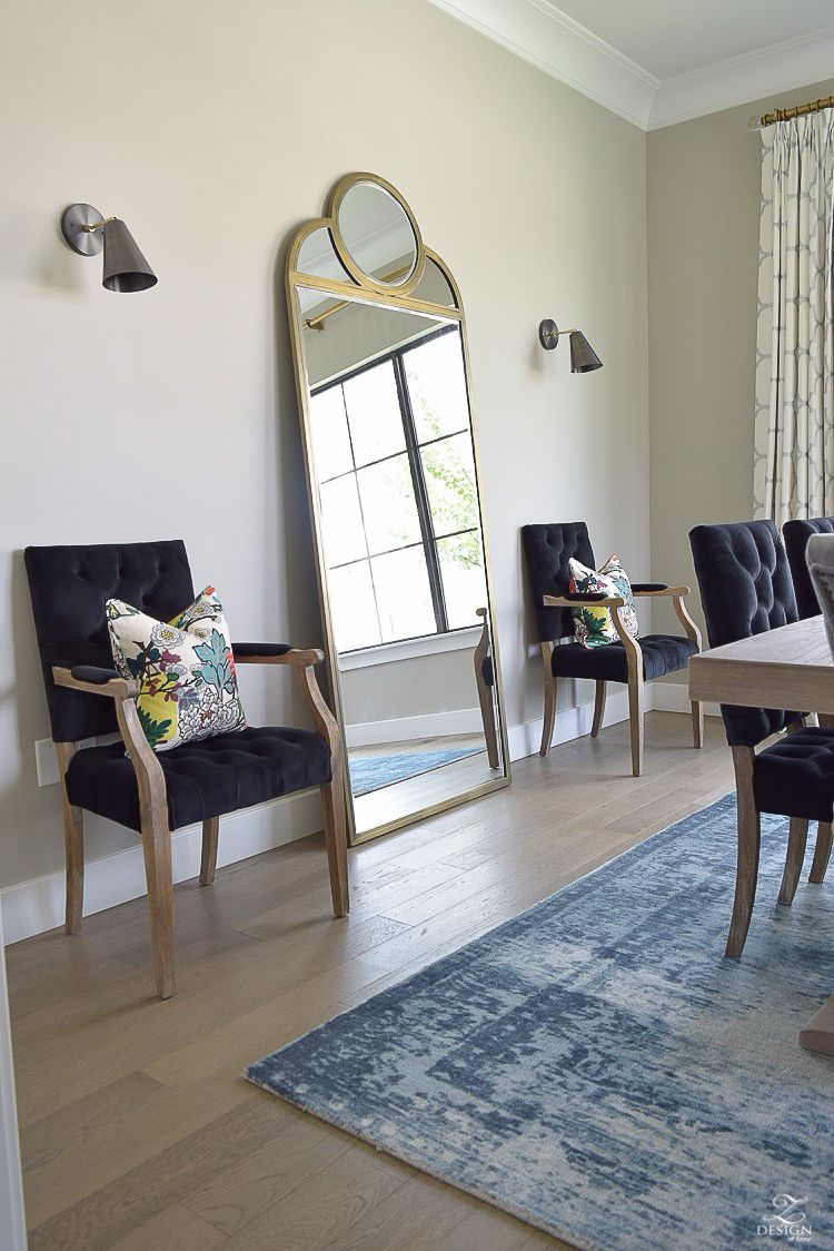
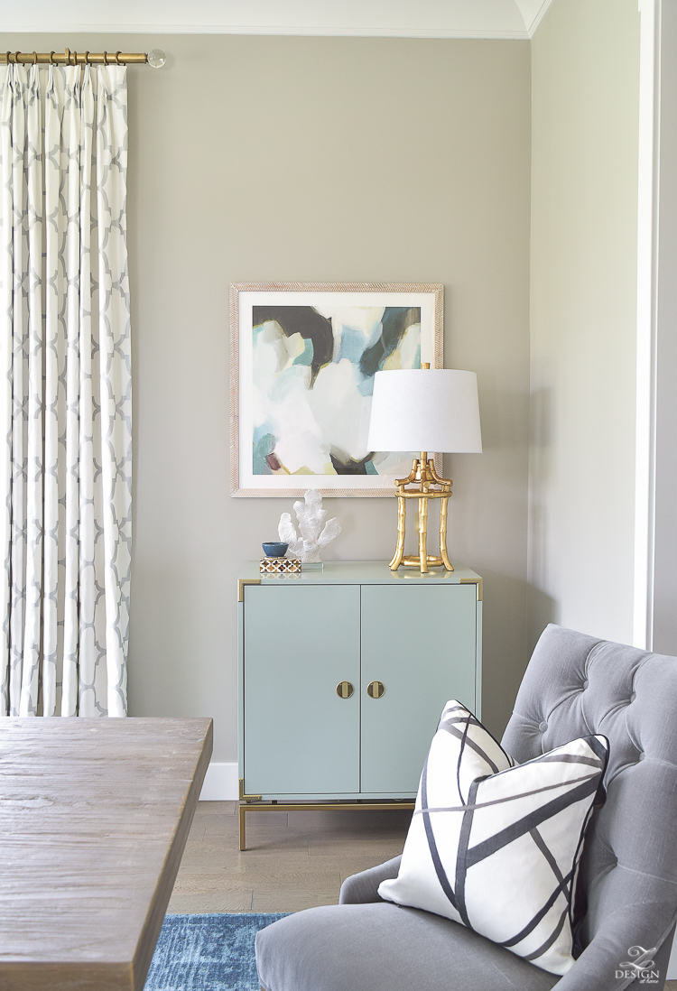
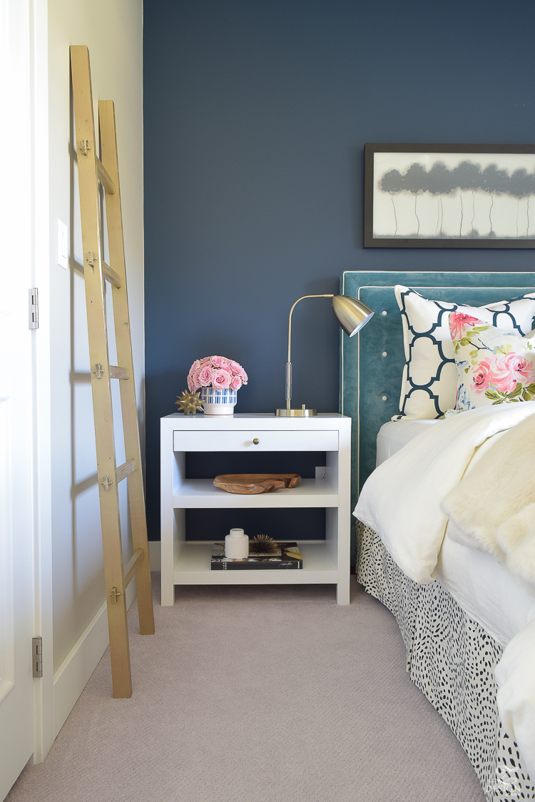
 Navy is still all the rage and I’m still head over heals for this color, Gentlemans Gray by Benjamin Moore one all day long!! And yes, this color says it’s gray but it is navy. It would also be great on cabinets (with brass hardware) and would be gorgeous wall to wall vs. just doing the accent wall like I did here with it. It would be great in a library or game room as well and in person is a bit darker than it appears here in my photos.
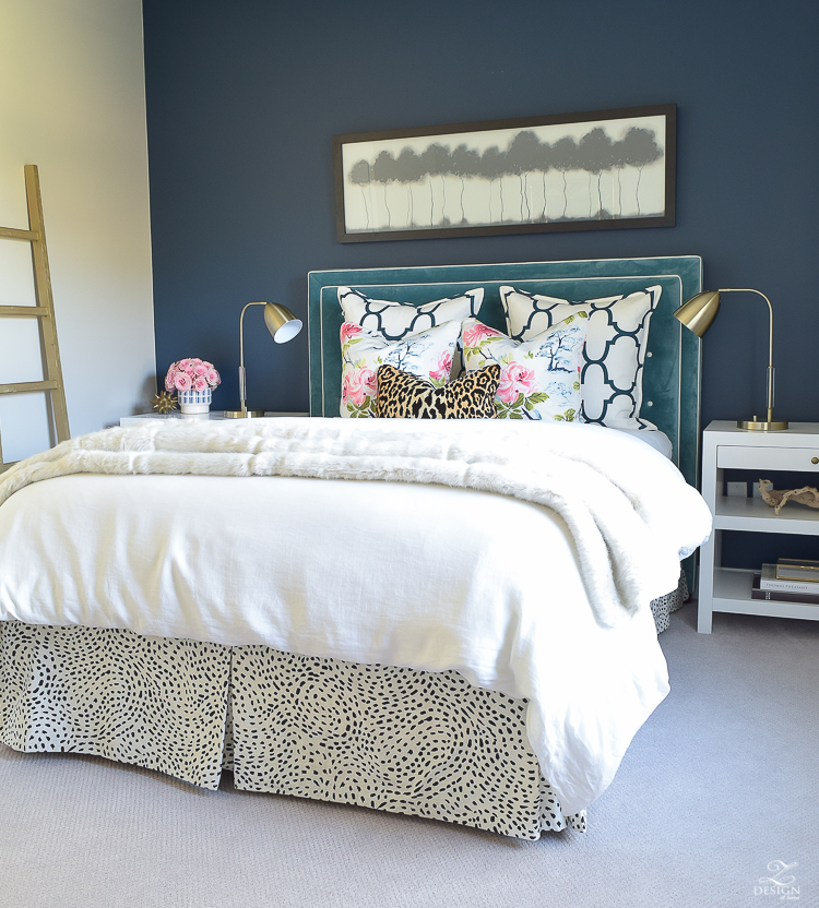
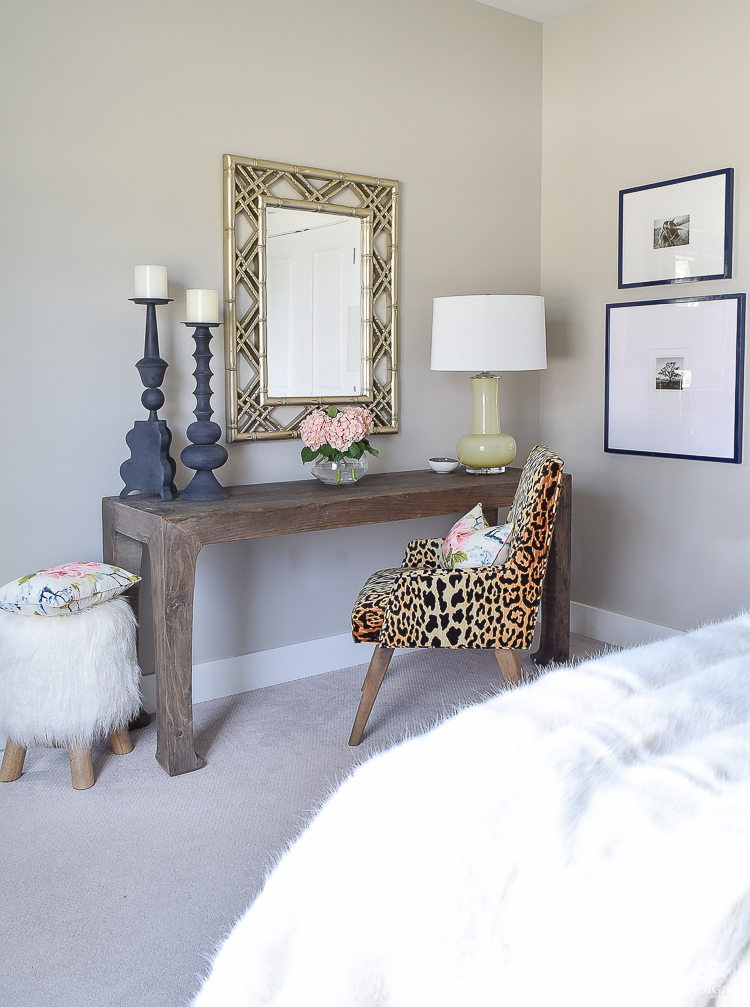
 I love Colonnade Gray for many reasons. 1st I love it because it’s super close to Revere Pewter which is my all time favorite gray but I also love that it’s a warm gray (it’s a greige) and that it’s not too light or too dark. This one also doesn’t pull any weird undertones. It looks great anywhere and pops beautifully against white doors and trim. This is a go to color that is literally one of the best neutrals ever and is Revere Pewter’s paint twin.
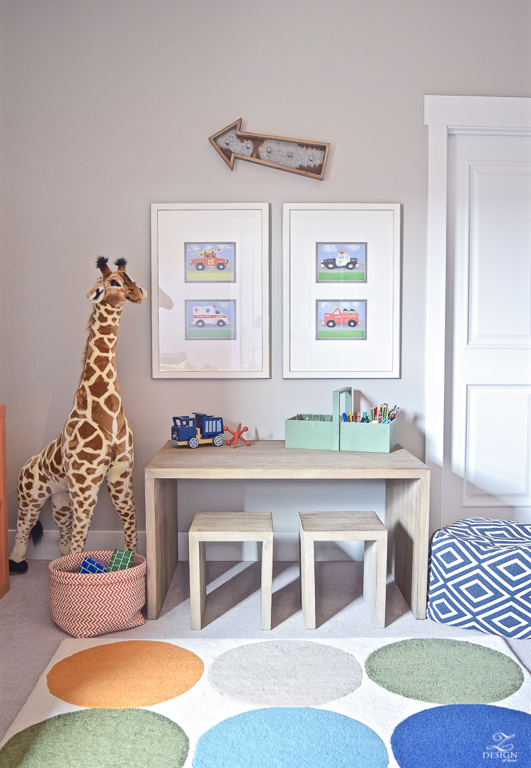
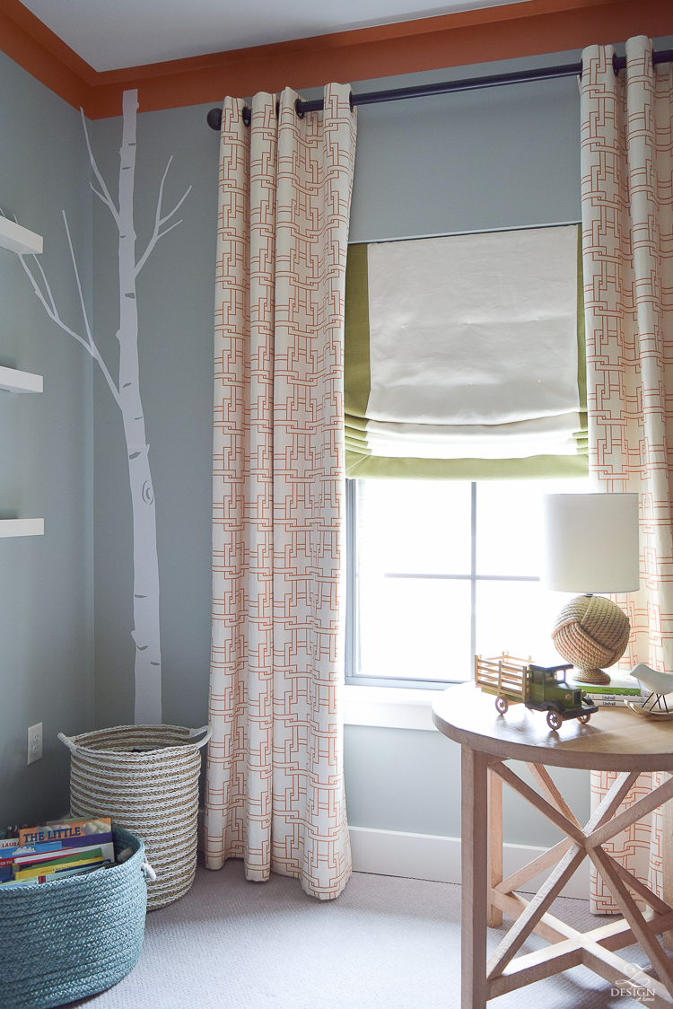
 Iced Marble is a super fun color that I used in my son’s room. To describe the color I would say it’s an aqua/gray/blue/green. I hope that makes sense because unfortunately that’s the best way I know how to put it. It’s a comforting color but playful at the same time. I would say this is all around great for a kids bedroom, play room, and it would also be great in the laundry room. It would probably be nice in a home office as well. And, in case you were wondering, the orange trim we painted for crown moulding is called Buttered Yam by Benjamin Moore (their Affinity line) and is such a fun orange if you need a color like this for a project or accent color. The stick on trees are from Etsy and can be found here.
 And last but not least is Benjamin Moore’s Stonington Gray. I don’t have a photo of it but I used it in my son’s bathroom in our current home and in a bathroom in our last home (that has no natural light or I would have a photo of it for you…maybe coming soon:). Again, it has no bad undertones and looks great anywhere you want to use it! Also looks lovely against white trim and would look fabulous in a kitchen or office.
I hope this post on my favorite paint colors was somewhat helpful and if you have any questions please let me know. I always love hearing from you and as always, thanks for stopping by ZDesign At Home!
Xoxo, Bree

For a full living room tour and resources go here & here
For a full kitchen tour and resources go here & here
For a full dining room tour and resources go here
For a master bedroom tour and resources go here & here
For a full master bathroom tour and resources go here
For a guest room tour and resources go here & here

This post could not have come at a more appropriate time. I’m in the midst of a total renovation on a home in South Florida, and my paint colors need to be chosen by Monday morning! I wish we were painting after floors and cabinets are installed, but that’s not the way the builder wants to do it. I have about 20 samples on my walls, and I don’t know if I love any of them. Skimming Stone is up there, but I feel like it may be reading a little pink. Other contenders are Drift Of Mist, Worldly Gray, and Agreeable Gray. My husband thinks I’m nuts, and keeps saying, “Just pick a white color.” Ummmm…there are a 100000 shades of white!
I just have to take a moment and compliment your design aesthetic. I often refer back to your blog when I am choosing design features for my home. I am attempting to replicate your fireplace! Thank you:)
These are some great interiors and a lovely color palette you’ve used! Well done! Thanks for sharing them with us! Personally, since I’m probably the greatest fan of navy I would probably have had the whole bedroom done with Gentleman’s Gray rather than just an accent wall. You see I’m all into creating ambient, moody spaces and generally speaking the blues palette is an all time winner for me! (Especially if you add a pop of orange color twist into the ensemble, then sky is the limit)! Thanks again!
Well that’s definitely something to consider and I may just do that next time!! Thanks for stopping in and for commenting! Xo
I’m with April! This post is right on time! I will be (hopefully) moving into my new-build within a couple months, and will be painting as soon as I get in there! My process for selecting paint is much like yours except my “narrowing down” starts with 5-6 shades, stressing myself way more than I should, lol! But I’m so picky in this process! Two of the colors on your list I’d already settled on, so thank you for the confirmation! This post is so nicely done. It should be published in a decor magazine! Take care. ?
Ingrid! Such a sweet compliment!!! Thanks so much and I’m so glad it was helpful. Thanks for stopping in and I hope to see you back soon! Best of luck with your new home…how exciting!!! Xoxo
LOVED this post and saved it so I can go back and refer to it again and again. Thank you!!
So glad it was helpful, Corbie! Thanks for stopping by!! Xo
This is a wonderful post! I’ve decided it’s time to change the color in my son’s room and Stonington Gray by Ben Moore is a contender. Now that I know you give this color a thumbs up, I think I’ve decided on this color. All of your color palette is so beautiful!
Michelle, I’m so glad this post was helpful! And, I’m so sorry I don’t have a photo of it but there is no natural light in the bathroom I have it in so it’s hard to get a decent photo that will allow the paint color to read right. Thanks for stopping in and have a great week!! Xo
Thank you for this post. I love your home decor and the color palette you put together is pretty awesome. We are in the process of painting our new home and this will definitely give me great ideas. What color do you like or use for the ceiling? Your input would be greatly appreciated. thanks again. Jennifer
Hi Jennifer and thanks for stopping in!! My ceilings are Benjamin Moore Satin Silver. Thank you for the sweet compliment and I hope that helps a bit!! Xo