Shelf & Console Table Styling 101
We’ve all been there at one time or another with a wall full of shelves or a console table that needed some added character through accessories and lighting, right? Shelf & console table styling is one of the number one issues my clients usually express they need help with during initial consults so I thought I would dish a little on the subject and give you my top 7 things to keep in mind when styling your shelves, consoles, and we’ll also take a look at coffee tables in the end.
Lighting is an essential element when it comes to styling shelves and console tables, adding depth, warmth, and a touch of sophistication to any space. A well-placed lamp can transform a simple arrangement into a curated design moment, creating a balance between function and aesthetics. Whether it’s a sleek table lamp on a console or a small accent light tucked between books on a shelf, thoughtful lighting choices can elevate the overall look, making the space feel polished and inviting.
When selecting lighting for these areas, it’s important to consider both scale and placement. A bold statement lamp can serve as a focal point on a console, while smaller, more delicate fixtures add subtle ambiance to shelving. The key is to mix and match textures and heights to create visual interest. For example, pairing a sculptural lamp with decorative objects and framed artwork can create a layered effect that feels both intentional and effortless. A well-placed lighting element like las sola can enhance the space’s mood, providing just the right amount of glow without overwhelming the design.
Beyond aesthetics, lighting also plays a practical role in making these areas more functional. A warmly lit console table near the entryway sets the tone for the home, offering a welcoming glow as guests arrive. Meanwhile, integrated shelf lighting can highlight favorite books and collectibles, bringing attention to the details that make a space unique. By thoughtfully incorporating lamps and light fixtures into shelf and console styling, you can create a space that is both visually appealing and highly functional, ensuring that every corner of your home feels complete.
But first, here are few examples of shelf & console styling that I think are spot on by not being too overly done and by having a curated look of items that are important to the home owner. First I just adore the way Kristen @blissathome1 used grass cloth to line the back of her shelves giving this otherwise white shelving a boost by adding some color and texture. The black grasscloth was also an excellent choice to make her accessories and books stand out. I love the way she layered her items and included things at varying heights to give each individual shelf some visual appeal and to create balance. I chose this one as my favorite example because I just grass clothed my dining room and am thinking of using the excess paper that was left over to do my living room shelves (stay tuned for that)!
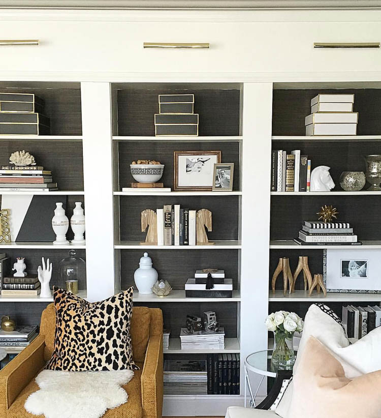 Photo credit @blissathome1 ~ Instagram
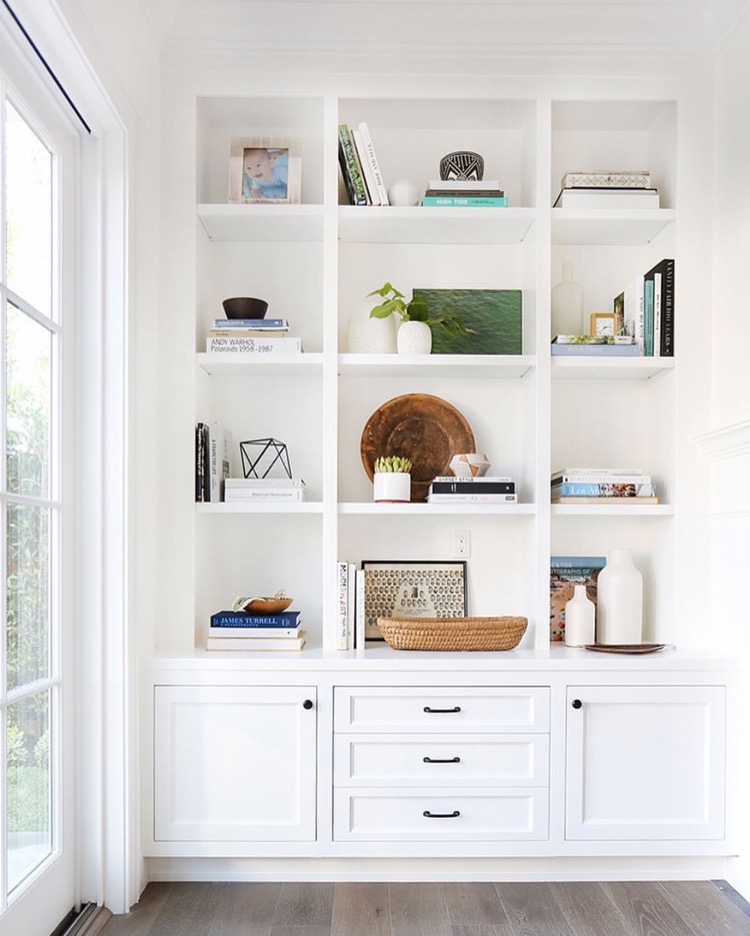
This next one has such a great mix of books, accessories, and organic elements. Layering here with artwork, greenery, and baskets gives these shelves visual appeal through a combination of texture, color, and pattern. I really love how clean this is and even though the shelves are large the stylist didn’t clutter things up with too many small items, which is key I think in achieving a well styled shelfie.
Here are some other examples I love for their simplicity and smart combination of items used to decorate with. They are all well balanced and use the principals I’ll discuss below for perfectly styled shelves, consoles & coffee tables:
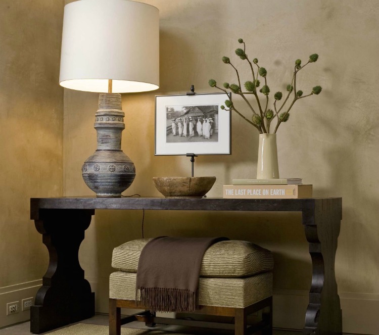 Image via Houzz | Glenn Gissler Design
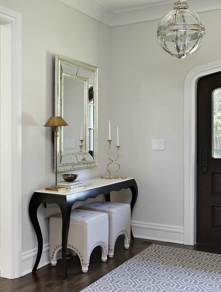 Image via Houzz | 2 Design Group
I really love the simplicity of these next two as I think sometimes you can just let well enough alone and allow your furniture to speak for itself by not cluttering things up too much with accessories and what nots when possible:
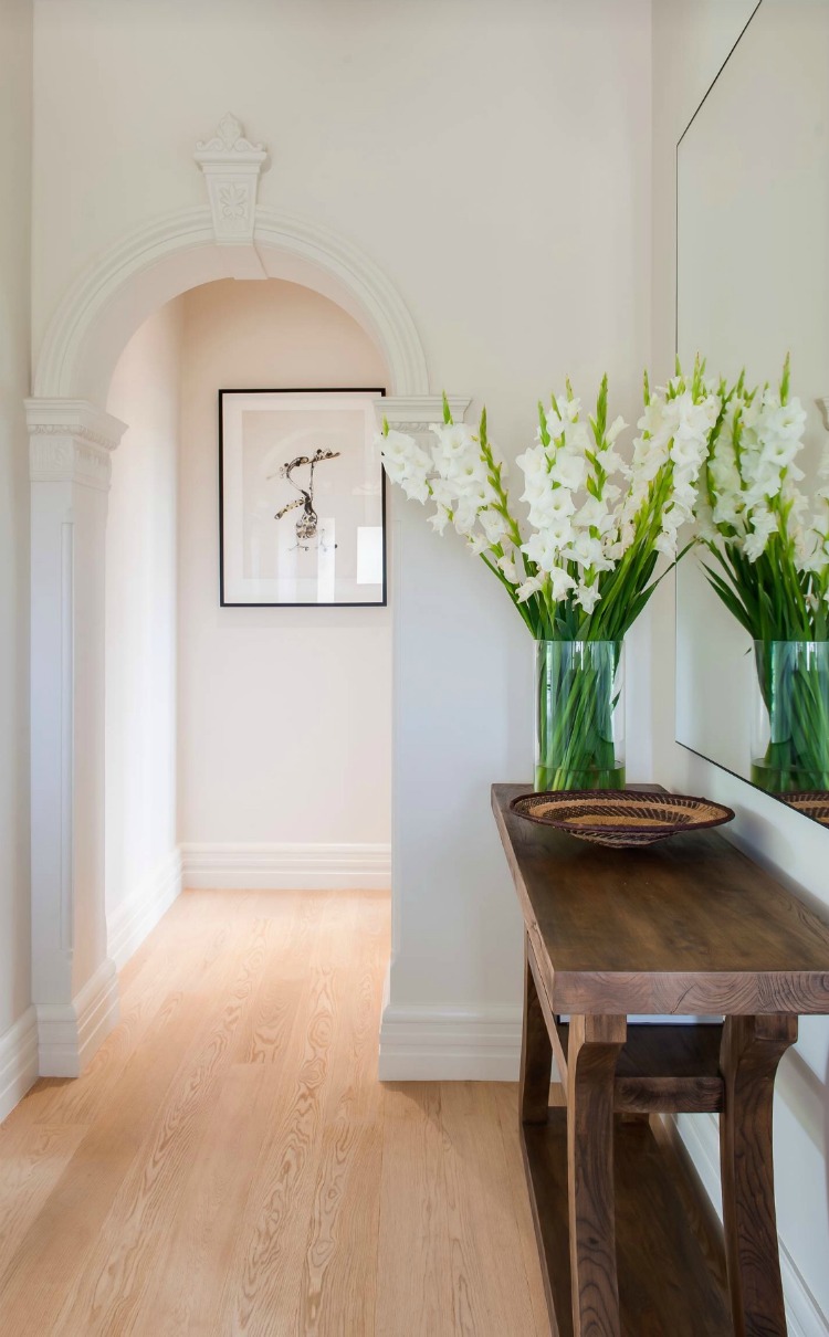 Image Via Houzz | Tanner Kibble Denton Architects | Image Credit: Lachlan Rowe
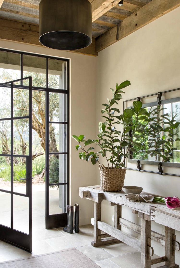 Image via Houzz | Jute Interior Design | Lisa Romerein
So now let’s cover those 7 things that are paramount in helping to create those beautifully styled shelves, consoles, & coffee tables, and then I’ll give you some of my own personal examples below…
1. Varying Heights – Gather items for your styling projects that are at varying heights
2. Alway group & layer your items – when styling, group items by odd numbers..3, 5, 7, etc. This isn’t ALWAYS the case but usually it is. When using two items that are the same or similar like candle stick holders or the organic flower elements on my guest room console table (below), you can display those in pairs and you’ll have to take those on a case by case basis by playing with the look.
3. Use a natural/organic item – always introduce something with organic appeal such as an orchid, small potted plant, a piece of coral (these are my favorite for texture), a topiary, etc to bring in that natural element to your design.
4. Include something shiny – Mercury glass, glass bottle(s), a glazed glass lamp, or even a mirror will create visual interest through it’s reflective properties.
5. Include something with color, texture, and/or pattern to give you that visual pop – examples of this would be the coral and/or small plant I mentioned above, a patterned frame, and/or a patterned or fillagree ginger jar, and I’m sure you can think of many more. If you are anti color then something brass or gold will always give a nice pop of color and style but in a neutral way.
6. Include a piece of art – art can be used for your back layer as you can place things in front of it for that layered look we all love. You can lean art against the shelf/wall or you can use a picture stand (I like to use acrylic stands for their simplicity) to hold it up on a coffee table or to elevate it if necessary (example of this shown below). A mirror can serve in place of art (or in addition to art) and is again a great piece to use because of it’s reflective properties.
7. Use books & decorative boxes – I like to use large home decor books all over my home to add color and to elevate items to the right height but, of course you can use any kind of books you have. Books can be placed under a lamp, on the coffee table, on your book shelves of course, and can serve as a vertical, horizontal, or flat piece (to elevate your accessories) as needed.
One of the biggest tips I have for styling shelves, console tables, and coffee tables is to not clutter them up with lots of little things (less is always more in the case of accessory styling in my book!). Use items that are large enough in scale that your eye isn’t confused about where to land, giving your vignettes a clean, organized look. I have lots of accessories that I love to use and that mean a lot to me but, I just don’t have them all out at once. To keep things from getting cluttered I switch things out as the mood strikes and as the seasons change. If you have a collection of items that are important to you, my advice would be to just have a few pieces out at a time or to have a cabinet with glass doors specifically for your collection as this is a great way to keep what is near and dear to you out but to keep from getting that cluttered look.
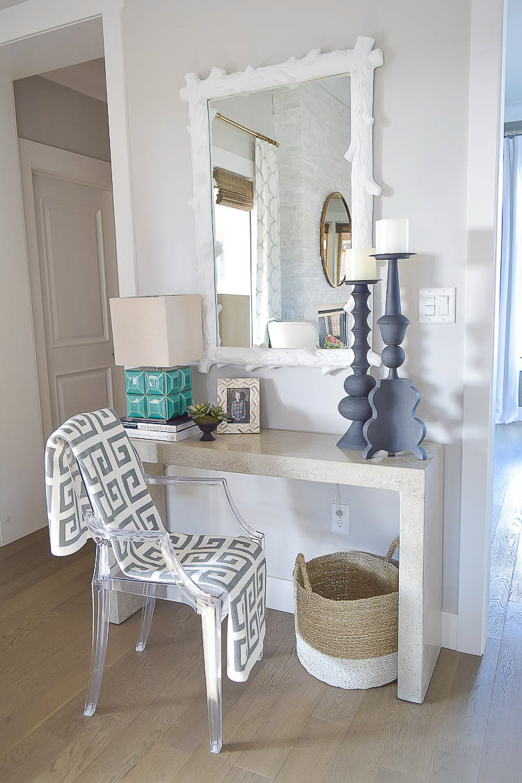
Here are some of my own personal examples that I’ve been talking about in this post with a console table styled two ways. I think the most important thing to notice here is that each item stands at a different height to give this styling job that flow and interest we want. I used books to elevate my lamp so that the top of the shade lands in the center of the candle stick holders to create balance. I also used my organic element with the small potted plant and I used a patterned frame. Additionally, I used a pair of candle stick holders that add pattern and texture. And lastly, my lamp also serves as my color pop and my shiny item.
Next I used some of the same but also some different items, again noting that they are all at varying heights. The lamp with books underneath serves as my shiny item and color pop and the small potted orchid adds that organic and patterned element we love (it’s pot has a navy & white subtle pattern). This time I added a bit of gold and texture with my little sea urchin and again with my candle holder. The frame adds a black and white element that always looks chic in any styling situation, and also adds pattern here as well. This is my favorite example because if you look at the top of each item, you’ll see the graduation of items across the console table. The candle holder is my tallest item, then the height graduates down to the lamp, then to the orchid, then the frame, and lastly my little gold urchin (my favorite accessory at the moment – source found below) giving this vignette flow and balance that is critical in creating any successful styling job! You’ll also notice this time that I just used my candle holders as a pair (vs. having my odd # of at least 3) because they carry enough weight and style on their own that if I had added anything else to this side of the table it would have been too much, however, if you add all of the items up on the table they come to a total of 7 items which gives me that odd number I’m always looking for when styling shelves.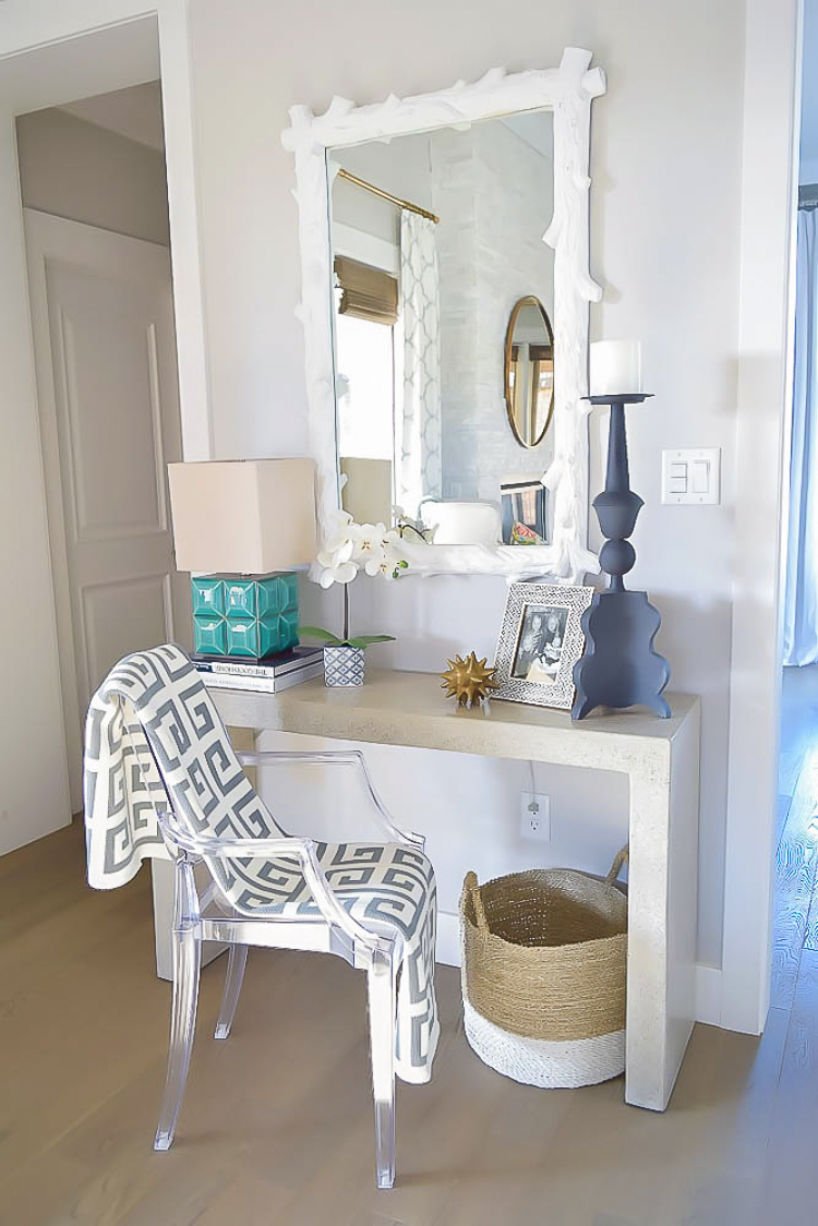
Get the Look
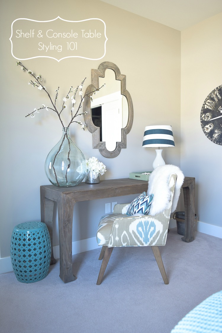
Here also is another console table that I’ve turned into a desk in my guest room. You’ll notice that on the left side there is an organic element that also serves as my tall piece which is usually always necessary on one side of a console table. You’ll notice I have another organic element that graduates down in height right beside it (same principal as above). These two items are both glass and shiny which creates visual interest. On the right side I have a tray and sitting inside the tray I have introduced a lighting element which was neccessary in this little corner for reading, or for putting on makeup for my guests which makes this space functional as well. I also have some starfish in the tray to add my texture piece. The tray is a faux croc print and is shiny as well which gives a nice juxtaposition in materials between the tray and the rustic wood it sits on (juxtaposition in materials always creates interest in any project). You’ll notice again here that all of my items are at varying heights and there are an odd number of items…these two things are extremely key in creating shelf, console, and coffee table styling that works. Normally on a console table this long I would have placed something in the center but, the tray on the right was wide enough that if I had put something in the middle it would have given this vignette a cluttered look and would have had to be removed anyway when this space gets used by my guests so, I just left it open all the while still having balance in my design between the two sides of the table.
Lastly, here are my living room book shelves (that I may add that left over grass cloth to!). You will notice that each space on the left is a small compartment so I though it was important to use 1 item for each rectangle so that those little compartments didn’t get that cluttered look we don’t want. On the top of the shelf I chose one large item that was in scale with the shelf and space so that again, things didn’t get cluttered up there. On the shelf directly above the TV I used my same principals as before with grouping things in odd numbers, using something with color, pattern, and texture, using something shiny (the white lacquer boxes w/ gold accents), and I used some art work so that I could layer in front of it. You can’t tell from this picture but instead of just leaning the art against the shelf wall, I had to elevate it with an acrylic picture stand so that it would be taller than my blue and white ginger jar for that varied height look that creates so much visual appeal.
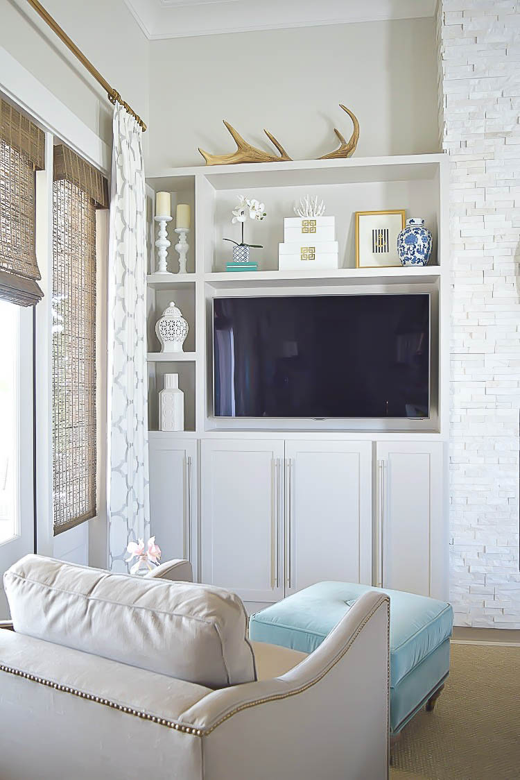
Get the Look
These principals can also be used on your coffee table as well so here are few examples using the same or similar points as stated above:
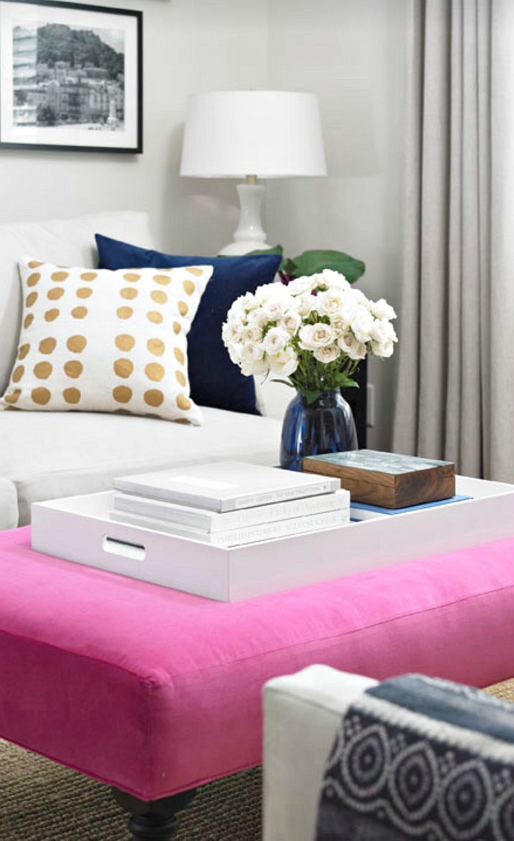 Image via Houzz | Vanessa Francis | KWest Images
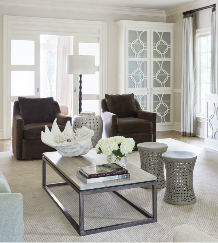 Image via Houzz | Tobi Fairley Interior Design
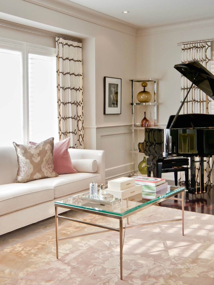 Image via Houzz | Design Credit: Shirley Meisels
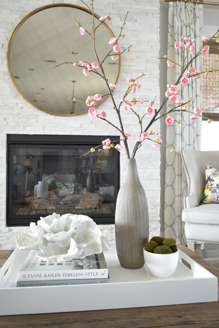
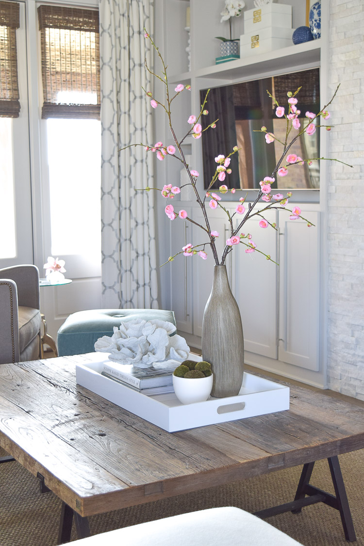
Lastly, I thought I would leave you with a few examples of my current coffee table styling situation (it changes often folks, very often and sometimes daily:). Something to note here is that my coffee table is very rustic so I used a white lacquer tray (source listed below) to create a contrast in materials and to glam up my coffee table a bit, similarly to what I did in my guest room with the faux croc tray in there. You’ll also notice that I keep my coffee table styling simple because we are a busy household and you’ll often find feet propped up on the table or someone sitting on it and that is one of the reasons I like to keep my nice things corralled in a tray…I always say I think a nice tray is a girl’s (or guy’s) best friend and the best place to start when styling your coffee table…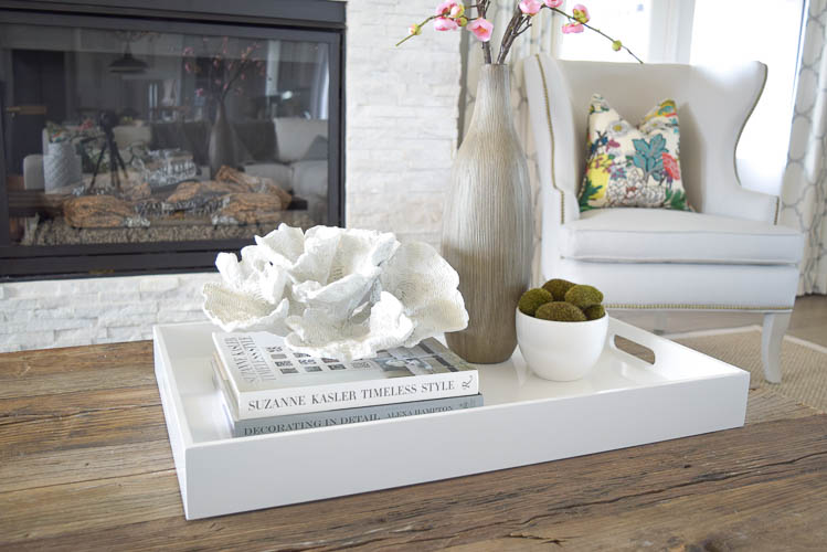
Get the Look
Please let me know if you have any questions and I hope this post on styling your shelves, consoles, and coffee tables was helpful to you! And remember, I always love hearing from you so don’t forget to leave me a comment!!
Xoxo, Bree
*Some affiliate links used
*Shop This Post
Round Gold Mirror | Large Rectangular White Tray | White Hydrangeas in Mercury Glass Vessel | Filigree Garden Stool (similar) | Quatrefoil Mirror (similar) | Coral (similar) | Coffee Table (similar) | Blue/White Decorative Jar | Faux Orchid Pot (similar) | White/Gold Decorative Boxes (similar) | Decorative Wall Clock (similar) | Gold Sea Urchin | Turquoise Lamp (similar) | Small Art (similar) | Coffee Table Book1 | Coffee Table Book2 | Greek Key Throw | Wing Chair (similar) | Candle Holders (similar) | Small Potted Plant (similar) | Seagrass Rug | Acrylic Picture Stand | Brass Curtain Rod | Large Cabinet Pulls | Faux Cherry Blossoms (similar) | Natural Woven Shades (similar)


Bree, this is such an informative post! I love how you teach so effortlessly. Beautiful photos, especially the ones in your home. xoxo
Thanks, Jen!! And thanks for stopping by dear friend! Appreciate you and your support so much:))
Bree! Oh my word.. LOVED this post so much! I’m taking notes!! I was looking at the corner of my office desk the other day thinking something is off and now because of you I know what it is! I used 4 items and I think three (odd number!) looks so much better! I swear you are the ultimate design queen and I am beyond GIDDY that you now have a blog I can regularly stalk! Your home makes me drool. Pinning this post! Such a good one cutie! xo
Oh my goodness, Erin:))! You just totally made my day with your sweet comments!! Thank you for stopping by the blog and for being such an amazing friend!! Love you, girly:))
Such great tips Bree! I absolutely love your new mirror on your fireplace wall too! You’ve motivated me to go style some shelves now! 😉
xoxo
Thanks so much for the sweet comments and for stopping by Shauna!! Always appreciate your support more than you know:)
I love this post and needed it very badly. I will to read and re-read. Thank you so much! Question: You used a lacquered white tray to style your rustic coffee table, but what would you use to style an espresso coffee table?
Hi Debbie! Thanks for stopping by the blog! You could still use the white lacquer tray or you could use something with color. If you follow the link in my post to the white lacquer tray you will find they sell those trays in many colors. You could also use something like a large basket tray or even something with a faux croc pattern (depending on your style/taste). I just really like to see a contrast in materials so that is why I chose the white tray with for my rustic coffee table but with the espresso table your choices are probably a bit broader. Thanks again and I hope to see you around soon:)
Where did you get the wooden large console table in your guest bedroom?
Hi Lindsey! It’s from Restoration Hardware. Hope that helps and thanks for stopping by:))