3 Simple Tips for Mixing & Matching Light Fixtures
I’ve said this before but having a well thought out lighting plan for your home is essential in good design so today I’m here to share with you some tips on how to mix & match your light fixtures, primarily in an open concept area of the home such as the entry/living/dining/kitchen area where often times you can see all or most of your light fixtures at once. This could also include (among other various places in the home) for example a bathroom where you might have sconces or decorative lighting around the sink and then a fixture over the tub.
Goodness knows I’ve spent countless hours on my personal homes and client’s homes trying to get this concept just right so here are a few tips that I hope will be helpful the next time you are building, renovating, or simply upgrading your lighting.
*Affiliate links used in this post

Use Fixtures that Share a Common Trait
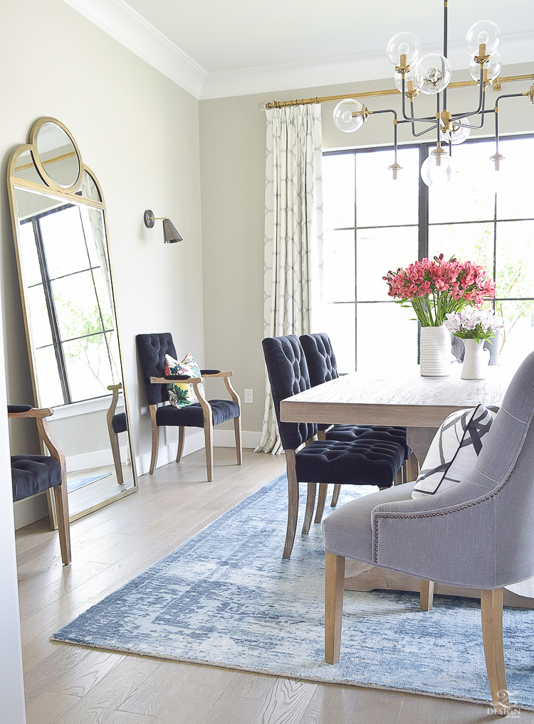
This tip is huge because using fixtures with the same or similar shapes, colors, materials or styles will bring harmony to the space and allow your fixtures to blend seamlessly, like they were meant to live together in the same space without being overly similar. For example, the sconces and chandelier in my dining room share the common trait of a mid-mod style and share a color trait therefore they work together in harmony to form a great lighting plan and look.

Don’t Use Fixtures From The Same Collection In the Same Space
This look becomes too matchy matchy and creates monotony, which is never good in design in my opinion. If you want to use the chandelier for example from a collection of lights but you also want to use the pendants or sconces from that same collection because you love them that much that’s fine but, use them in another space separate and apart from the space you are using the chandelier in so that things don’t become monotonous. Cookie cutter builders do this because it’s easy and cost effective for them but if you are replacing your lights, renovating or building and have options, always stay away from using a collection of lights together in the same space.
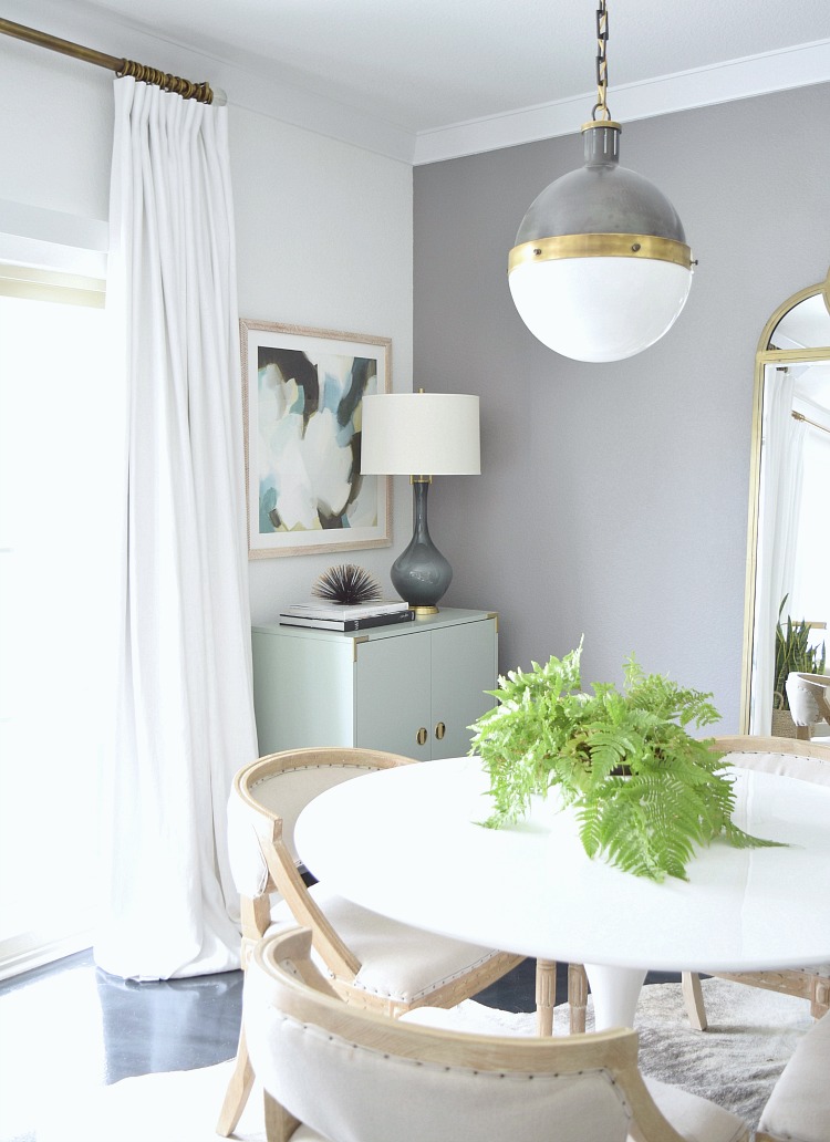
For example, when we moved into the place we are staying in while building our home (more on that HERE) I immediately changed out the light over the dining table to break up the monotony of the lighting plan in our rental. See how the two lights here share several common traits with style, color and shape that make them work well together in the space?
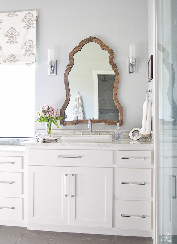
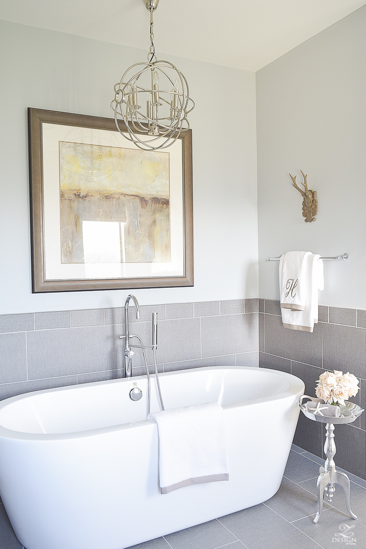
 In the bathroom I could have used lighting from the same collection which would have made my choices super easy but taking the extra time to find fixtures that would blend make the space more interesting and less monotonous. My fixtures share the same color and some similar shapes but mainly they aren’t matchy matchy and therefore give my space a more custom feel.

Use a Variety of Brands, Colors (i.e. mix your metals), & Textures
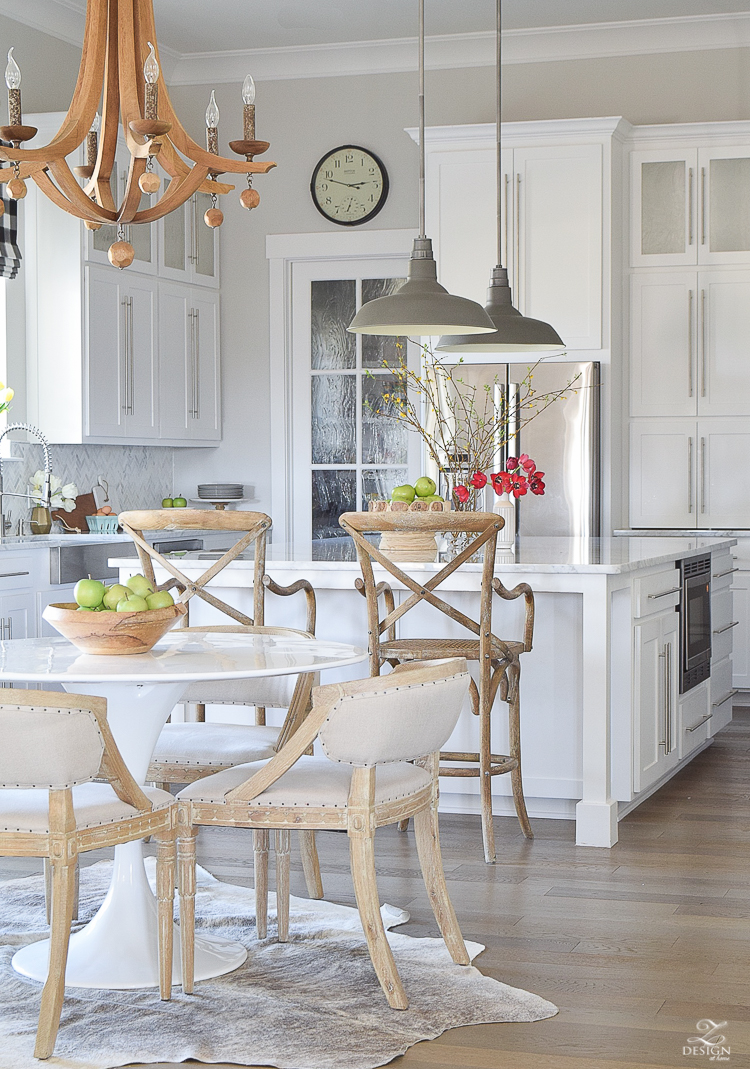
Varying the brands you use along with the colors and sizes can create interest, scale and character in a space. For example, the chandelier in my breakfast area is entirely different from the pendants over the bar so even though they live in harmony with one another sharing farmhouse style (as described in tip no. 1), they are also each individually interesting because I’ve mixed my metals (the candles on the chandy are a mixture of bronze and silver), used a chandelier with wood to add texture, and they are from entirely different brands/retailers so again, giving my space a custom look and feel.
These lights below are just a few of the ones I’m contemplating for my new build but to give you some examples of lighting for an open concept space where you might see several fixtures at once, I have shopped for some combinations in different design styles (i.e. transitional, modern, boho) to give you an idea of how to mix & match light fixtures to create a harmonious lighting plan.

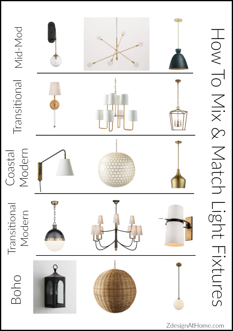

Mid-Mod
Transitional
Coastal Modern
Transitional Modern
Boho
Other lights I’m looking at for #FinallyHomeProject
Sconces
Chandeliers/Large Pendatns
Pendants

Dining Room
Bathroom
Breakfast & Kitchen


Love the post ! It’s really helpful . What do you think about using different styles in different rooms that you can’t see all at the same time ? Like bathrooms or a loft ?
I’m not the person you asked, but I think you can do different styles in rooms that are not connected/visible from other rooms. My daughters room is alittle more shabby chic. My son’s room is a little mid century modern. Those aren’t the styles in the rest of the house, but I think its fine to change it up a bit in singular rooms. I will be interested to see what Bree says.
Totally agree, Jalene! Thanks for chiming in, cutie!! xo
Hi Jessica! I think that’s totally fine and encouraged actually. I use different lights all over the house and prefer it that way. Thanks so much for stopping in and I’m so glad this was helpful to you!! xo
Beautiful selections Bree! Can’t wait to see more of your lighting (and everything else) for your new home!
Jen, thanks so much for stopping into the blog! I can’t wait to see either, lol! As you well know there are sooo many decisions to make that can keep your head spinning;). Xoxo
Thanks for your replies!
You’re so welcome and thanks again!! xo