Dining Room Reveal Part 2
Thank you for stopping by today to see Part 2 of the dining room reveal, and welcome back if you were here last week for part 1! If you missed the first part you can view it here to get caught up but here are a couple of my favorite shots from part 1 to get you started. This room has come together a little bit over time and I’m super excited to share part 2 with you today! This first shot is the bar cabinet area where dishes, flatware, and linens are stored and I talk a great deal about this perfect little piece in part 1 of the reveal so please check it out when when you get a moment.
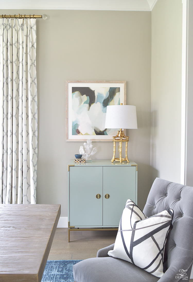
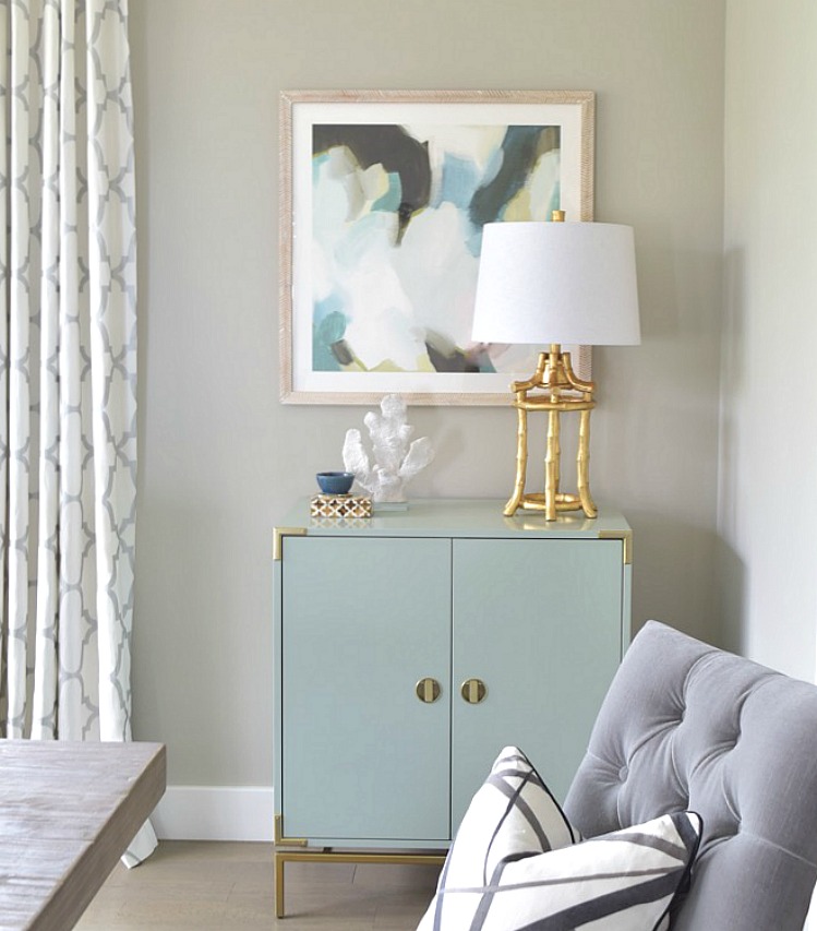
This is a small corner of the room that I dressed up a little with some art from Minted.com. I shared last week in part 1 about both pieces of art and what they bring to the space.
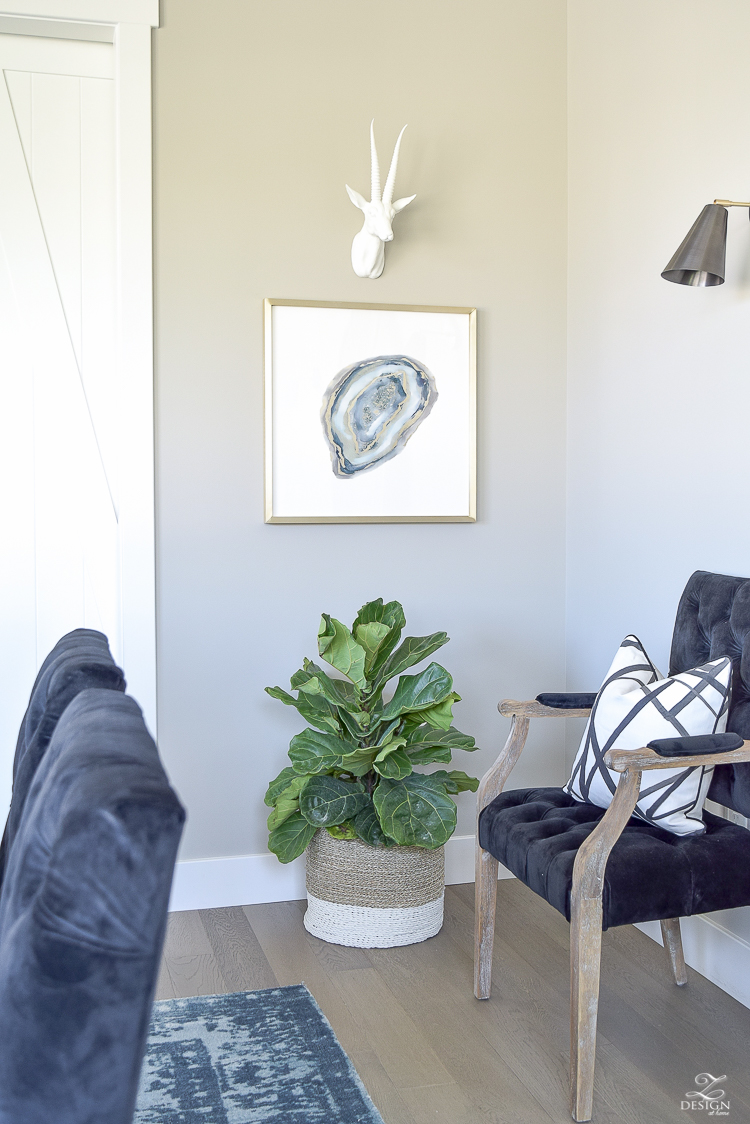
Now that I have you somewhat caught up on images from part 1 I want to share a little (reality) about the dinging room in general. For our family with a child only a couple of years out of the toddler stage and having friends/neighbors with children of the same or similar age, this is a room that doesn’t get used often. Most gatherings of any sort around here are spent hanging out, eating, laughing, and talking around the kitchen island (can anyone else relate?) or in the cul-de-sac for that matter. However, this room needed to be completed (since it’s been over 3 years now that we’ve been in our home) for those occasional formal dinners so I had some real decisions to make about which way this space should go and here’s that story…
Our home was just barely under construction when we purchased it and the home’s architect had designated this space as an office but it wasn’t long after moving in before I realized that if we were to have more than a visitor or two over for a meal, our casual breakfast table/area (seen here) isn’t large enough for seating over 4 which meant the “office” area was going to have to be designated instead as the formal dinging room to fulfill that need. With all of that said, this is the final room in our home to get decorated and since the dining room is a place where we share meals and time with those that we care about, and where (in theory) sometimes the world can be changed through sharing meaningful conversation, I knew this room had to be special (at least to us) and that it had to have that “finished” feel I always like to achieve upon completion of any space.
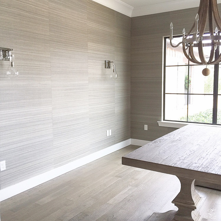
When we moved into this home we had kind of a hodge podge of items from our previous home that were suitable but that just didn’t “fit” the home. I searched for quite some time taking my time to find the right pieces and when the time was right I listed our existing things on Craig’s List, which I didn’t feel bad about at all since I originally purchased those pieces on clearance and sold them for more than what we paid for them (I have mad Craig’s List skills, people)! Additionally, I even had this room wallpapered at one point but knew almost instantly that I didn’t love it (actually that I hated it) and thank goodness for the best husband a girl could dream of (and that read my mind) because he took it upon himself to get up early one Saturday morning, head to the hardware store, and come home with the right products to spend the weekend taking that paper off for me (happy wife/happy life, right friends?!). I have always loved grass cloth for the texture and warmth it adds to a space and had always hoped to have it in my home someday but for some reason it just didn’t work out as well as I had hoped in this space. I thought it was the perfect choice since this room is light filled because I felt the intense texture of it would make the room feel cozier. Much to my dismay, it just simply didn’t work out and I had to chalk this one up for experience. That doesn’t mean I won’t ever use it again but it just means it didn’t work out in this space to achieve the end result I was going for in here. This is what the room looked like with the paper…
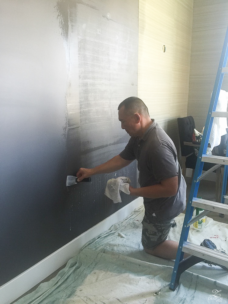
On a side note, we (he) used this wallpaper remover that worked like a dream! It may have worked so well partially because the wallpaper hadn’t been up for very long but it was only a matter of spraying the product on the wallpaper, letting it sit for 15 minutes, and then it literally pealed off like butter on hot corn! You can only image that I was singing a sigh of relief at this point;)!! My husband’s recommendation is to use very hot water, even though the instructions say to use warm water but of course if you choose to use this one (or any other wallpaper remover) you should always read the instructions for use very carefully.
Shop this Product
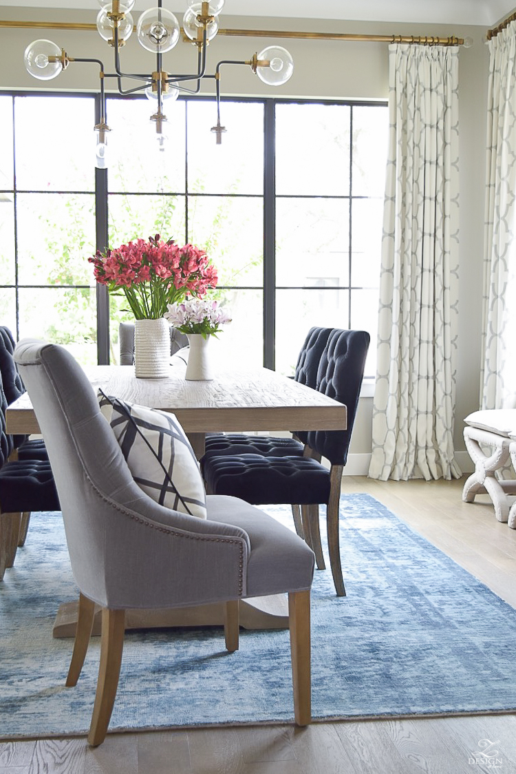
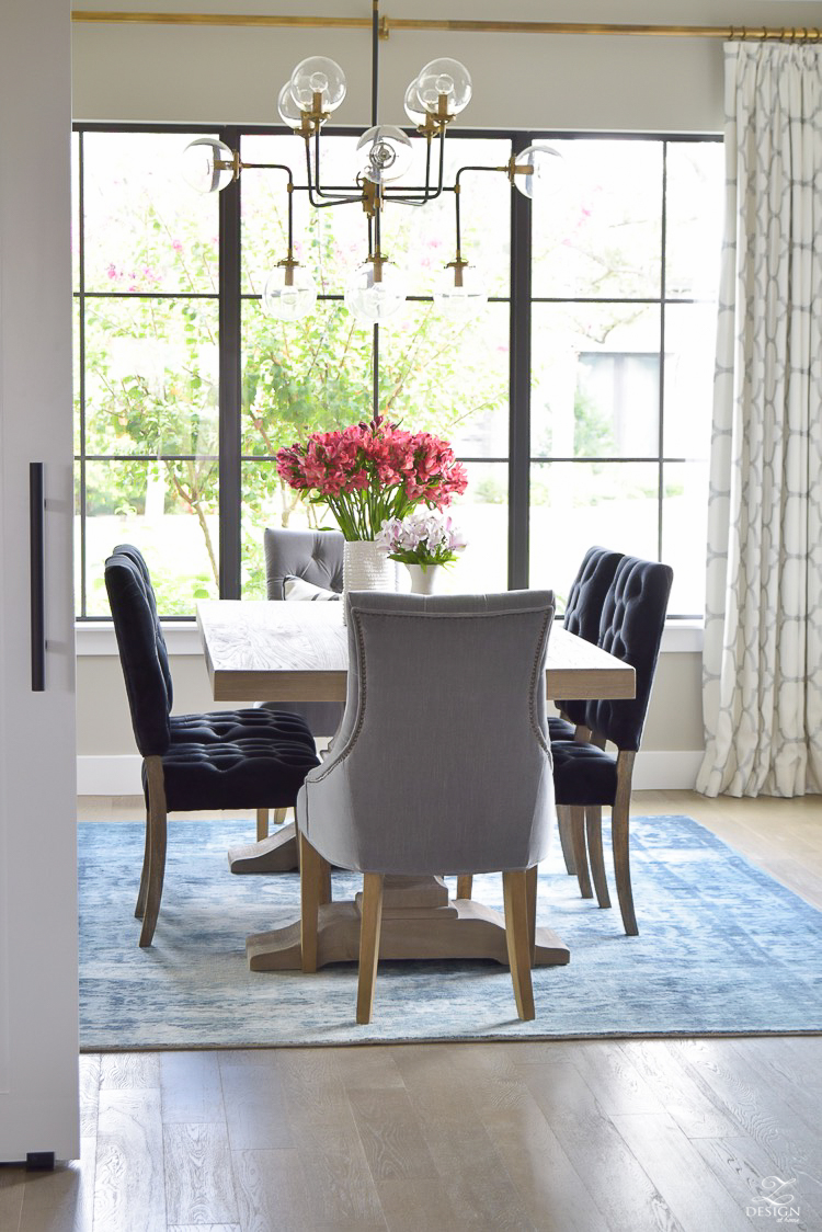
Now on to the good stuff! I spoke about this in part 1 but I really wanted this room to have a grown up, comfortable, yet luxurious feel with pops of color for interest. After the wallpaper debacle the walls were pained SW Mindful Gray (my new favorite gray for sure!) and then this rug laid the foundation for the rest of the room by grounding the space and by adding that pop I was looking for with one of my current favorite colors (it’s the crown jewel of the room as far as I’m concerned).
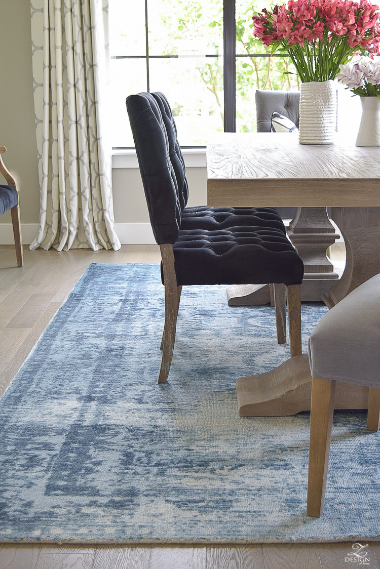
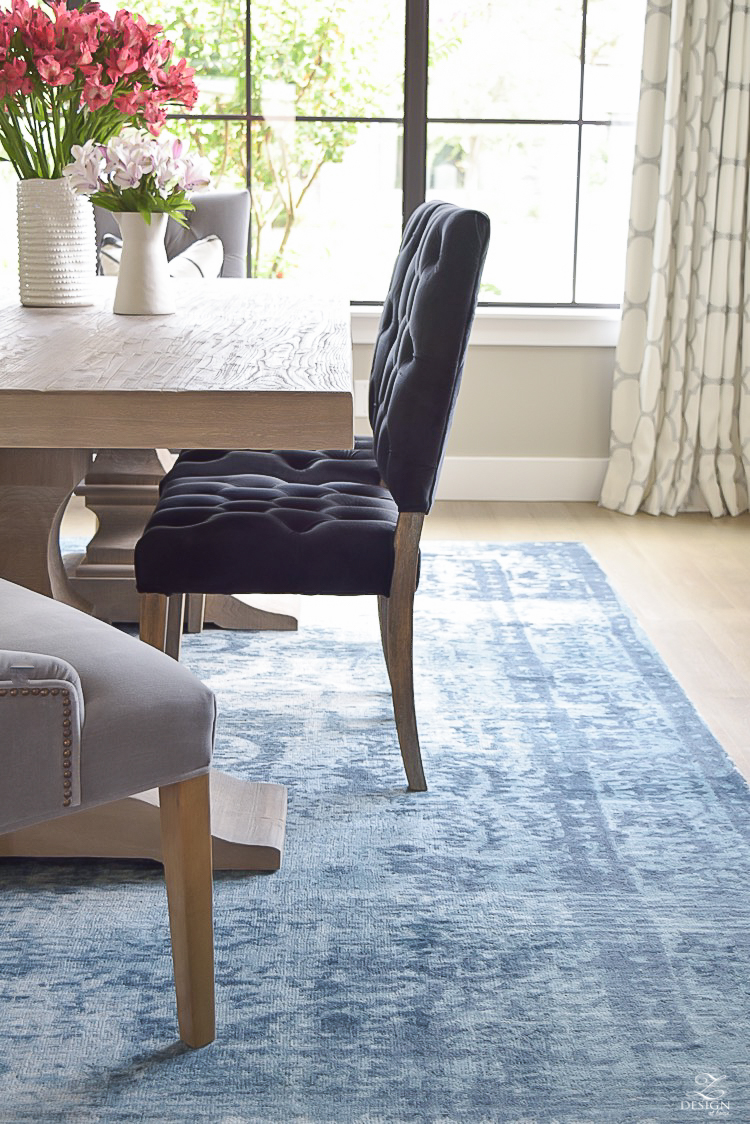
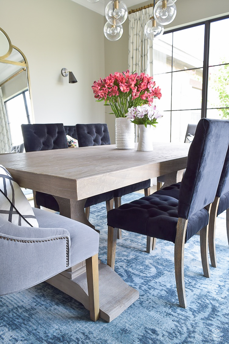
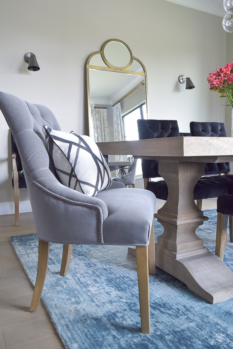
It’s soft, variegated, vintage inspired color palette had me at hello and I knew it would fit into my design scheme for this room perfectly! The only caveat with this rug was that I really needed an 8×11 for the perfect fit but it didn’t come in an 8×11 and a 9×12 was too large for the room. According to the rules, you need at least 24″ from the edge of the table to the edge of the rug in order to have plenty of room to prevent chair legs from catching on the edge of the rug, which means I settled in this case but I’m completely fine with it since it was the perfect piece otherwise for the room. I was also feeling really inspired by black for this space and ran across these black, velvet, tufted chairs during my search and knew instantly they were the ones.
“I always think it’s ok to settle when you know it’s the perfect piece even though it may not meet the quote/unquote ‘rules’ for decorating”
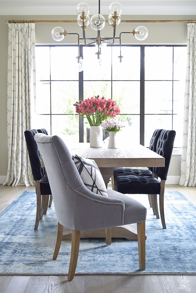
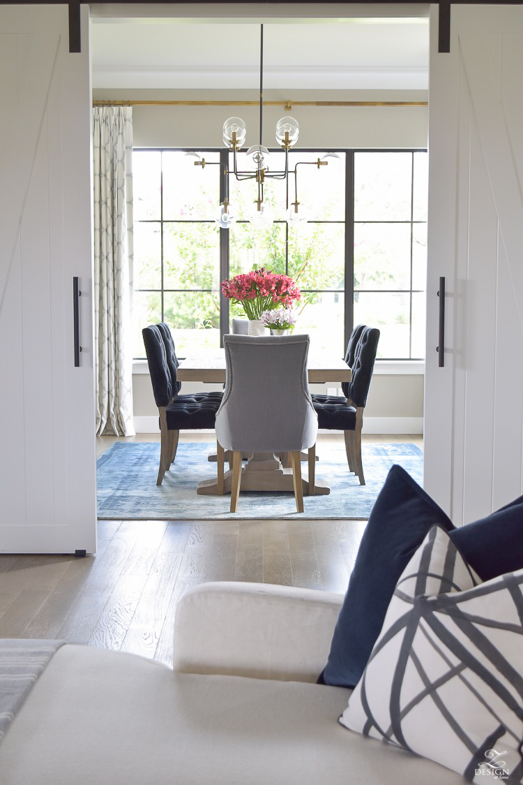
The table was a find from a trip to the Restoration Hardware outlet last year. Combined with the rug they give this space the perfect juxtaposition in color and material I like to give the room that cozy feel I was looking for. I know the table especially will be a staple in our home for years and years to come (I’ve sourced a similar one here and throughout this post for your convenience). The chandelier (from One Kings Lane) was actually purchased for our living room but it didn’t work there (adding another design mistake to my list…I’m probably setting a record here;) so we tried it in here actually knowing before it even went up that it was going to be perfect for the room. It is already unavailable but I’ve sourced an almost identical one here and some similar ones as well below. I love its mid mod feel and the warm pops of brass really add life to the room. I also love the globes as they make the room feel fresh and on trend but classic at the same time!
Shop this Post | Clickable Images
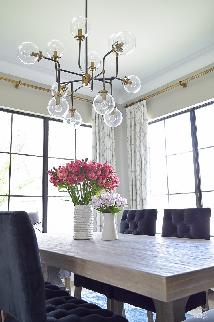
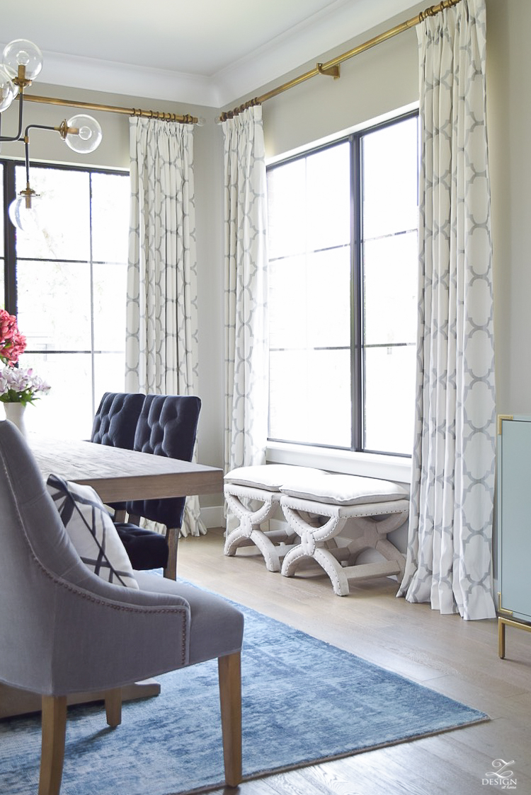
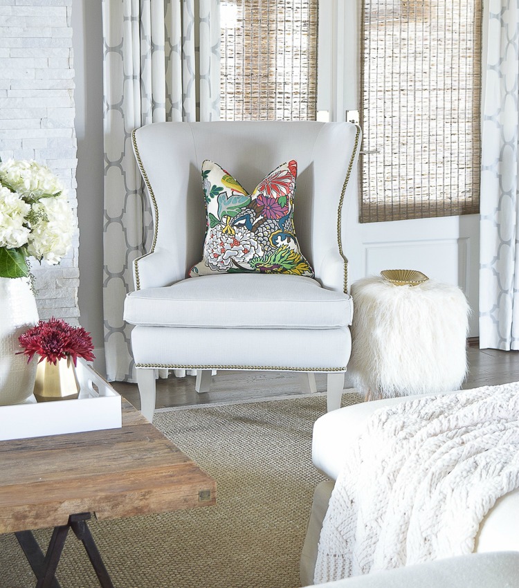
Brass for the curtain rods was a given and I chose to do the draperies in the same fabric as my living room since these rooms are almost all the way open to one another. I like to repeat pattern and fabric at times to help create flow between spaces (I share a lot more about creating flow between spaces here and more about custom draperies & ready made curtains here).
I also relocated my existing X benches in here to reside permanently as they provide additional seating for the room plus, they help to fill in what was previously an open, awkward space in front of the large window.
Shop this Post | Clickable Images
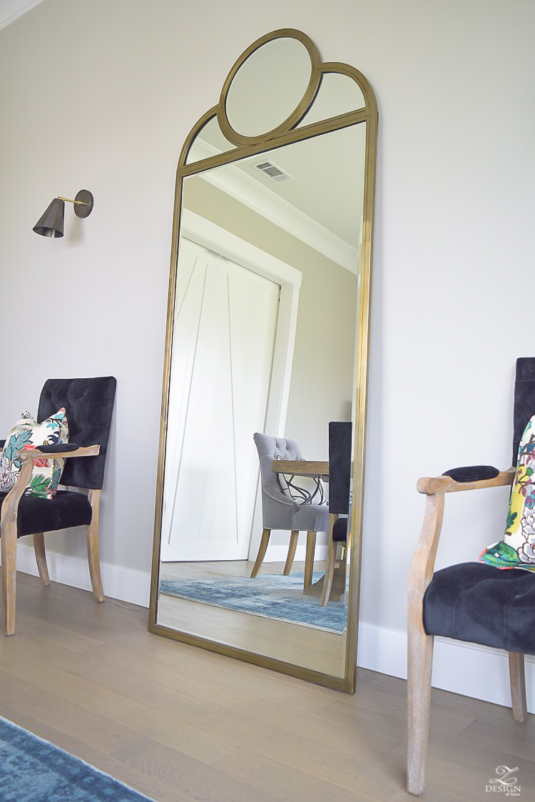
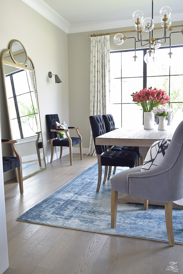
Now to turn your attention to the other other side of the room, which has me all giddy by the way! Previously over here we had a large buffet which made the space feel cramped otherwise, I would have just kept it and painted it to make it work for the space! I fought it for a while but knew a large mirror would be perfect here and again, this one spoke to me for this space. I love the retro quality it sports and knew it would blend perfectly with the chandelier, not to mention the mid mod reproduction sconces (from Cedar & Moss) we chose for the space. The end result of this area of the room is that the mirror creates a beautiful reflection that brings so much life into this space that I didn’t really even contemplate initially…what a nice surprise, huh?! Unfortunately this mirror is no longer available at the moment but I’ve sourced some similar ones here and here.
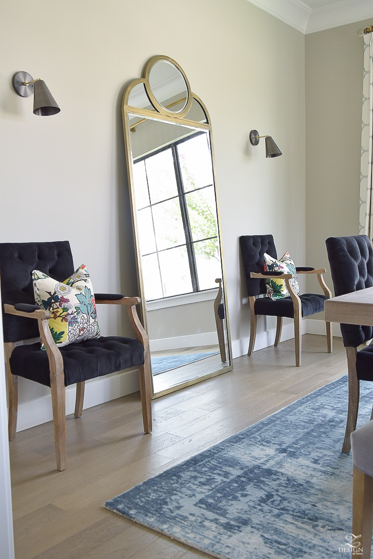
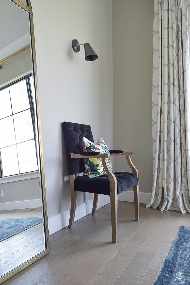
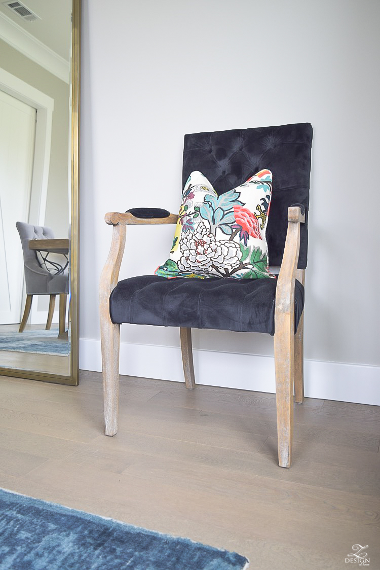
I flanked the mirror with these black, velvet, tufted arm chairs in the same family as the side chairs and used my favorite floral pillows to once again create flow from the living room since these rooms are so open to one another (I talk a lot more about designing the perfect pillows here). I had been looking at some almost identical chairs from RH but they were budget busters so these were the perfect option. The chair legs have the perfect distressed finish that compliments the fabric and they look beautiful sitting on top of the rug as well. Additionally, the arm chairs provide extra seating and balance out this wall to complete this side of the room.
Shop this Post | Clickable Images
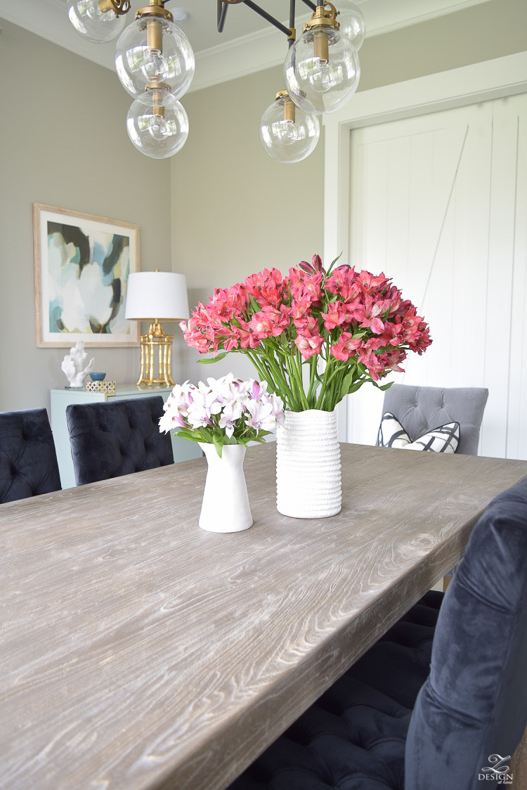
In closing…designing a room from start to finish is always so much fun but even more fun (and rewarding) is to see it all come together and to be able enjoy the fruits of your design heart’s labor in the end. I say labor because it is hard work pulling a space together like this for yourself or for someone else but in the end it’s always well worth it. I know this room will be shared with many people that we care about and that’s the very best part and what matters the most!!
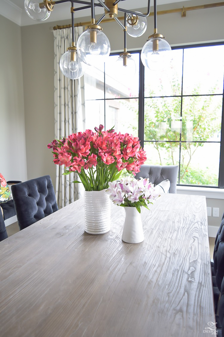
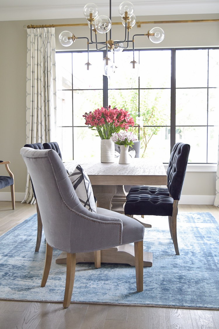
Shop this Post | Clickable Images
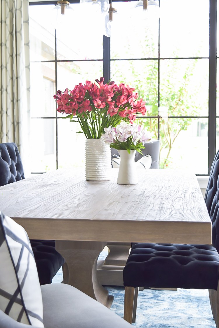
Thank you for stopping by to take the final part of this dining room reveal tour! I Hope you enjoyed it and please feel free to leave me any questions or comments you might have as I always love hearing from you. I hope you’ll continue to join me as I decorate and redecorate different areas within my home and that you’ll join me for all of the fun tours coming up this fall!!
Shop this Post with these Clickable/ Scrolling Images
Furniture
Rug & Lighting
Accessories
Draperies & Pillows
*Affiliate links used for your convenience


Bree, it’s FABULOUS! Love the rug with those velvety chairs. Oh! and that chandy! Such a stunner! So happy you finally got this room just the way you wanted.
xo
Shauna!! Thank you so much my friend!! Love you girly:) Xoxo
It looks stunning Bree! Great choices!! Love the rug, the chairs, the table, the chandy! Well, pretty much everything!! Good job!!
Thank you so much, Amy!! And thanks for taking the time to stop by…you are such a sweetie:)
I know the chairs are black but they are showing more midnight blue than black in the photos. How are they in person please?
Hi Nicole, they are definitely black. Thanks for stopping in to check out the new dining room:)
Bree, I don’t think this room could have turned out more perfect! I am just in love with your streamlined style. Each detail is so precise and I love your thought process and approach to design – I’m seriously in awe of you! Fabulous room! I would SO love to see this in person some day! xoxo
Tamara! Thank you so much sweet friend!! And thanks for taking the time to stop by to check things out. Now if I can just get you and all of the girls over to share a meal in here…that would be a dream:) Xoxo
Just gorgeous! I love everything you chose!!! The new rug is perfection! xoxo
Thanks Jen! We love it so far and can’t wait to get started using it with family and friends!! Xoxo
Bree this room turned out absolutely AMAZING! I seriously love every single item you chose! You are such a talent my friend! Now when can I come over for dinner!? 🙂 xo
I would love to have you over anytime for dinner my friend!! Thank you so much for taking the time to stop by and I’m so glad you approve…that means everything!!! Xoxo
Bree its all so gorgeous! You did such an amazing job!!! Love love love!!! xo
Thank you so much Randi!!! Hugs Xo
Would you mind sharing the size of the table?
Hi Elle! The table is 84″ long by 39″ wide. Hope that helps and thanks for stopping by!
Fabulous, love the rug & chairs! xx
Thanks for stopping in, Jaime!! So glad you like them:) Xo
What is the brand of the chandelier? I know you said it was no longer available but it’s exactly what we’ve been looking for!
Hi Bess, We got the chandelier years ago at Arhaus and unfortunately it is no longer available. My plan when I was building this home was to use two of them over the island and I already had the one but couldn’t get a second one so I ended up just putting it over my breakfast table. And there is no brand as far as I know. Hopefully you can find something else via the links I provided on my home resources page. Thanks so much for stopping in!!