Dining Room Reveal Part 1
If you follow me on Instagram you may know that this dining room reveal has been a long time in the making. Through a series of issues such as items being on back order for months at a time to the sheer problem of sometimes just simply being paralyzed with my design decisions (it’s so much harder to decorate for yourself vs. decorating for others…why is that?), it has literally taken a year and a half to pull this space together. I even had this space wallpapered at one point and took it down (which I’ll share more about next week) but for now I want to focus on a couple of areas of the room that really brought a lot of life and personality into this space.
Other main areas of my home are somewhat neutral (you can see examples of that here & here) but for this space I knew I wanted to incorporate a fair amount of color through art, furniture, and textiles so I shopped for pieces that brought exactly those qualities into the space. We started out by repainting the room a medium gray which I’m completely in love with and which might just be my new favorite gray (Mindful Gray by Sherwin Williams). The room is completely flooded with light during the day so the previous dark wall color was nice but it just didn’t give the space the feeling that I had initially hoped for. I also chose to use flat paint this time around which I have never done before but for a formal dining room flat paint is perfect because this kind of room typically won’t be a high traffic area and the bonus is that it leaves the room feeling like it’s enveloped in a luxurious fur throw (which is exactly what I was going for in here!).
Tip Time: “The bonus of using flat paint is that it leaves the room feeling like it’s been enveloped in a luxurious fur throw”
We will be using this room for dinners with my husband’s co-workers, church gatherings, and the like and I really wanted it to have a grown up, comfortable yet luxurious feel with strong pops of color for interest and I think I have achieved just that so I’m super excited to finally be sharing part of it with you today!
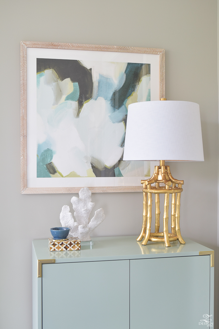
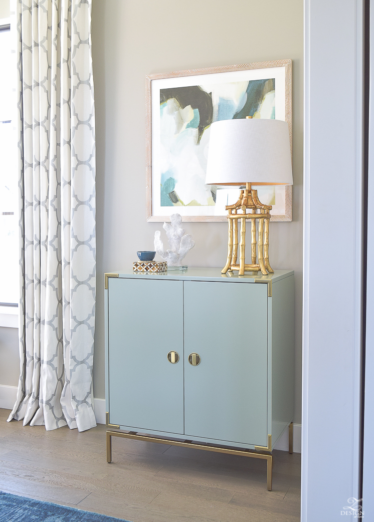
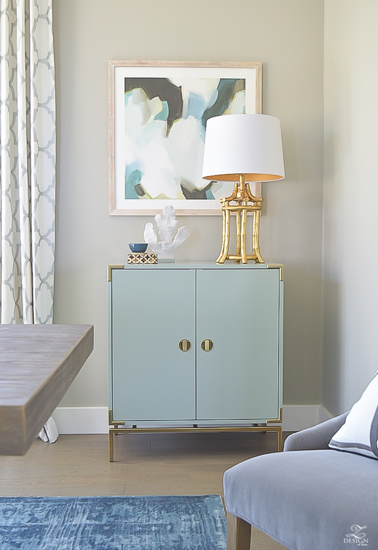
I always start each of my designs with an inspiration piece and build upon that piece to create the rest of the space. In this case I started with this lovely piece of art from Minted.com by artist Melanie Severin. I believe that art is a very personal item and that the art you hang in your home should speak to you, and this piece in particular spoke to me for not only it’s stunning composition, but it comes in 3 color ways as well which made it easy to find a color scheme that fit with my overall scheme for the room. I had it framed in their whitewashed herringbone frame which I truly love and which was the perfect compliment to this piece and to the rest of my dining room design. One of the things I love about Minted is that they make it so easy to view on line the art you are looking at, with the style frame you want, and in the size you need so that you can envision it in your home. The process was so easy and I couldn’t be happier with this piece and the personality it brings to this room!
Get the Look | clickable Images
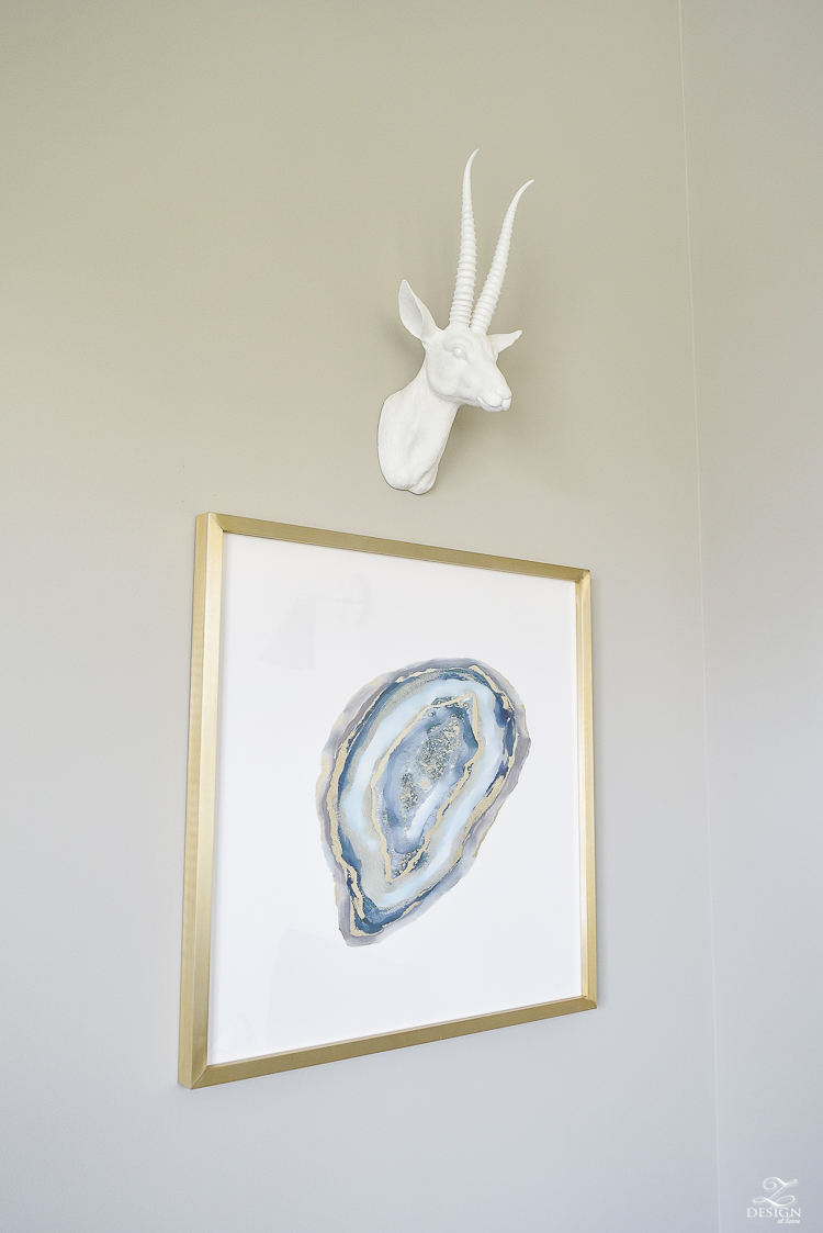
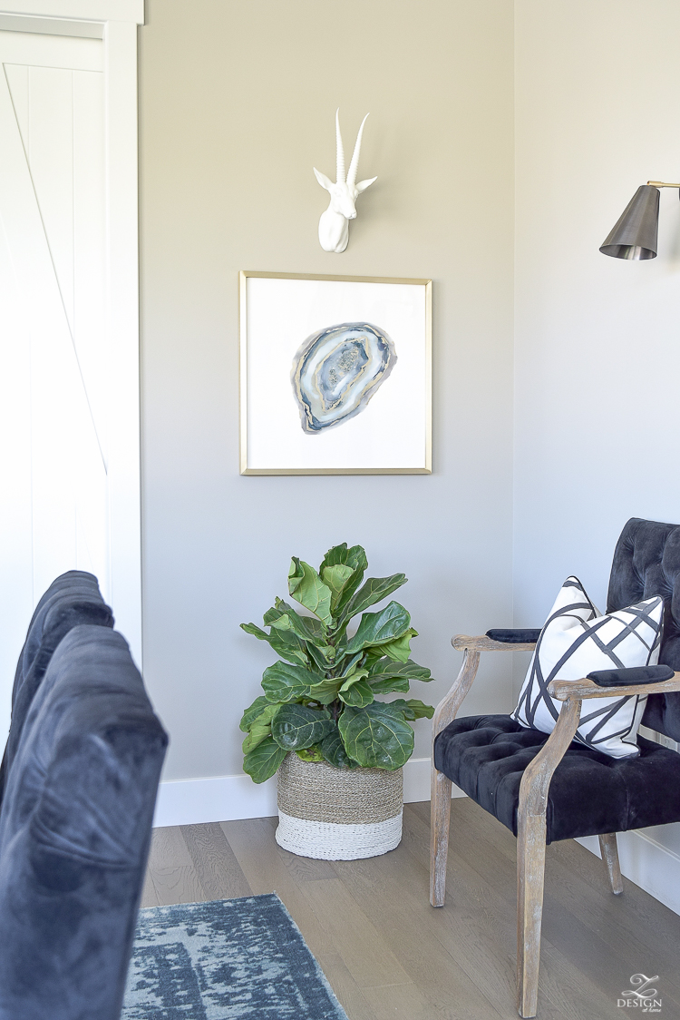
Equally as important to this space was another piece of art from Minted.com that I just adore by artist Amy Lighthall. I have completely fallen in love with agate art and accessories lately (you can see here where else I have used agate in my home) so this piece really spoke to me. Plus, it compliments nicely the previous piece I spoke about. On this one I chose to use their chic metal frame in matte brass and it’s just stunning in this corner as it adds that pop of color and interest I was looking for to this area of the room!
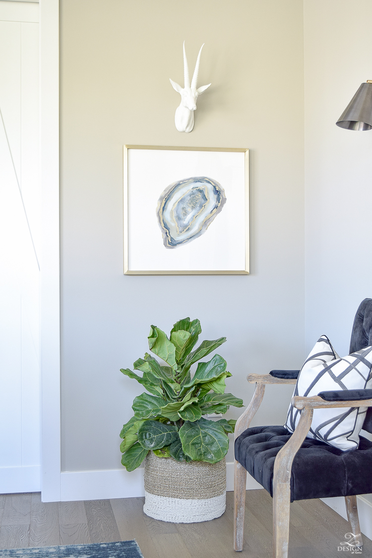
Additionally in this corner of the room I added a fiddle leaf fig (please keep your fingers crossed for me that I don’t kill it right away) and placed it in this fun tow-toned basket I’ve had for a while that gets rotated around my home as needed. The fig helped to add a little texture over here and a little bit of greenery never hurts so it gives this side of the room even more life. P.S. I’ll talk about those gorgy black chairs you see there to the right more in my room reveal part two coming up next week so please stay tuned!!
Get the Look | clickable Images
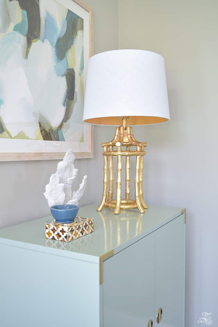
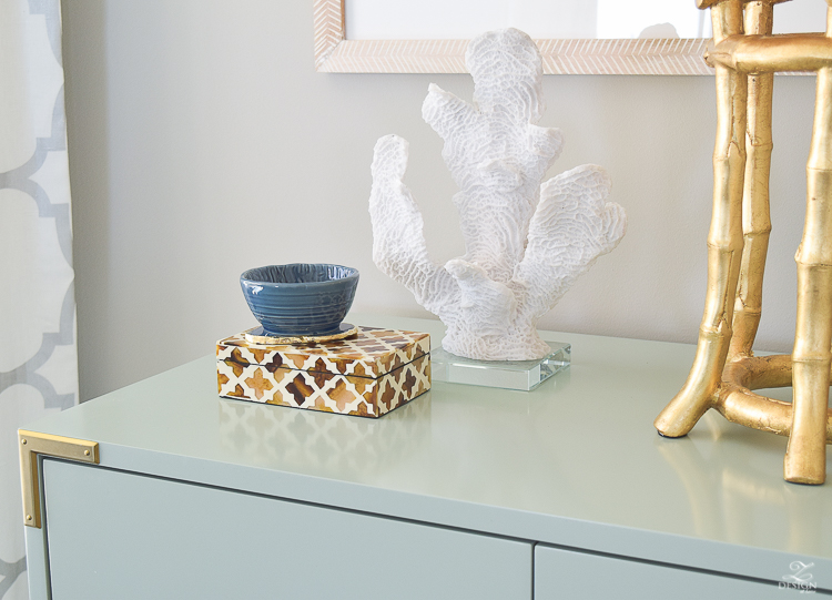
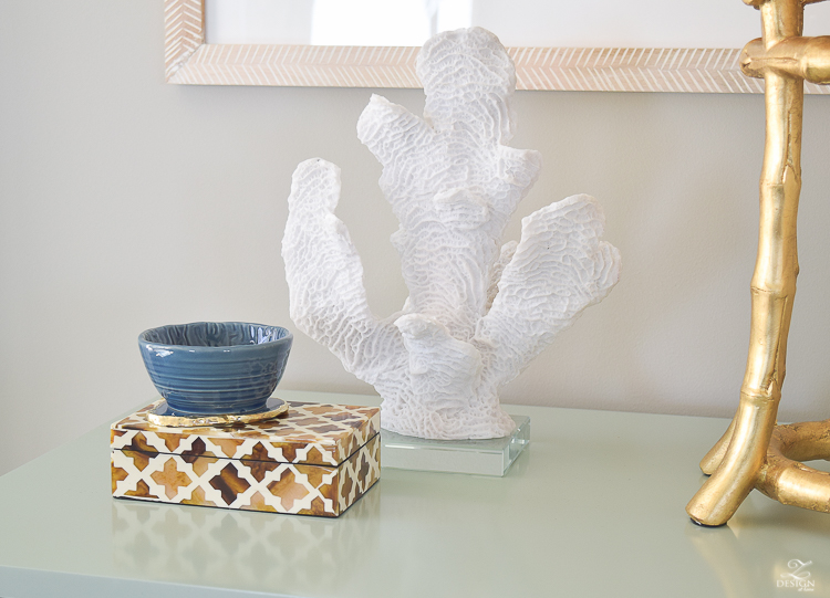
Back to the bar cabinet side of the room where I’d like to share a little bit about the accessories I chose for this area and why. I first saw this lamp in the beach cottage of my friend Shauna of The House of Silver Lining (you can see more about that trip here). It was love at first site and I knew it was the perfect lamp that I had been searching for for this dining room redo. I had had this patterned box for some time and the bowl and agate piece the bowl sits on were both items we brought home as keep sakes from a recent family vacation. The coral is also one of the signature items I decorate with (because I grew up on the beach and it lovingly reminds me of home) and was a local HomeGoods find. However, I decided to keep my accessories simple so that most of your attention is directed to the art and to the lovely bar cabinet beneath (more on shelf & console styling here).
Tip Time: “My advice for styling a console table or shelf is to not clutter things and to choose only a few key pieces that resonate with you and that work for the space so that your eye and attention float to the main pieces in a vignette such as your furniture and/or art. This will give flow to the vignette and allow your accessories and/or lighting to be the jewelry to that setting”
Get the Look | Scrolling Clickable Images
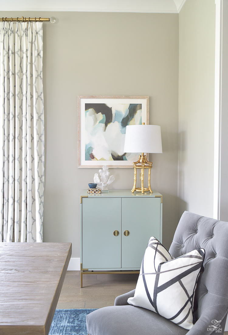
And the bar cart, oh the bar cart!! Well, lets just say this isn’t the first piece of furniture I chose to store my dishes in for this space. I’ll dish more (no pun intended) on this next week but there was something before this piece that let’s just say went back to the retailer since I had seen this one first and had my heart set on it! From the very first time I saw it I knew it was the one. I initially chose not to go with it because of it’s size as it was much smaller than my previous buffet and of course and I knew it wouldn’t store all of my dishes. However, after some contemplation and reorganization of this room and my dishes, I decided I could move some of the items I stored in my buffet previously to the kitchen, which is exactly what I did. Much to my surprise this one held most everything that my previous buffet did and very little had to be moved to the kitchen. This one has shelves for plates, a place for stemware and silverware, extra storage in the doors, and even a beautiful glass shelf inside and it has turned out to be the perfect piece for this spot. I love it’s minty/aqua color and I adore the brass legs and accents and love how the slickness of it is the perfect juxtaposition to my rustic table, which gives this room great balance. I feel it’s a statement piece that won’t go out of style and that I won’t tire of since it is such a unique piece.
Tip Time: “When designing a space, choose key furniture pieces that are unique and that can be used in multiple places in your home so that you can get the most of out them when you get bored with a space. If you have followed these guidelines you can always move said piece to another area of your home to give new life to that space and hopefully continue to enjoy that piece for many more years to come”
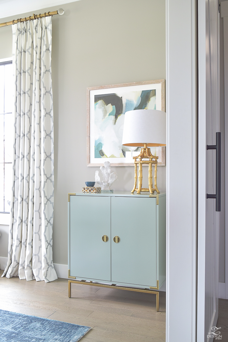
You may also notice that I chose to use the same drapery fabric I used in my living room since these two rooms are almost completely open to one another. I did this to help create flow and continuity from one space to the other (I talk more about creating flow between spaces here in my transitional master bath tour). I also went with brass curtain rods with a crystal ball finial to pick up on the brass in the rest of the space, plus the brass is a great compliment and contrast to the white/gray drapery fabric and the medium gray walls.
Tip Time: “Incorporating contrast through the use of fabrics and furnishings always adds interest and excitement to any space and/or design”
Shop this Post to Get the Look | clickable Images
Art
Furniture
Accessories, lighting & drapery
Well, this brings me to the end of part one of my dining room reveal! I hope you’ve enjoyed it so far and that you’ll come back next week for part 2 when I reveal the rest of the space but first, let me leave you with a little sneak peak of the crown jewel of this room that I can’t wait to tell you all about when I see you again soon!!
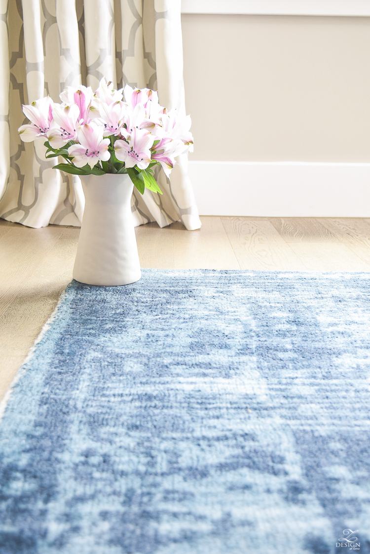
See it before I reveal it | Clickable Image
Thanks as always for stopping by ZDesign At Home this week and please don’t forget to leave any comments or questions you might have below. Please also don’t forget to sign up for my weekly news letter to alert you of new posts. I hope to see you back next week for part 2 of this reveal!!
Xoxo, Bree
UPDATE: Click here for dining room reveal part 2
*This post was done in partnership with Minted.com, however all opinions are my own
*Affiliate links have been used throughout this post for your shopping convenience and where an item is no longer available a substitute has been provided


Simply stunning!! I love it ALL. You’ve outdone yourself!
Thank you so much, Magen!!
Bree!! More more!! I can’t wait! It is Fantasia and your art choices are just perfect!
Thank you so much Kelley!! It’s been a fun room to decorate and probably my fav to date. Thank you as always for stopping by…love ya!!! Xoxo
Oh my goodness Bree! I’m in LOVE!! ❤️ What a stunning space! I love how your decorating style is so clean and simple with wow statement pieces. You’ve done an amazing job with this room! Can’t wait to see the rest! p.s. I was debating some art from Minted for my bedroom with that exact herringbone frame but wasn’t sure. I think you’ve sold me. ?
Thank you so much, Erin!! Now if I could just get you over here to share a meal with me and my family!! The art is fabulous and I couldn’t be happier with it:)) Xoxo
It looks gorgeous Bree! I’m dying over your rug! xoxo
Jen, Thank you so much! The rug is definitely the crown jewel of this space and I can’t wait to share more next week 🙂
Bree, I’m dying at the peek? That rug is so gorgeous! Now if only I could come on over for a glass of wine in this fabulous room with you!❤️❤️
Xo
Shauna!! I would love nothing more than to have you over to share a meal at my table! Thank you for stopping in and for for taking the time to comment. Love you girly!!! Xoxo
Bree! This is amazing and I’m dying for more of this incredible reveal! Your choices are always perfectly spot on. I LOVE that rug!! so gorgeous!!
Hi Tamara! Thank you so much for stopping by to check it out and I’m so glad you like everything…that truly means so much to me!! Hugs Xoxo
It was worth the wait – sooooo good Bree! I love your art choices – I have a piece by one of the same artists in my bedroom. They really bring the space to life!!
I noticed your art too, Kris!! I can’t get over how much it does bring life to the space!! Thanks so much for stopping by and I hope you’ll come back next week. Xoxo
Bree this is absolutely gorgeous!!! I love the art and all the thought/details you put into this inspiring space!
Thank you so much for stopping in, Annie! Xoxo
Gorgeous room!! I was so excited when I read you chose SW Mindful Gray, as I used that shame for MY recent dining room makeover! I also used pops of teal & Aqua, which I love with the gray. Can’t wait to see the rest!
Thank you so much and thanks for stopping in, Lacy:)
Bree I love your room! You did an amazing job! You pay such amazing attention to detail. I can’t wait to see more! Xo
Randi, thank you so much for stopping by and for the sweet comment!! Xoxo