Casual, Chic Dining Room Reveal
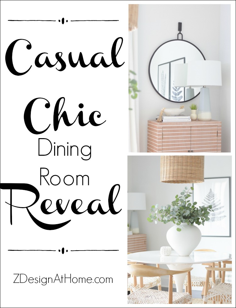
It’s been a long time in the works but it’s finally done and I couldn’t be more excited to share my Casual, Chic Dining Room Reveal with you today! I’m so glad you stopped by. At the end of this post I’ll be sharing how I achieved this look for just under $2000 so make sure to hang in there until the end, where all sources are located as well!
![]()
Affiliate links used, read my full disclosure policy here.
When we moved into our rental over a year and a half ago now it was to be temporary but since then a lot has changed (you can catch up on our home building journey HERE). As it looks now we’ll be here for about another year or more until our new home is finished some time next year. So, in light of that I decided to go ahead and make some updates to this space to keep our rental cozy and feeling fresh.
Here is a look at the BEFORE…
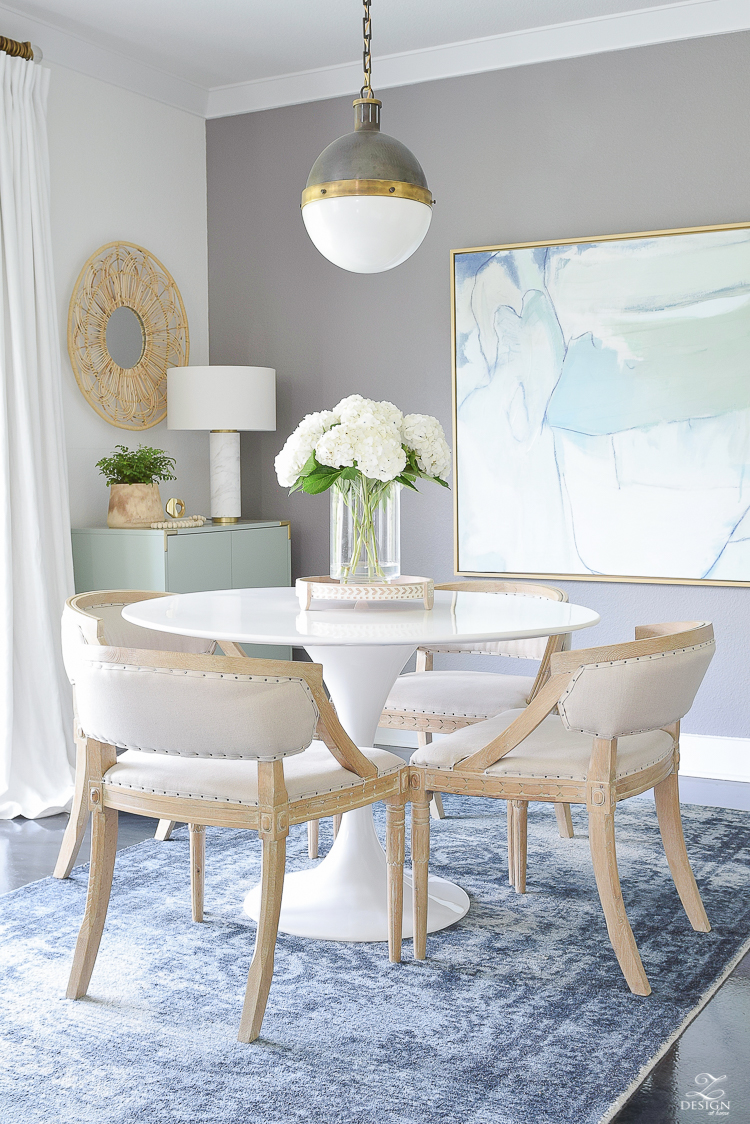
I made sure when picking things for this space that all of the decisions I made are ones that I will be able to incorporate into our new home so no worries there…all of the new items will be put to good use in our new spaces!
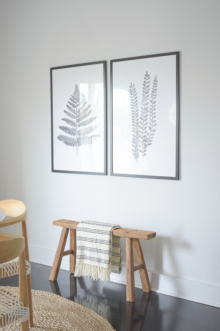
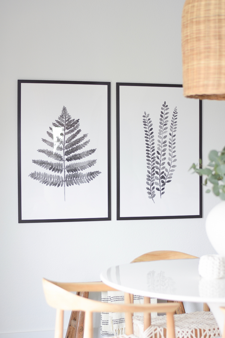
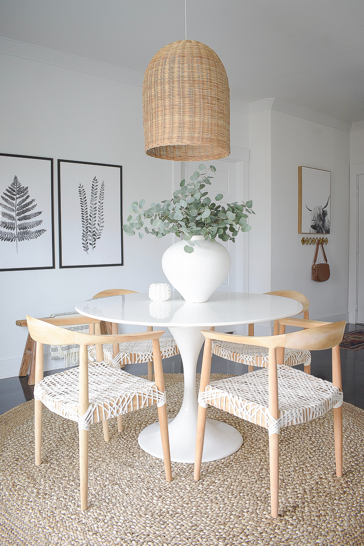
The first thing I started with were these fern art pieces. They are 24″ x 36″ and I love the look and feel of them in this space. The Chinese Wooden Bench is something I’ve had for years but moved it here to fill in the space under the art. Oh and can we talk about the white wall?! I’m not sure if you remember it before but it was a gray accent wall (seen above) which was nice but it made this space feel dark and small. The fern prints came just as a print so I ordered these very affordable frames to put them in. They come in several sized but mine are the 24″ x 36″ for reference.
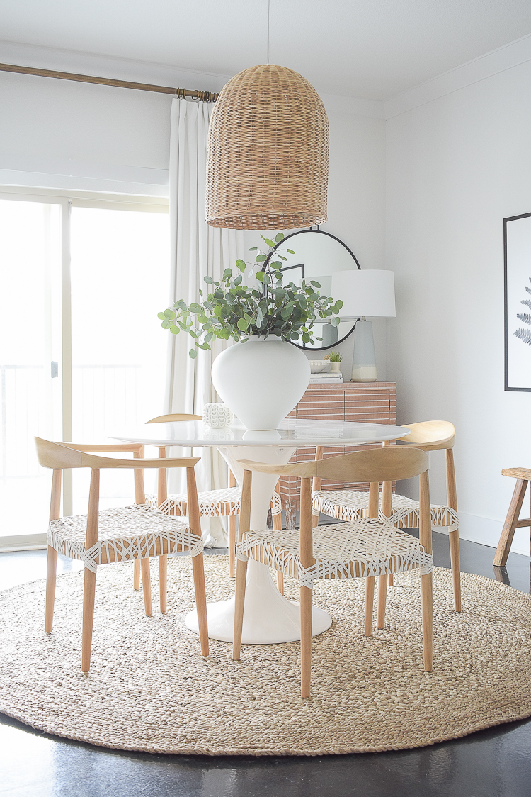
The next big decision was this cabinet that I adore. It’s a bit smaller than what I had here before which is good when you I’ve in a small space and I love the fresh, boho chic modern feel of it. It has plenty of storage and was super affordable too.
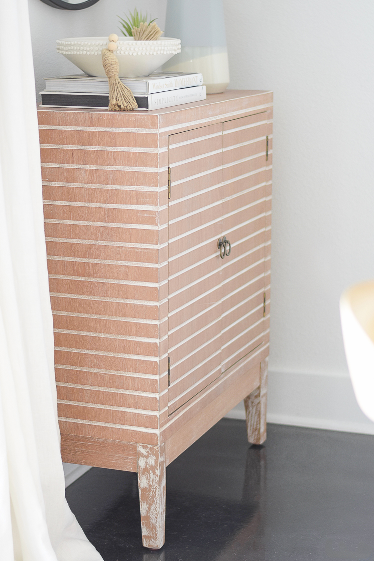
I love the lines of it, the brass hardware and the actual lines that run across it that give it warmth and character.
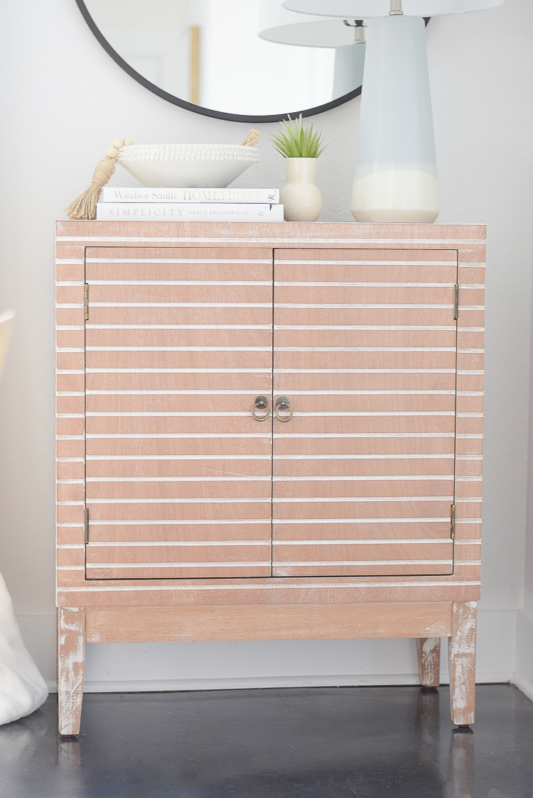
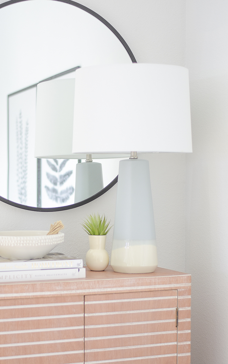
I really love how this whole corner turned out. I already had the round black mirror, which was a purchase from last year. The mirror also comes in gold.
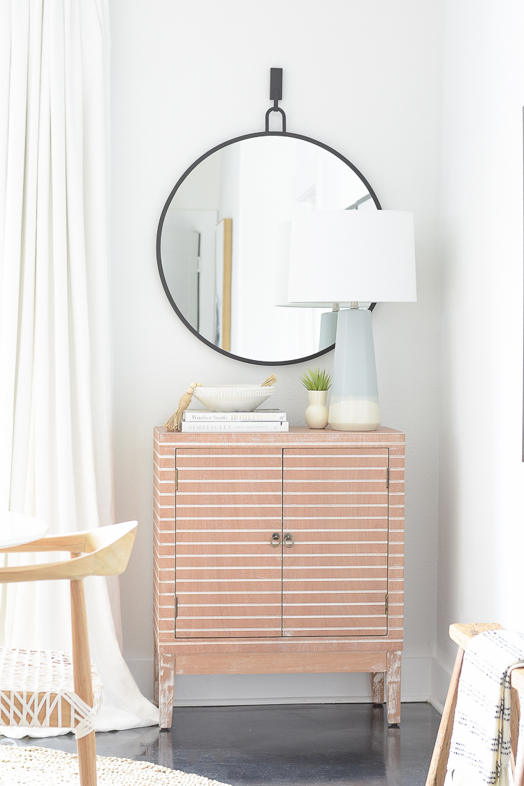
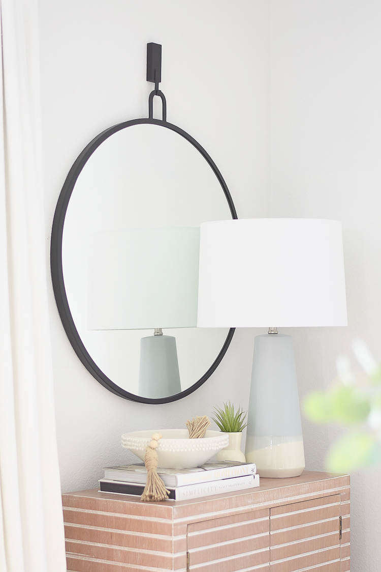
Also added this blue lamp and love the little pop of color it provides in the space.

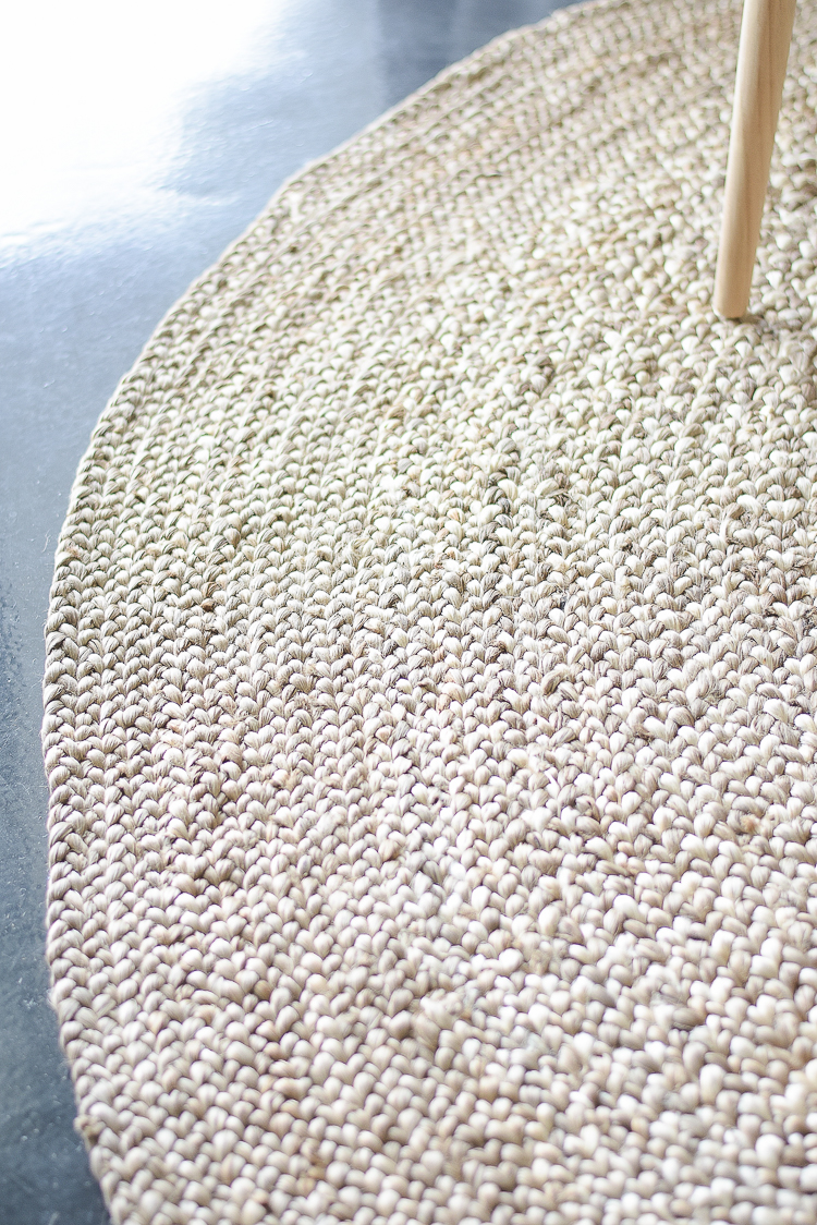
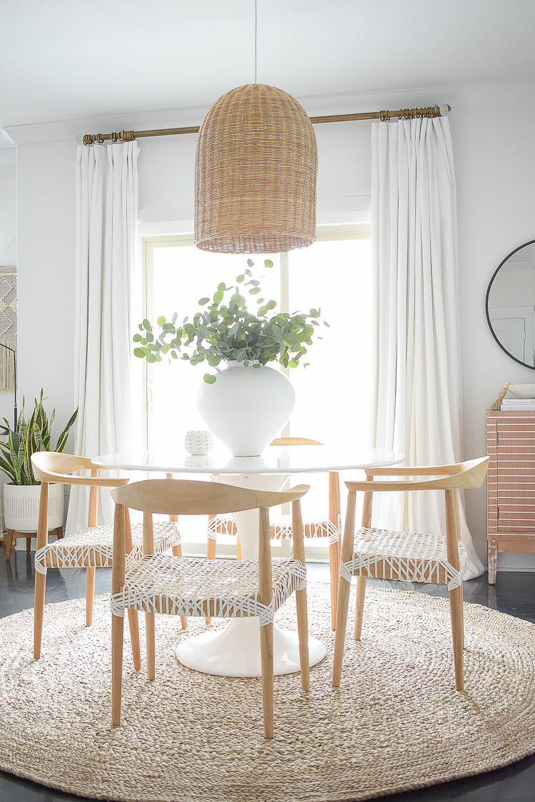
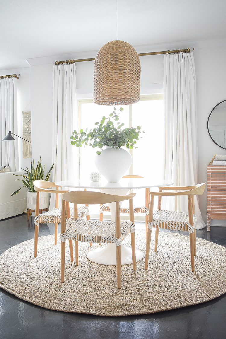
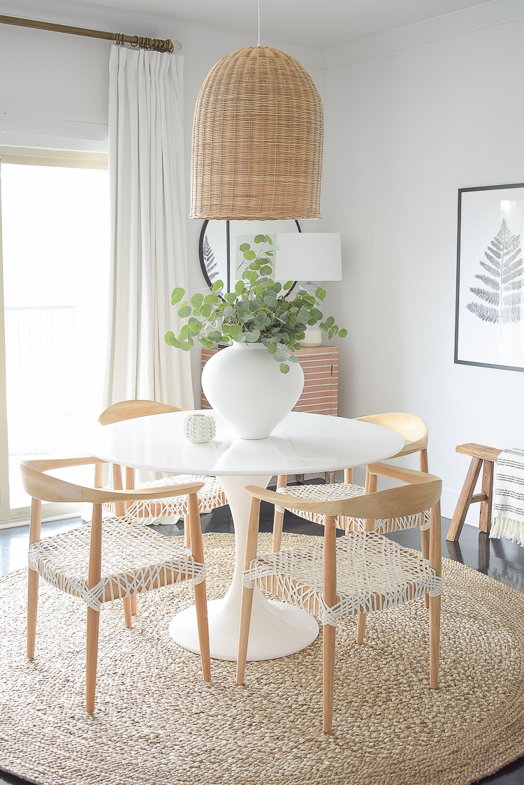
The next big thing was the rug. I struggled over this decision as with most rug decisions around here but I think I found the perfect one. I’ve not been a fan of round rugs in the past but completely fell in love with this one. It’s very affordable too and is great quality. It really brightened this space up and makes our new dining room feel so new and fresh now! I chose the 8′ round due to the size of our table (it’s 48″ dia) and the color is sand.
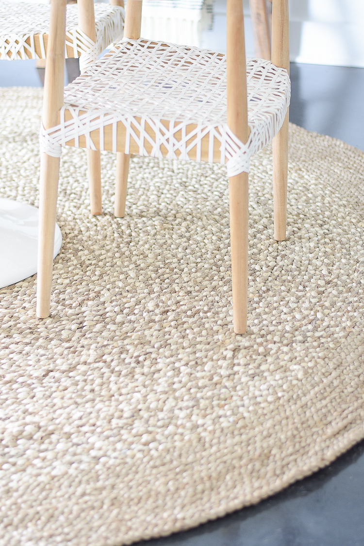
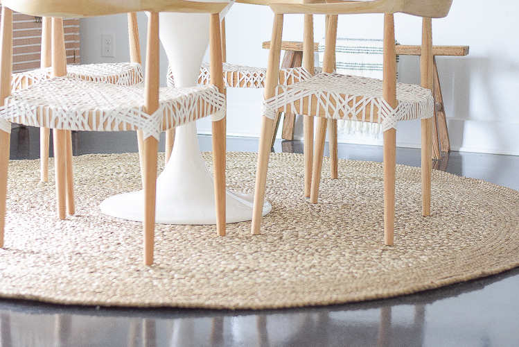
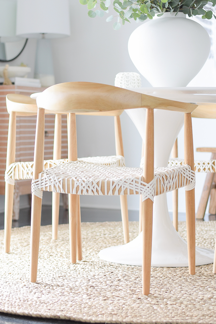
Well, I guess I gave a way the chairs in the last photo so here they are. This was the biggest decision in this redo (and subsequently most expensive since I used my same table) and I completely love these chairs! I was looking for something more contemporary than I had before but with similar lines and this one was perfect. They are surprisingly very comfortable and we are enjoying them very much! Honestly can’t get over how great they look in the space and for a good quality, modern chair they were pretty affordable, I think.
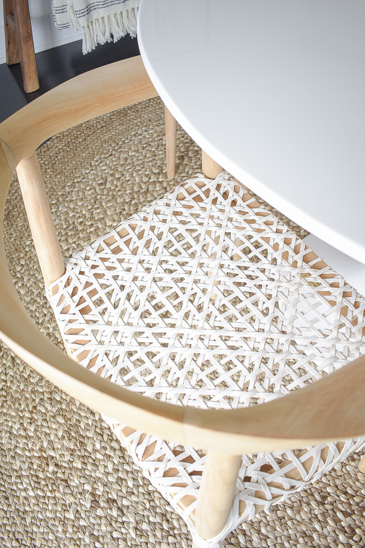
The seat is leather and very tight. I also love that now I don’t have to worry about spills since they wipe up easily.
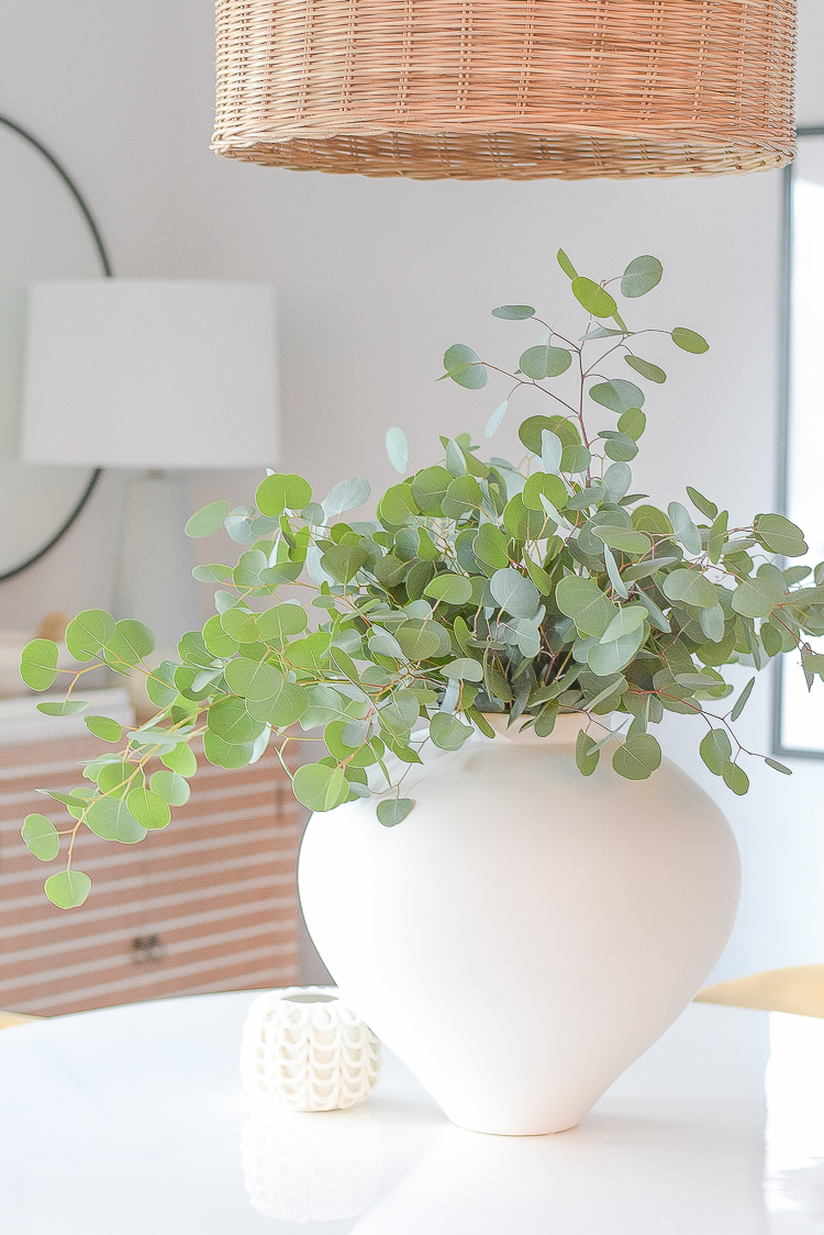
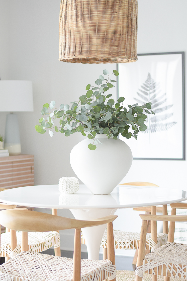
I also added this lovely vase. It was a bit of a splurge for a vase but I wanted something bold that would hold lots of greenery or other flowers during the different seasons.
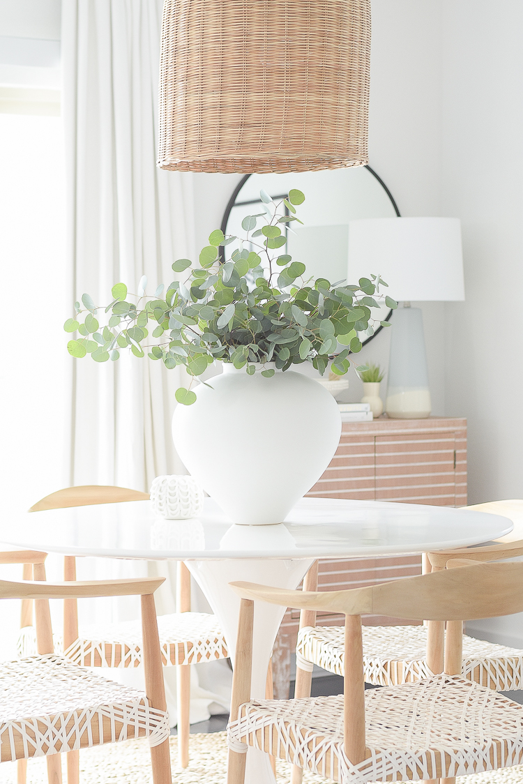
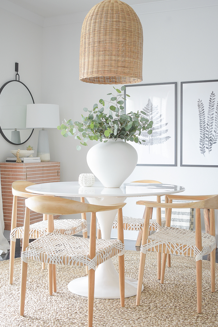
Here is the whole space in its entirety…I hope you love it as much as I do!
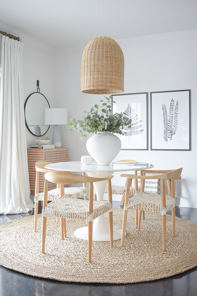
I also added this basket pendant late last year in preparation for this redo. It’s perfect here and will transition well into our new home!
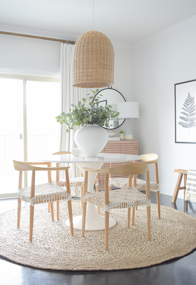

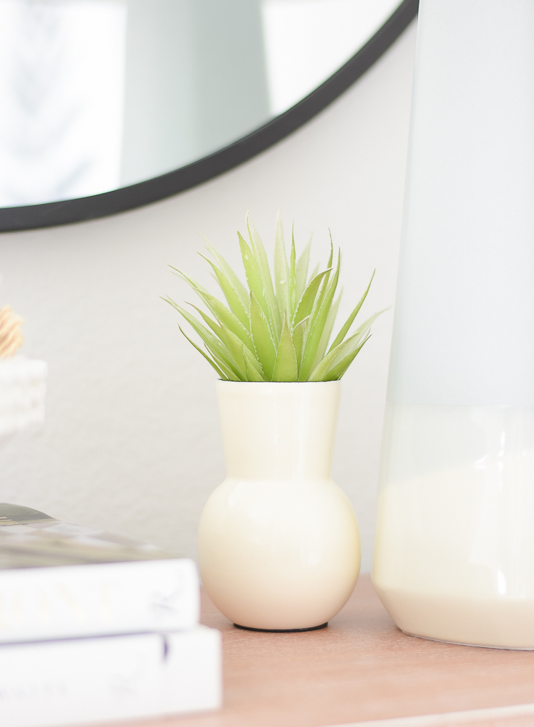
Some other little things I added that you may have already seen are faux succulents (similar) and some pretty white accessories.
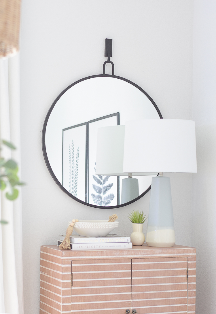
This decorative bowl calls my name every time I lay eyes on it…just love it!!
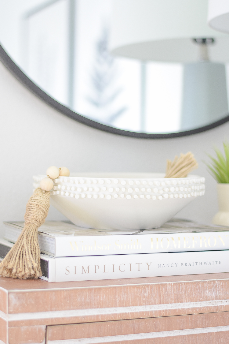
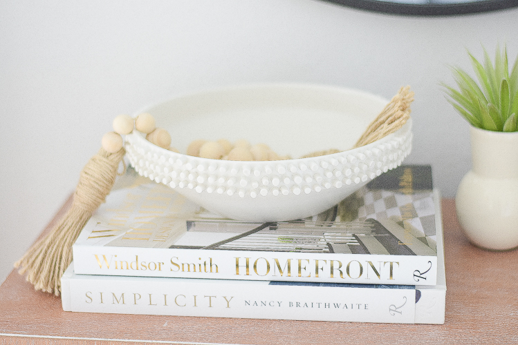
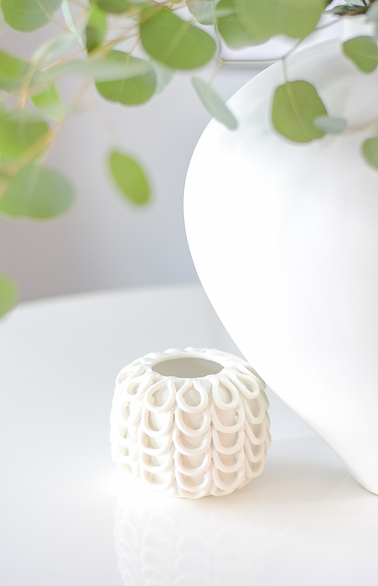
I always like to say that your accessories are the jewelry to your home that help to finish off your spaces and these pieces worked out perfect here, at least for now (or until they get moved around the house some more:)! Love this little bud vase too!
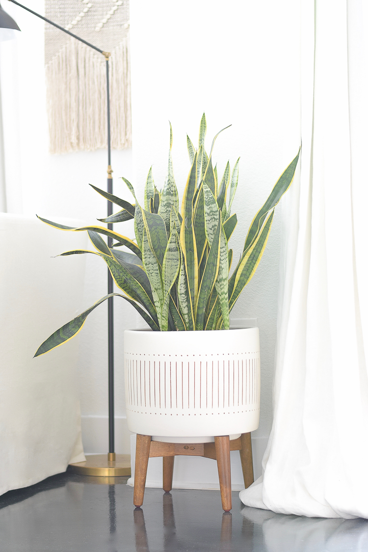
This is a favorite planter that I used for our left for dead snake plant that is placed just off the dinging room. Hopefully now it will have a chance to survive!
Love this view now as you walk in the front door…it feels complete now.
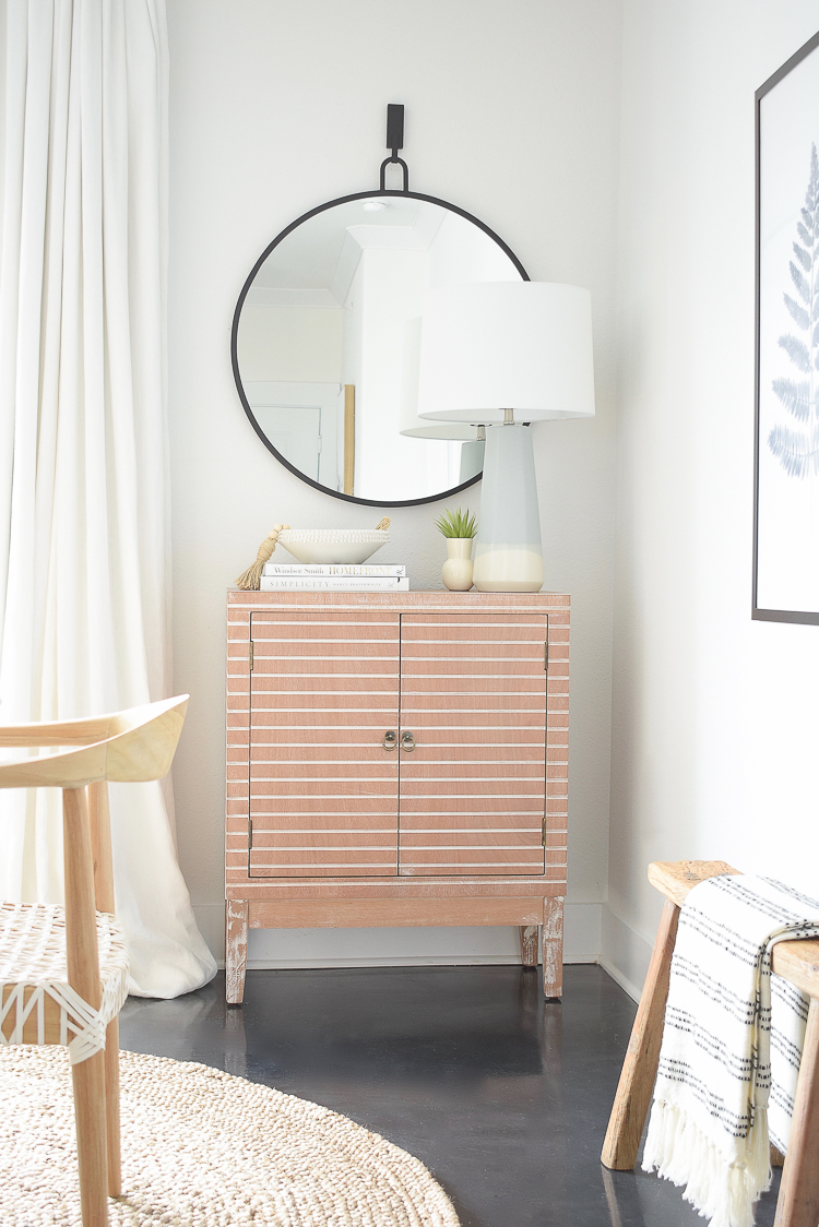
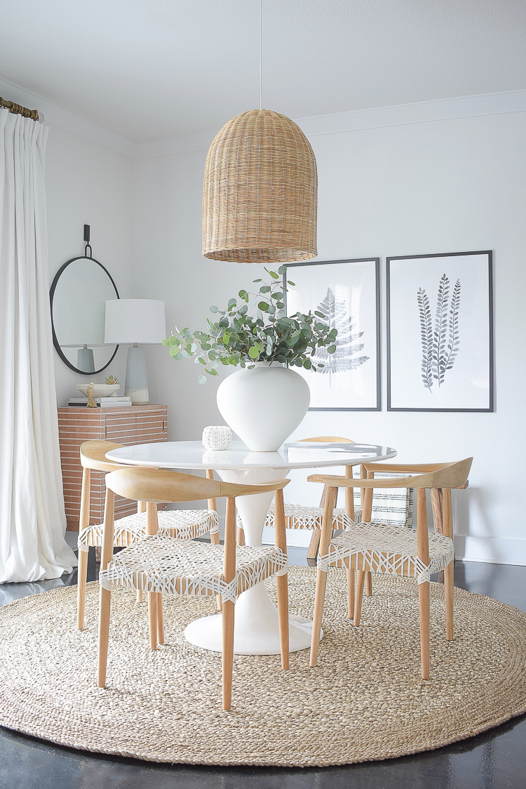
Here is the view from the other side.

The Details
Now for all of the details and how I came in just under $2k for this project. I’ve only included items I didn’t already have or that I didn’t purchase necessarily for this redo (like the small white accessories, books, bead strand, etc.)
Dining Chairs – $221.77 x 4 = $887.08
Round Jute Rug – $254 (sale price)
Fern Art – $135.00
Frame for Art – $29.51 x 2 = $59.02
Cabinet – $215.00
Lamp – $37.99
Lamp Shade – $19.99
Large White Vase – $89.99
Basket Pendant – $223.50 (sale price)
Sources for items I already had:
So the grand total for my redo (minus the items I had previously) came in at $1,921.57. Some of the items were on sale so you have to take that into account plus of course this doesn’t include tax or shipping on some of the items but I think for around 2k it’s a pretty nice makeover and I’m very happy with the way it turned out.
Here is one of my new favorite shots for the space that I’ll leave you with.
Thanks for stopping in to visit my Casual, Chic Dining Room Reveal and please leave me your comments below to let me know your thoughts. Please also sign up below to receive weekly updates from the blog…
Let’s stay connected…
Pinterest | Facebook | Instagram | Twitter


Beautiful update Bree! You know I love those chairs! The lamp is super cute too!
Jen, thank you so much for stopping by! The chairs are everything and make the space I think!! Always appreciate your feedback! xoxo
It’s a much more casual look. I really liked your previously styled dining room . I liked the soft colours in the picture, cabinet and carpet. I liked the juxtaposition between your tulip table and the more traditional chairs. That’s not to say this isn’t a pretty room, just the other was more to my taste.
Hi Joanne, thanks for stopping by and for your feedback! It is a much more casual look but it also goes better with the space we currently live in. The floors are crazy dark here in our rental and now the space (at least in person) just feels so much lighter and airier, which we love. Thanks again!;)
I LOVE how light and airy your home is and the fact that your decor is mixed with items from different price points. Your rooms are eye candy that I just keep coming back to feast on!
De Ann, how sweet of you! Thank you and I am so happy you feel inspired here and thank you for continuing to come back!! xo