Finally Home Project: Inspiration Photos & Breaking Ground?!
Hi friends! I bet you thought I would never pop back in with an update on the construction of our Finally Home Project?! I know it’s been a while and if you are new here and wondering what I’m talking about and would like to follow along with our home building journey as I offer design advice and tips about the process, you can start by getting caught up HERE.
Things have been moving slowly as we have been working on our house plans since March but we are about to ramp things up pretty soon so I wanted to share some of the progress with you today! I was just moving walls and doors around, adding fireplaces, and making tweaks as recently as last week. If you have ever built a home from the ground up (including designing the plans) you know that there are literally thousands of decisions that have to be made and while this will be my 5th time to do this, all of the decisions that have to be made each time around can still seem overwhelming!
On a side note about our plans, I walked though a custom home in our neighborhood that was under construction and there were some aspects of that plan that I really liked so I immediately came home, broke out the sketch pad, and sketched out those points that I liked which were that the master, living area, and a second bedroom were all at the back of the house but that was it. Everything singe other thing about the floor plan I came up with and drew out myself, gave it to my builder/architect team and over a series of months and so many revisions that I can’t even count at this point, we have come up with a plan that works and flows for our family. Originally I wanted a 1 story house but as the plan evolved I could see the benefits of a two story for the views (since we are on a lake) so up we went! From one of the rooms upstairs that will be used for a workout room to the game room that will have a large window seat and window overlooking the backyard and lake, there is definitely a bonus to having a two story home on our lot so in the end the best choice was to go up and we are super excited about it!
Earlier this month our plans were submitted to the HOA and a brand new requirement that my builder’s team was unaware of was missing from the package so now we have to wait until early next month before the package can be submitted again. Just FYI, and this was not the issue but, before a package like that can be submitted to the HOA, you have to have your exterior colors and roofing material and color picked out for approval with the HOA. We have picked some tentative colors for the package submittal but to be honest they might change, which will cause us to have to request a change with the HOA at a later date but it will be worth it in the end and shouldn’t be a problem. Currently we are looking at (both SW) Pure White for the main exterior color and Iron Ore for the eves, other trim, garage doors and outdoor fireplace.
In the mean time and as we wait for next month to roll around we are doing what I call roof riding, lol! Again, we tentatively picked out exterior colors to include a roof color but we really need to nail down the roof and color so we are riding around in our spare time to addresses we’ve been given by the roofing company to see how the different roofing materials and colors look in real life, rather than just on a simple swatch. I highly recommend doing this if you are building because it’s no different than choosing a paint color from a swatch without seeing the bigger picture. I always recommend doing sample boards for paint (you can read more about my process for that here) so roof riding is definitely helping us to see the bigger picture. I really want a metal roof although this may be the one big place I’ll have to compromise on this project but we’ll see as this journey unfolds…stay tuned on that!

Additionally, the same process should be used for any exterior material colors whether you are using brick, stucco, stone or any other material. Don’t just look at a swatch in a showroom…hit the streets to see it in real life before you commit to it so that you don’t regret your decision later! The place that you or your builder are buying your materials from should be able to give you a few address that you can ride by to check things out:).
With all of that said, we hope and pray (and assume at this point) that when our package is submitted next month that it will be approved, all permitting will be obtained after approval, and breaking ground will fully ensue! Once that happens I will do my best to give you a weekly update on the process and answer any questions you might have. I’m certain I will also be asking you questions as I’m always learning through the process each time and this is one of the largest projects I’ve tackled so I’m certain I’ll need help from some of you along the way as well!
Now that I have you up to speed on where we are in the process, I thought it would be fun to share a few inspiration photos that I’ve used throughout the design process giving you a few tidbits along the way about what was/is in my head about said photos and how I’m incorporating this inspiration into our home. Here ya go…
Exterior Inspiration
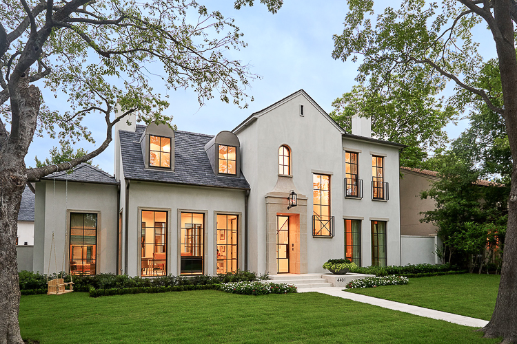
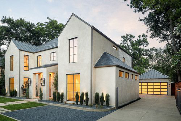
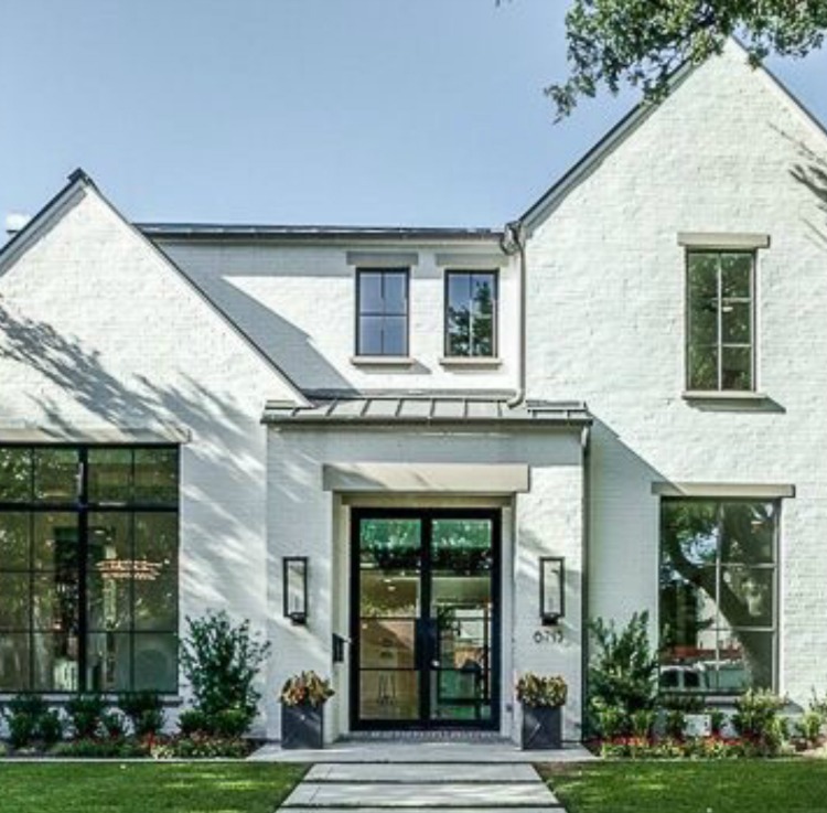
I love the exterior look of each one of these homes so I shared these photos with my builder and we used aspects and ideas from each home to come up with the exterior look for our home. The main feature here that you will notice are the steel windows and doors that I’m super excited about. We will be doing a look a like steel window except for on the back of the house off the living room (because the real thing is so expensive) but we will definitely be doing all real exterior steel doors, which I’m super excited about. I recently met with a steel door company here in Houston that I’ll be partnering with for this project and I look forward to sharing them and their amazing work with you soon. The exterior color and material will be white stucco with a gray undertone (similar to what you see below) and any trim you see will be Iron Ore by Sherwin Williams…over the summer I saw this color on the wall in a CB2 store in Austin, TX and fell in love with it. The employees were nice enough to share the color with me so for now this is the color I plan on using but everything is subject to change at any time with me, lol!
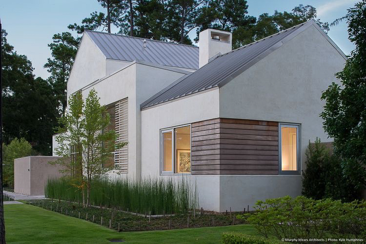 Via Murphy Mears Architects | Photo: Kyle Humphries
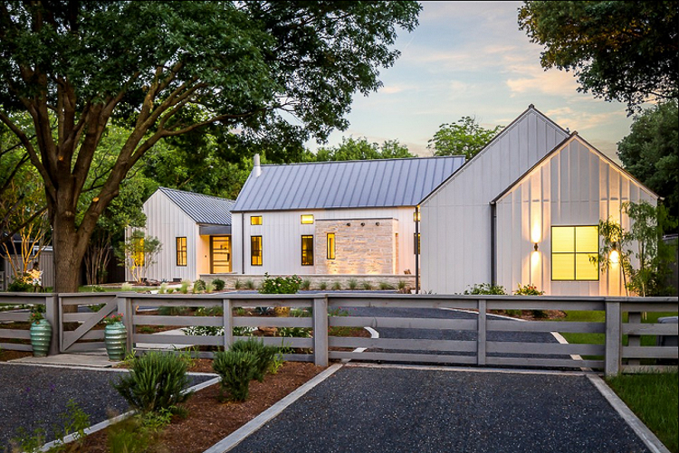 Via Olsen Studios Architects & Building Designers | Photo: Sean Gallagher
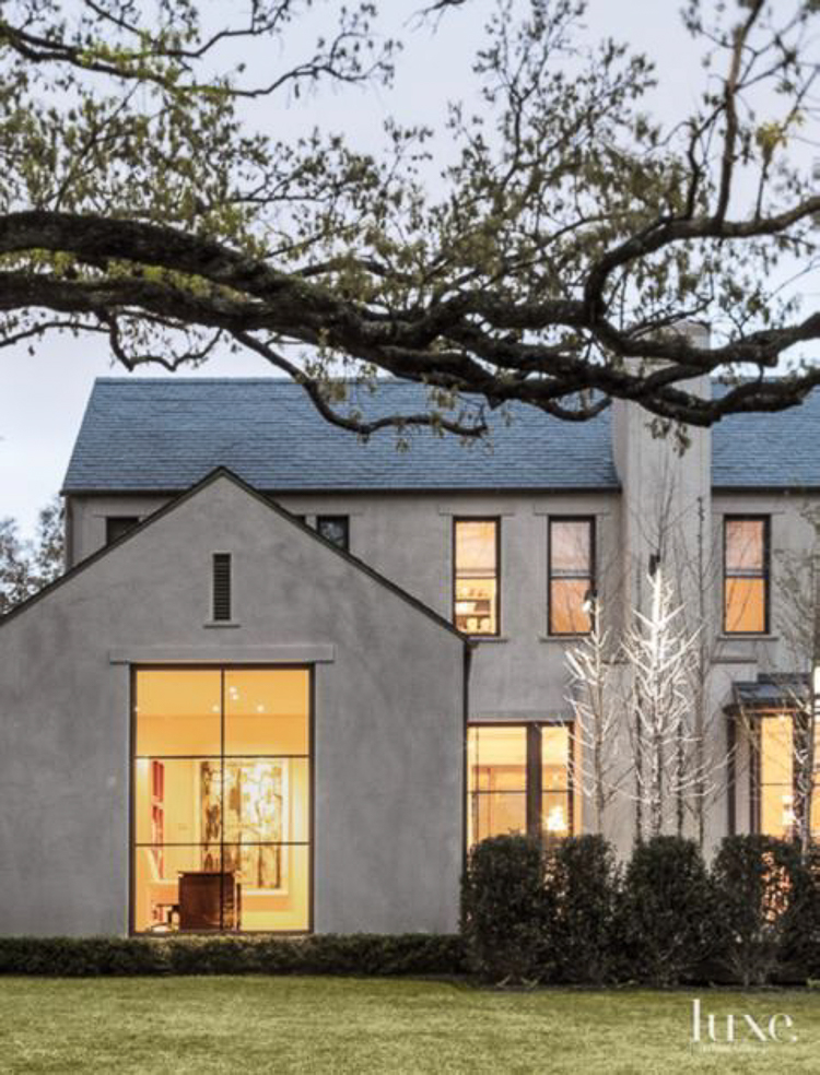 Architect David Stocker via Luxesource.com
Entry & Living Room Inspiration
Hard to see in this first photo but I love the way these floors are laid in a circular pattern and I’m thinking of doing something like this in the entryway/hall. I also love the dark shiplap at the end of this hall that I’ll be doing a lot of in the house along with the picture light that I’ve worked tirelessly on with my builder to incorporate into our electrical plan at various spots throughout the home. I’ve used these over pictures in previous homes but I’ll be using them this time in the living room and in my study above the book shelves, along with a few other places throughout the house.

If you want to incorporate something like this into your new build make sure to tell your builder and/or architect well in advance so that he/she can plan accordingly to incorporate this into your electrical blue prints.
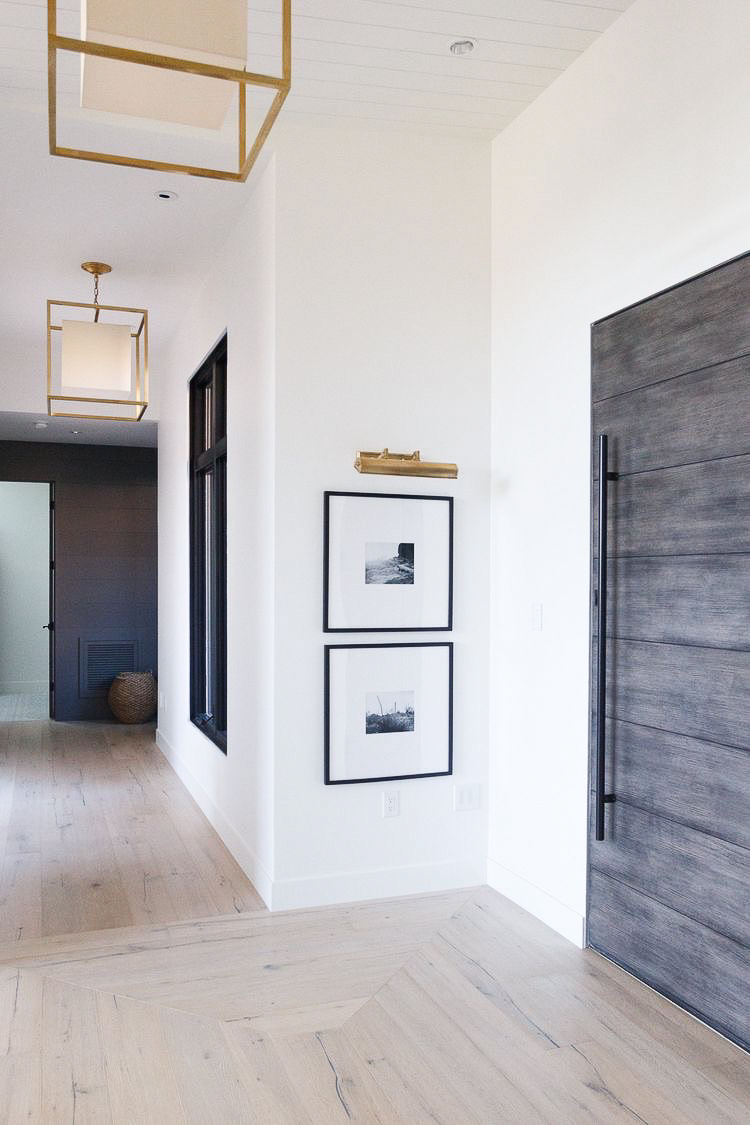 Via Salt Box Collective | Photo – Alicia Wade
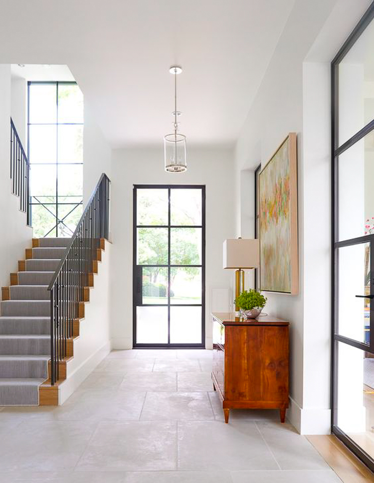
From the inside, this is what the front door area will resemble minus the staircase being so close to the door but we will have the tall window in the staircase landing, plus the ceiling will be much higher here. Super excited about this design decision!!
You may have seen this photo on my Instagram that I shared recently but this is similar to what the back of the home will look like when you leave the foyer entering the living room. The only exception is that we will be doing a vaulted ceiling in the living room but the steel windows and door won’t have a vault like the one pictured. The whole window/door combo will be 10′ wide x 12′ high with no vault and with a large steel door in the center.
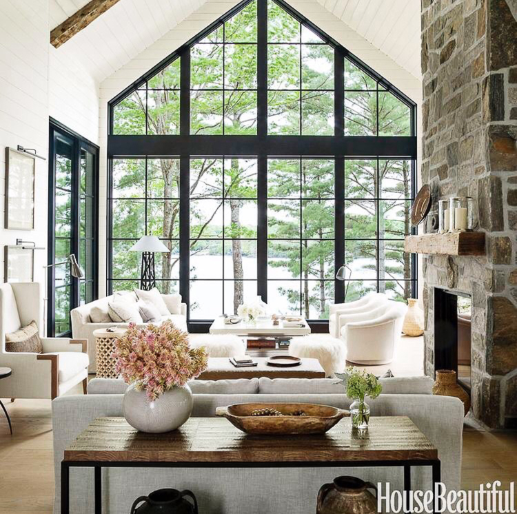 Via House Beautiful | Designer: Anne Hepfer | Photo: Don Freeman
So it will look more like this…
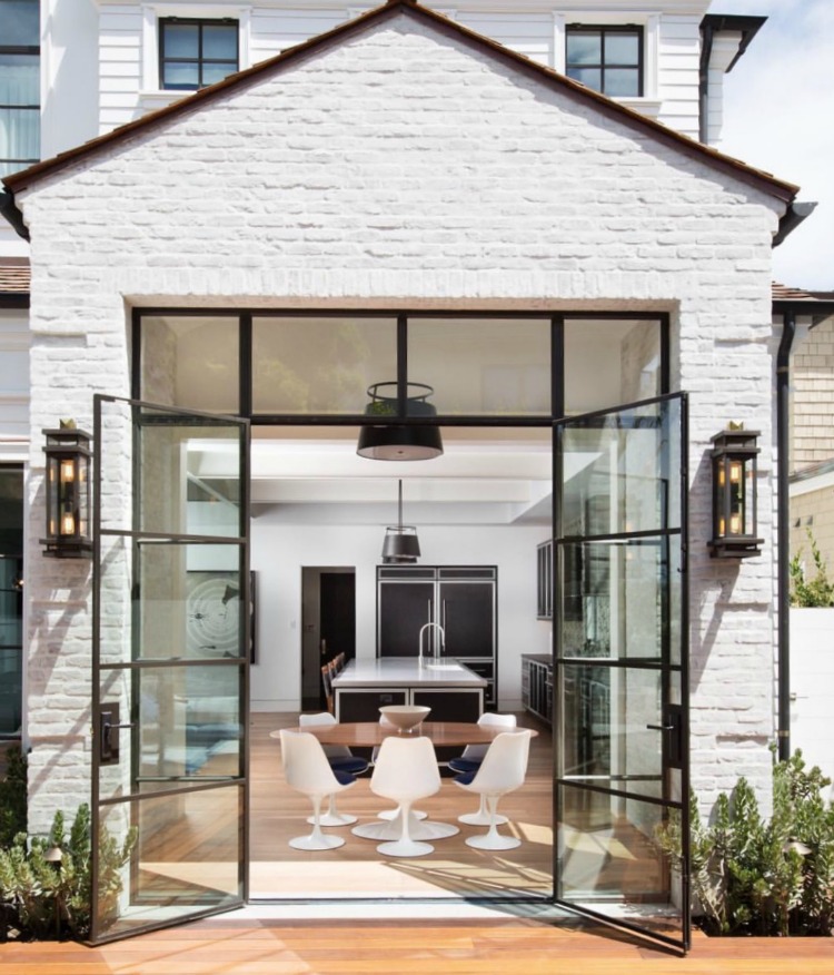 Via @brandonarchitects on Instagram | Builder: Patterson Custom Homes | Photo credit: @tostistudios
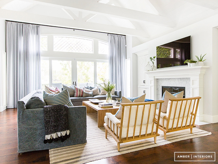
I can imagine it looking something like this once it’s completed and furnished (but without all of the beams and a completely different look on the fireplace wall). We will just be doing one beam down the center of the vault for a cleaner, more contemporary look.
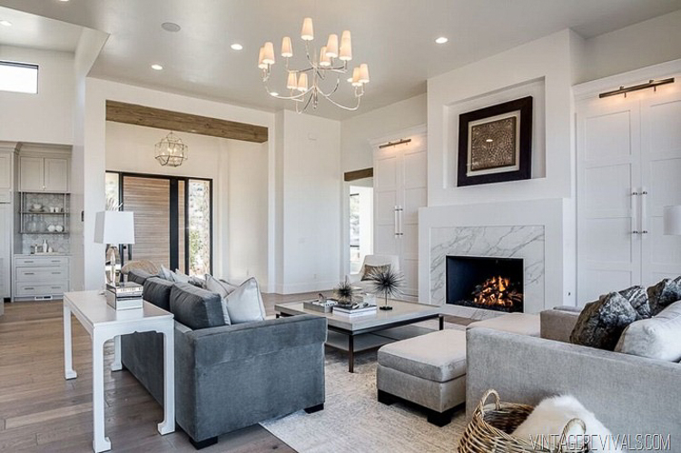
We’ll also be incorporating some header beams like this in the main living space. Since the walls will be all white this feature will be a nice relief from all of the white plus give the space some color, texture, and character. I also love the simple fireplace with marble surround and custom builtins that flank the fireplace, which will hide all of the things that we never want to see in our living rooms, like wires and tv equipment.
Study Inspiration
Love both of these studies and will be incorporating the grid wall (or something similar) into the space along with a similar dark blue wall color for a moody space that will keep me focused (hopefully) on my work, haha!. Again, I love the picture lights and will be incorporating those into the space also above the book shelves.
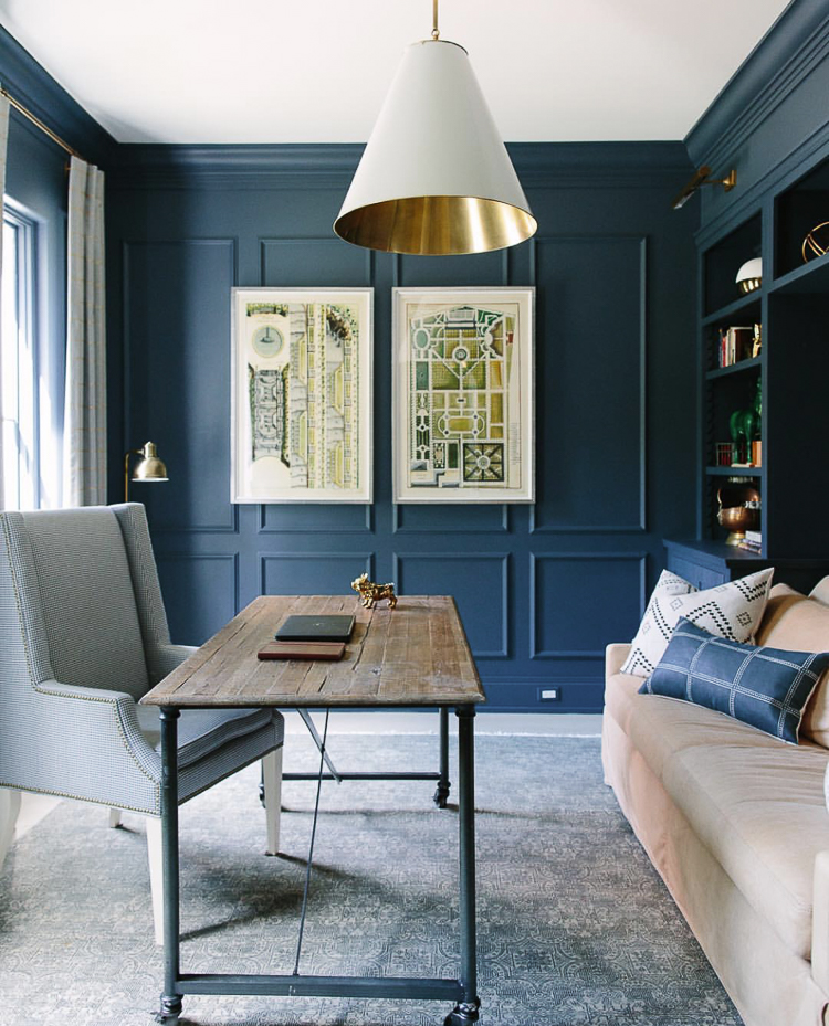 Via Designer – Kate Marker Interiors
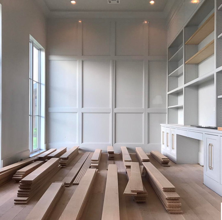 Via Scheffy Construction on Instagram
Stairs
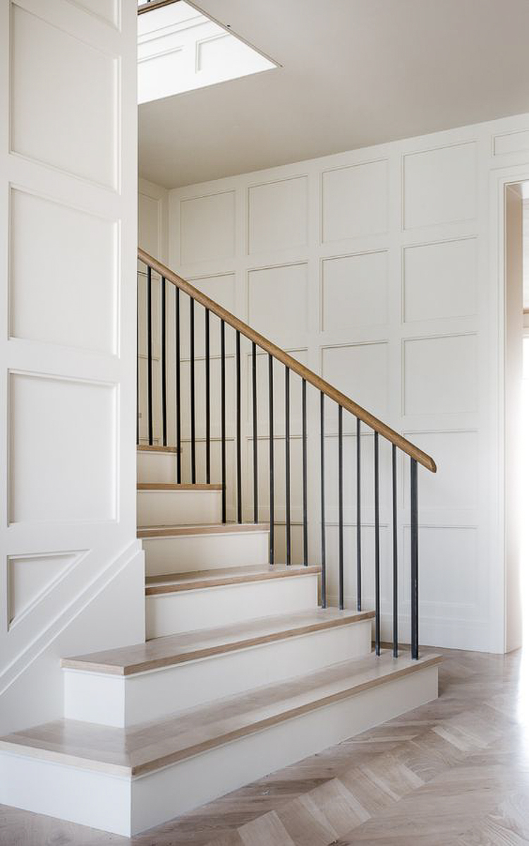
As you enter the home I designed the dining room (which sits off to the left) so that you can view the staircase through the dining room from the entry. It will look very similar to this with the grid pattern on the wall and I’m still on the fence about hand rails, although I know they will be a clean, contemporary style.
As mentioned above, there will be a window in the staircase landing something similar to this.
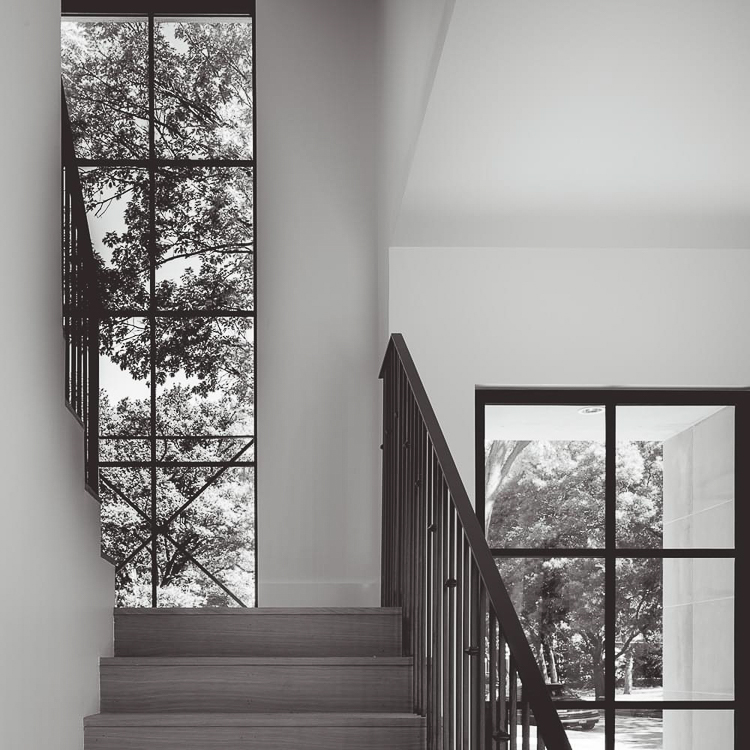
I also really love this mid-mod handrail by Leo Designs that is a definite contender to the more simple one above. You may not have known this because I haven’t recently decorated a lot in mid-mod style but I really love it and will be incorporating a little more of it into this home.
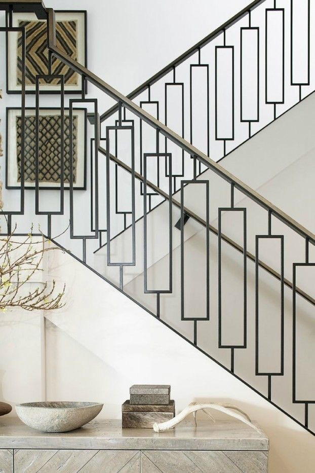 Image via @leodesignschicago on Instagram
Kitchen Inspiration
I have always, always, always loved seeing the sink at the back of the house with a big picture window above and that is exactly what we will be doing. Here is an inspo photo that I love for this feature but this photo also has a similar lighting situation that I’ll be incorporating, plus the open shelving that will flank the sink area. I may even do dual refrigerators that flank the sink area or the stove area like the second photo below.
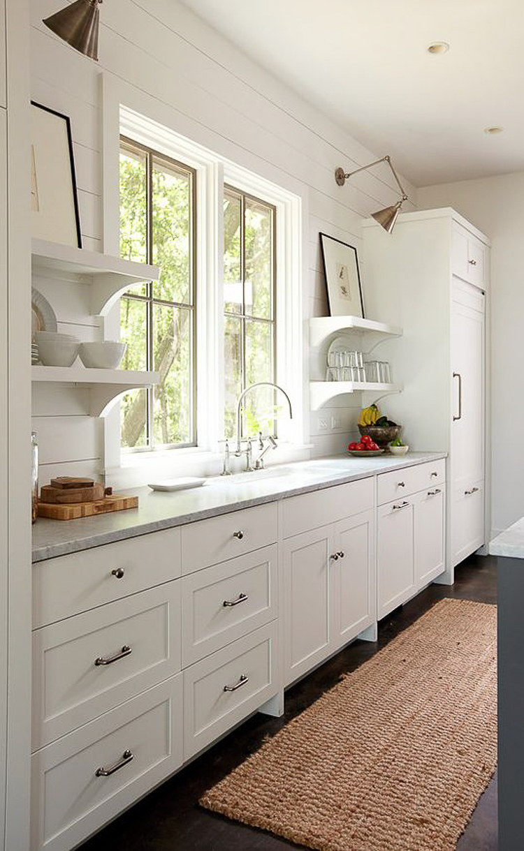 Via Holly Shipman Interior Design | Photograhphy by Colleen Duffley Productions
The kitchen flow will be very similar to this with a sink at the window and a second smaller sink (but not as small as a vegetable sink) in the island …
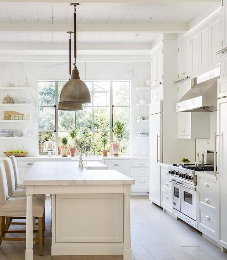 Via @velvetandlinen on Instagram
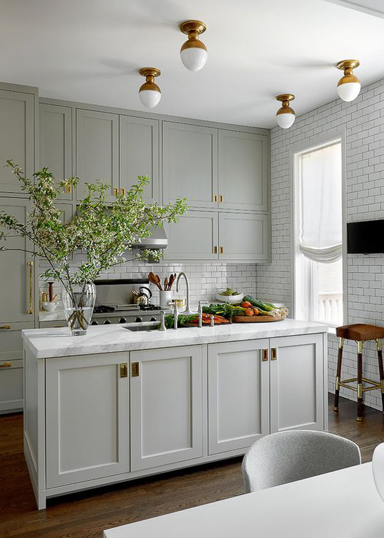
I’m also on the fence about cabinet color. I won’t be going with white cabinets again but I will be doing some shade of gray anywhere from a medium gray to charcoal. I love the charcoal but then I feel like the medium gray will be more classic and stand the test of time better. Isn’t this gray kitchen just scrumptious with the brass accents?? And it’s so timeless… I think that’s what I love so much about it!
But I love this look as well by the super talented Studio McGee. Hmmm…decisions, decisions;). I will also more than likely be doing natural open shelving to create a little warmth and contrast against the white backsplash I’m going to use.
Additionally, I already have lights just like these (but in a brass/iron mix) from Lighting Design that I’ll be sharing once we get into the home as part of a fun collaboration. They were actually meant to go up in our previous home but when our move came up unexpectedly we decided to wait to put them in the new house.
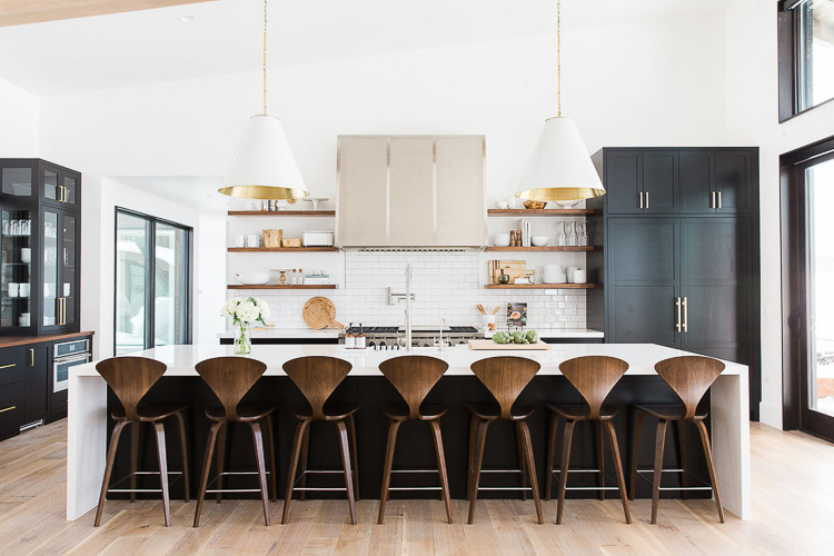 Via Studio McGee – their Modern Moutain Home Project
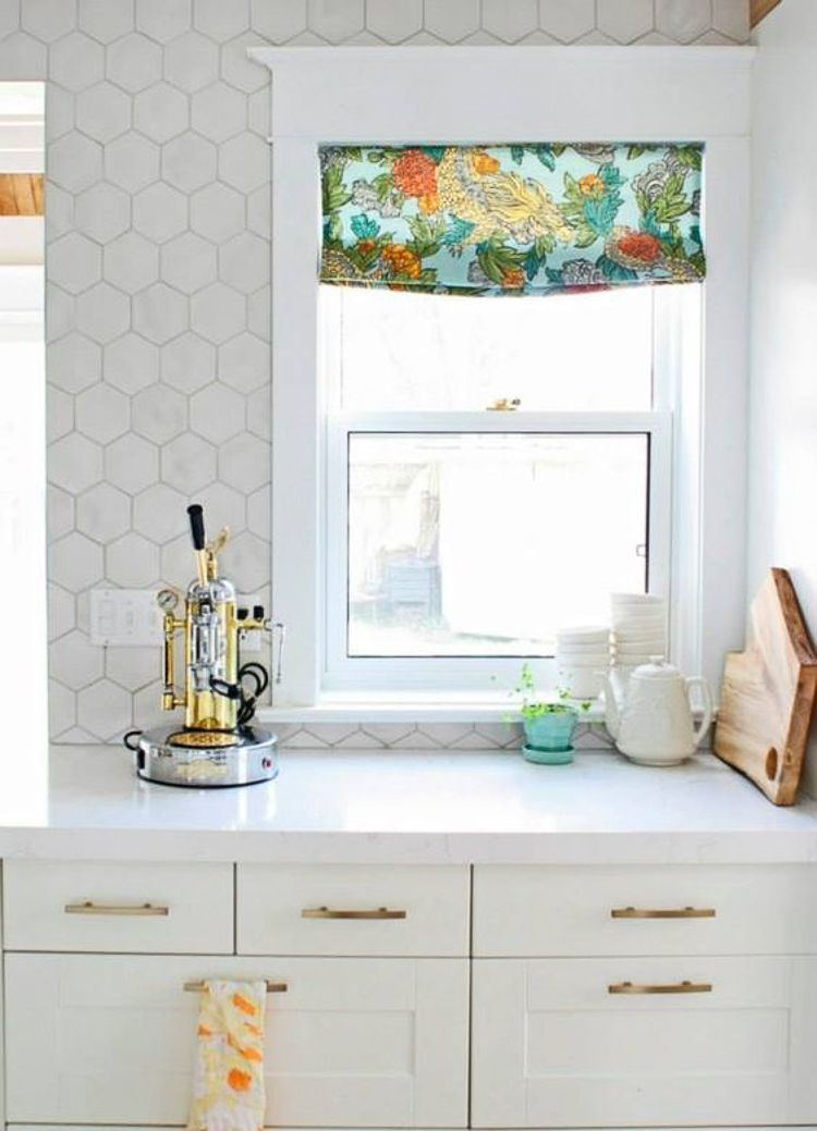
I also love this white marble hex tile that I feel like at this point I’ll be using in the kitchen, but in a larger size. I haven’t decided if I’m just going to take the marble countertops up the wall for my backsplash (yes, I’m using marble again…more on that later) or do something fun like an 8″ marble hex tile. I couldn’t find the source for this but if you know it please comment here or email me and I’ll happily and promptly add it.
Utility Room Inspiration
I haven’t been able to find one photo that represents what the utility room will look like but here are a few that I’m pulling inspiration from starting with this cabinet color. I have no idea what this color is but I’m looking for a medium to dark hue that is blue/gray in color for the cabinets in this space.
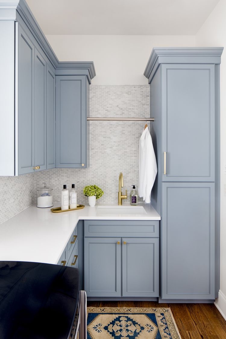 Via Stephanie Gamble Interiors
We aren’t doing a stackable washer and dryer as we already have a w/d set and you can see them here along with our previous laundry room but, there will be a designated dog area in the laundry room with a dog shower, dog bed incorporated into the cabinetry, and storage for dog paraphernalia.
I like to call this space the Family Ready Room…I didn’t make that up but thought when I recently heard it that it was a great title for this type of space that has such great dual purpose.
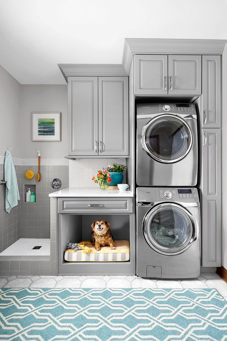 Via This Old House | Photo by Ricky Rhodes
So ignore the cute baby belonging to the darling Jillian Harris (which is impossible to do of course!) but there will be a sink at the end of the space with a window above it and a tiled wall similar to this.
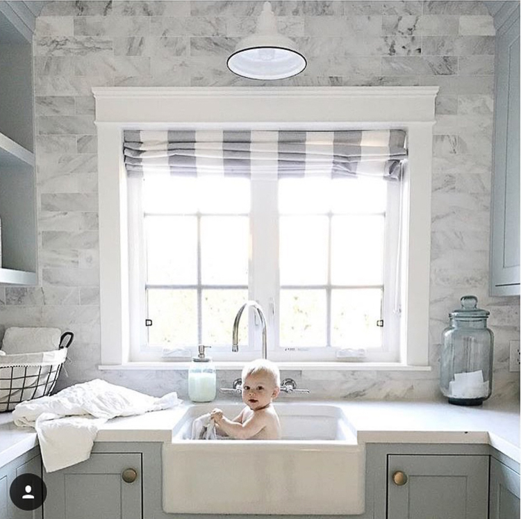 Image via @jillianharris on Instagram
There will also be an island but I couldn’t find an image of one in a laundry room with the exception of this corner shot. I love the idea of having it on casters for movability since I plan to use it for flower arranging and will be able to roll it closer to the sink for easy clean up.
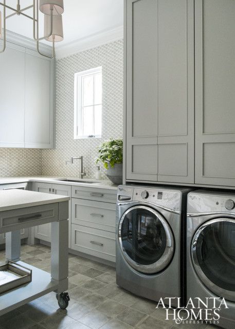 Via Atlanta Homes Magazine | Karen Ferguson, Harrison Design
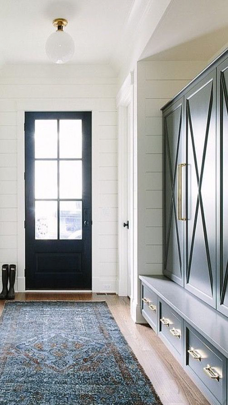
We’ll also be incorporating some beautiful lockers similar to this into the space since this is where you’ll enter the house from the garage. Additionally I’ve always loved the X pattern on the doors and plan to use this design somewhere in the house. The most exciting feature for me in the whole laundry room is that it has a door that goes right into the master closet…hallelujah!!! This is something my husband and I have both always wanted and we couldn’t be more excited about it!!
Master Suite Inspiration
I knew I wanted a fireplace in the bedroom and this one sealed the deal for me for some reason. I’m sure it will look somewhat different once it’s all said and done since there will be a vault in the bedroom but this one is gorgeous by Scheffy Construction. If you aren’t yet following them on Instagram you should really get on that for an amazing, daily dose of inspiration!
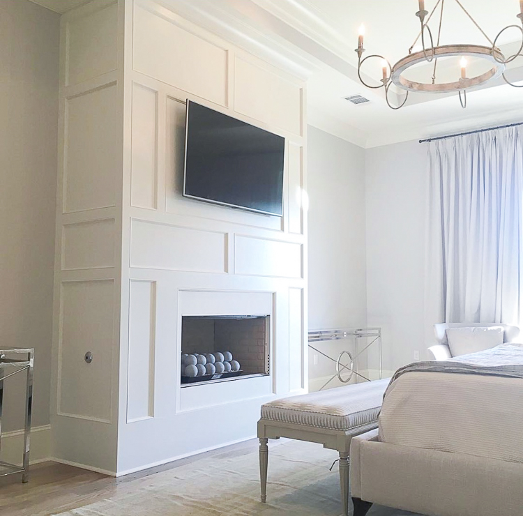 Via Scheffy Construction on Instagram
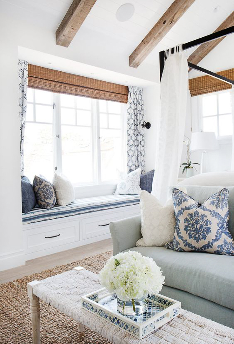
Will also be incorporating a window seat into the MBR with sconces on either side to create a cozy reading nook.
And then of course for the master bath this gorgeous bathroom by Tiffany Harris Design. Love everything Tiffany does and this bathroom is no exception! I love the cerused oak cabinets, brass accents, and patterned floors. I will probably go light on the patterned tile in this house for a few reasons but I’m definitely using it in the master bath along with a classic pattern in my son’s bath.
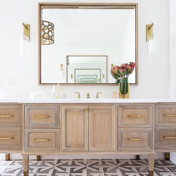 Image via @tiffanyharrisdesign on Instagram
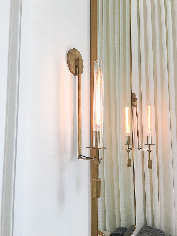
These lights (and mirrors) from RH will either make an appearance in the master bath or in the powder room, but probably in the master. These were true love at first sight!
Gameroom Inspiration
The game room will be a straight shot with yet another vault and I know that most people would probably do a dark color in here but I want it to be light and bright, probably with ship lap or tongue and groove on the walls and ceiling (the ceiling is a maybe).
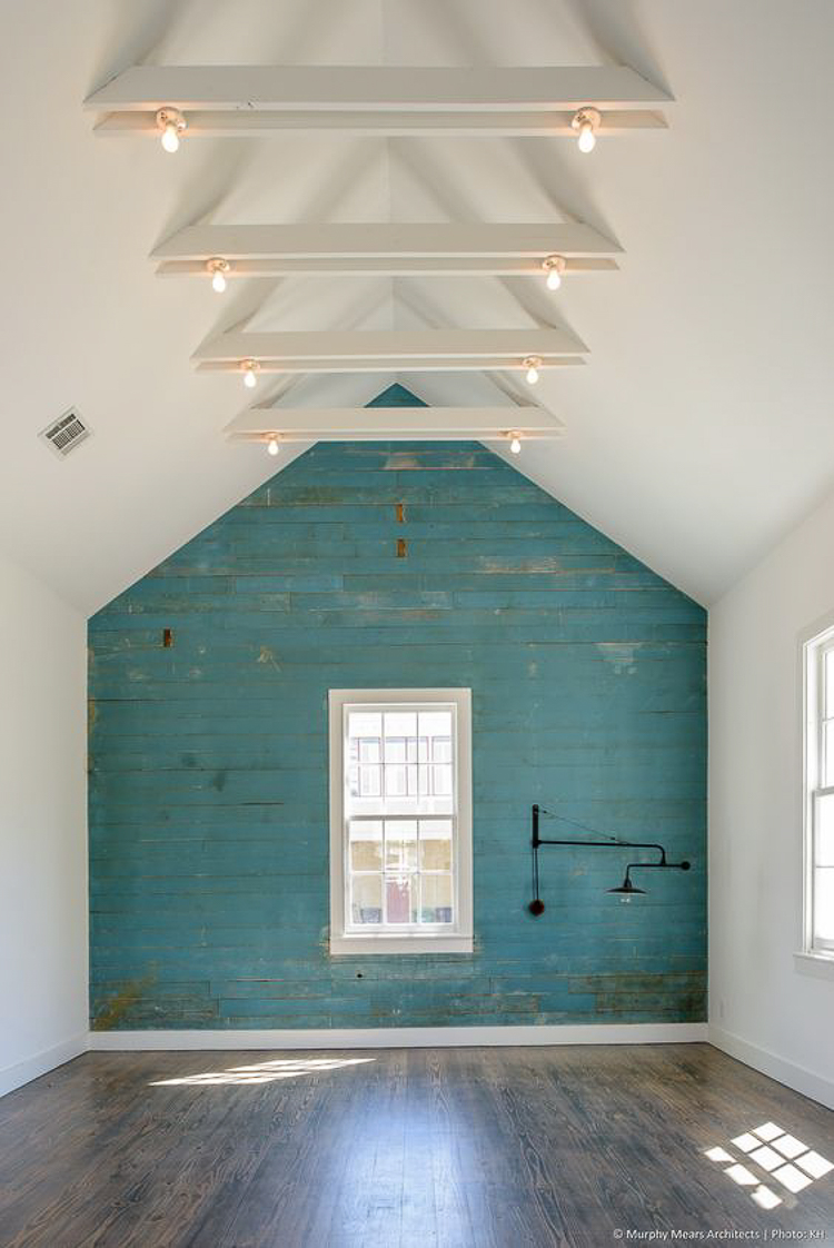 Via Murphy Mears Architects | Photo: Kyle Humphries
I think this will be a favorite spot in the room for lounging and reading though under the window with the view that overlooks the backyard and lake…remember, that’s the reason we went up instead of out with our design;).
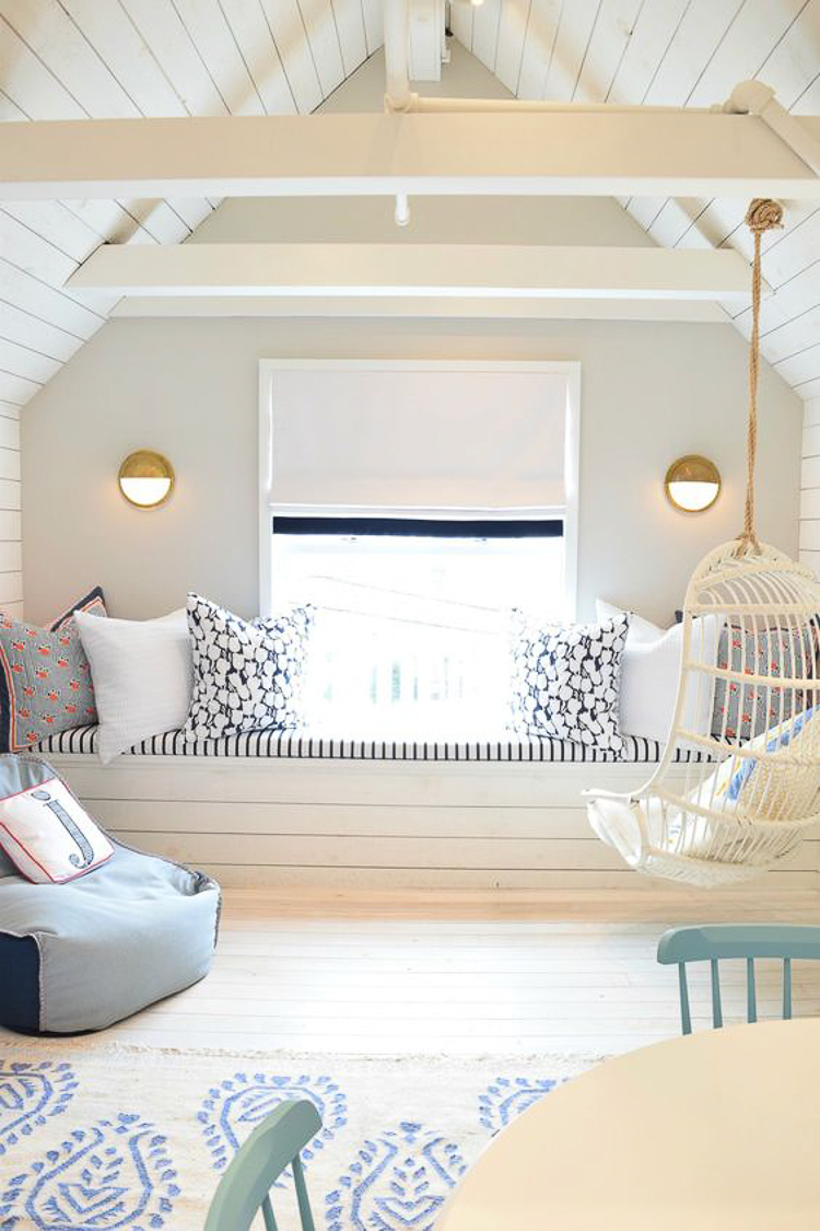 Serena & Lily design via Nesting With Grace
Son’s Suite
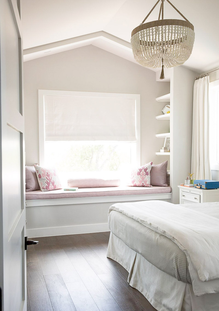
Love this quaint space for my baby boy (he’s not a baby anymore…insert crocodile tears here). The window seat flanked by bookshelves is a must and the gentle vault in the ceiling is perfect for his space. This is just right minus the pink and then add a little blue and gray. You can see his current room here.
For my son’s bathroom I love pretty much everything in this design below by Studio McGee but this is just a general idea of what his bathroom will look like. I probably won’t do the black shiplap in here (although this would be perfect in a boy’s bathroom) but I do love this general look for the space.
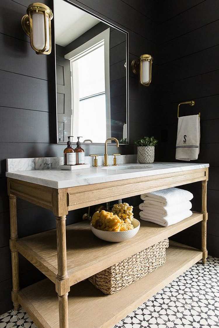 Via Studio McGee – their Modern Moutain Home Project
Well folks, that about wraps up my first update for our Finally Home Project! I hope you’ve enjoyed the inspiration photos and the update but there will definitely be more to come in the weeks and months ahead (with lots of tips)! And knowing me, some or all of this could change drastically between now and the time we’ve completed this project so I hope you’ll stay tuned for all of the fun stuff ahead! 🙂
Thanks for stopping by and don’t forget to sign up for my news letter HERE to stay up to date on our new home build journey!


I will be thinking about this post all day! Such beautiful inspiration photos, I can’t wait to see it all come together in your home!
Kate, thank you so, so much! I can’t wait to see it come together either! Thanks for stopping by:) xo
Absolutely love the clean contemporary looks. Yours will be the bomb — can’t wait to see it.
Becky, thank you so much! And thanks for stopping by!! xo
AHHH! Bree! It’s going to be SO good!! I just can’t wait to see your house come together! Seriously some of these pictures gave me cold chills! Absolutely stunning. If I ever build again (which would be YEARS down the road because I can’t handle that again with kids at home 😉 ) I’m hiring you to help! I love your style so much and this home is going to be jaw on the floor amazing! CAN’T WAIT!! XO
Erin, you are so sweet to stop by my friend!!! I’m so glad you approve of my design decisions and although you definitely don’t need any help with design, I would be over the moon honored to help you with anything you need on your home! Love you and thanks for stopping by!!! xoxo
WOW! Everything looks amazing! I love all of your design ideas! Can you please share the name of the white pendants from lighting design? Thank you
Hi Jessica! I believe they are the Goodman pendant. This is one from their extended line so you might want to reach out to them on Instagram to see if they can get it for you. You can find them at @lighting.design.company on Instagram. Hope that helps a bit and thanks for stopping by and for your sweet comment!!! xo
So many beautiful inspiration photos Bree! I have many saved on Pinterest, but my goodness you found some incredible new ones! So so fun! I actually have the source for the child’s room. It’s Annie Downing Interiors. I used the photo in a blog post about lighting and she is super talented and sweet! Good luck with getting through your HOA. I’m sure you are incredibly excited to be nearing your start date!
Jen, thank you so much for the source! I’ve already added it!! Thanks for stopping in to check out the progress and hopefully soon we’ll have some real progress to share soon!! Hugs! xoxo