Art Updates + Simple Tips for Hanging Art
Art hung the wrong way is like the white elephant in the room. Hung too high it looks like it’s floating like someone alone on a deserted island and hung too low well, we’ll just leave that to your imagination. As the daughter of an artist I grew up with all kinds of art paraphernalia around the house from wet paint brushes, to canvases of all shapes and sizes, frames, and the like. I enjoyed countless trips with my mom to hang her art in different venues for show and/or for sale and learned at a young age how important it can be to have art in the home to help express your personal style.
With that said, hanging art can be a daunting task that even one with a good eye can be overwhelmed with so while I’m not a total expert on the subject, I can offer you some simple yet practical tips that I use for hanging art around my own home. But first, I want to share some recent art hiccups in my own home along with how I’ve recently rearranged some pieces to remedy my design dilemmas!
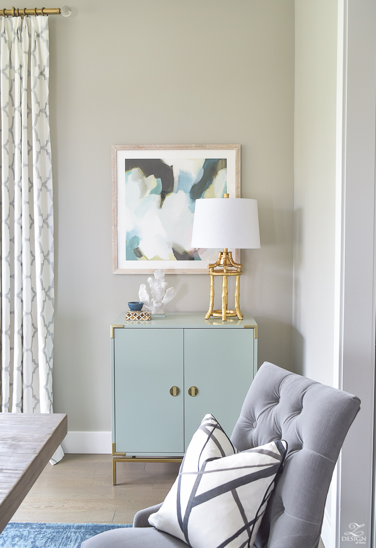
For starters, I love this piece above from Minted.com by artist Melanie Severin and just placed it here last year during our recent dining room reveal (part 1 HERE) however, the challenge here for me was that I wanted a pop of color in my art for this spot and loved how this piece spoke to me but, I really needed a vertical orientation vs. the square orientation I originally chose. I could have had it framed in a vertical orientation but that wasn’t really what I wanted because there would have been a lot of white space above and below the print so I chose to have it framed like this knowing that framing it the way I did would compliment this lovely print the best. It always bugged me though that (for me) there was a little too much space from the top of the print/frame to the ceiling so recently I decided to move things around and replace this one with a vertical piece. I could have hung something complimentary above it to visually fill in that space but again, I just wanted this beautiful piece to shine on it’s own, especially since there are a lot of other pretty things already going on with this vignette. But don’t worry, this piece isn’t losing it’s place in our home…it’s just going to a spot that it’s better suited for.
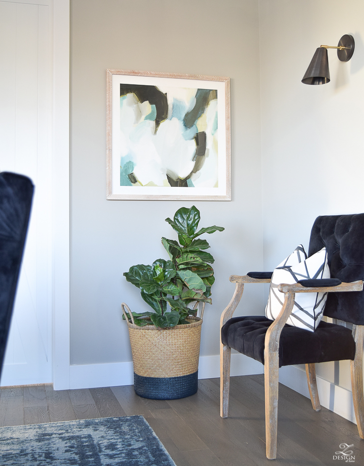
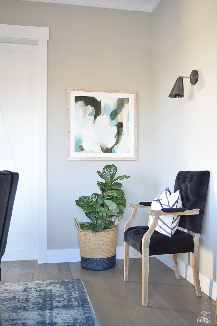
This is a tighter corner and the art now brings the perfect pop of color and personality to this space. It’s perfect here over the fig tree and if you’ll stay tuned for a bit I’ll show you where I moved the piece that was here previously. I also love the way the herringbone frame compliments this piece. You can find it all HERE if you love it as much as I do!
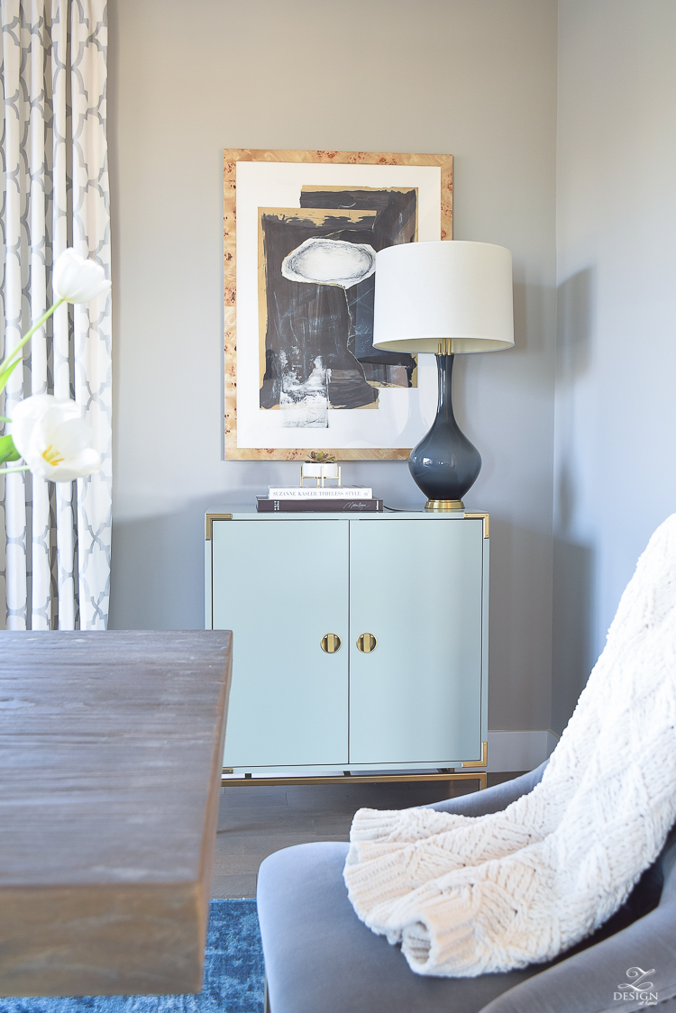
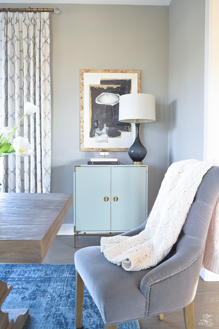
Now back to the other side of the room where I’ve placed a piece that is more suited for this spot. It’s a vertical orientation which is perfect but this time I chose to go with less color since the rug and bar cabinet really provide plenty of color in this spot. I had been eyeing this print for quite some time (it’s called Hovering Union by Misty Hughes from Minted.com) and had it in my cart forever but just couldn’t decide on a frame. However, when I saw the Cairo Burl Wood Frame at Frambrdige recently, I knew it would be the perfect compliment to this print (and for my space) so I had the print shipped directly to Framebridge and they framed it perfectly to my specifications. We are seeing this amazing wood more and more again in design lately and I couldn’t pass up the opportunity to use it. Framebridge was so easy to work with and when my print arrived in it’s new burl wood frame I couldn’t have been happier. Much care was taken during the packaging and presentation process and I think it looks fabulous in this spot (By the way, Framebridge is offering my readers 15% off with code ZDesign through May 31, 2017)! Can you see how pretty it is in the back ground of this first photo?…
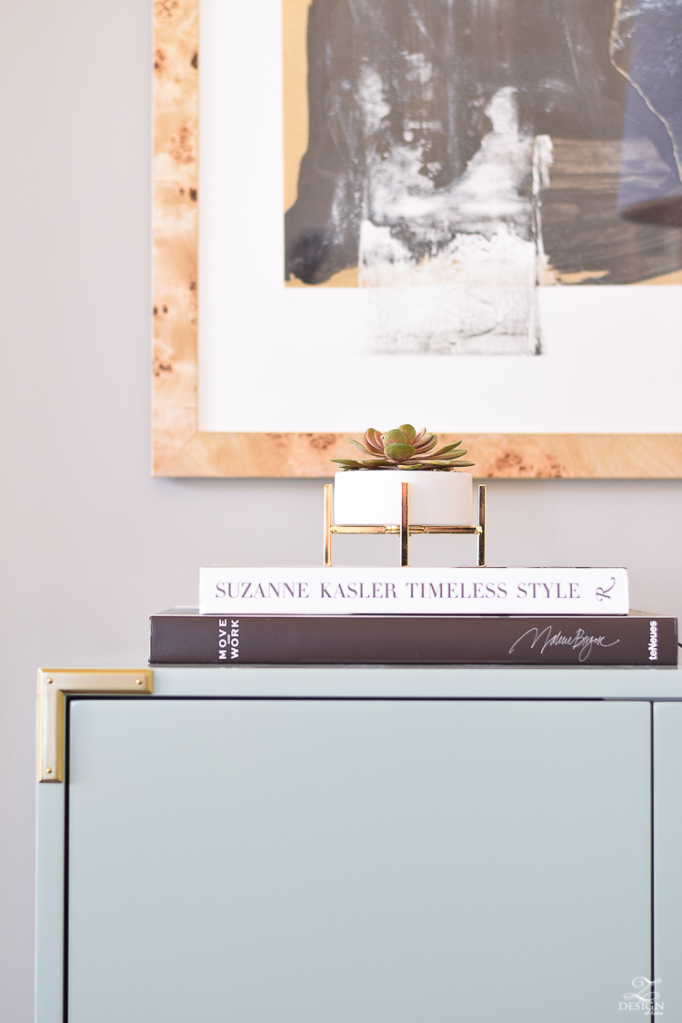
Honestly I just can’t get enough of the burl wood and want to bring more of it into my home now in other ways!! If you are not familiar with what burl wood is, it is an abnormal grain pattern or growth in or on a tree. It develops in response to physical, environmental, or invasive stress to a tree and when this occurs the result is a spiral, swirled, or twisted pattern called burl. I love it for the uniqueness it brings to the space.
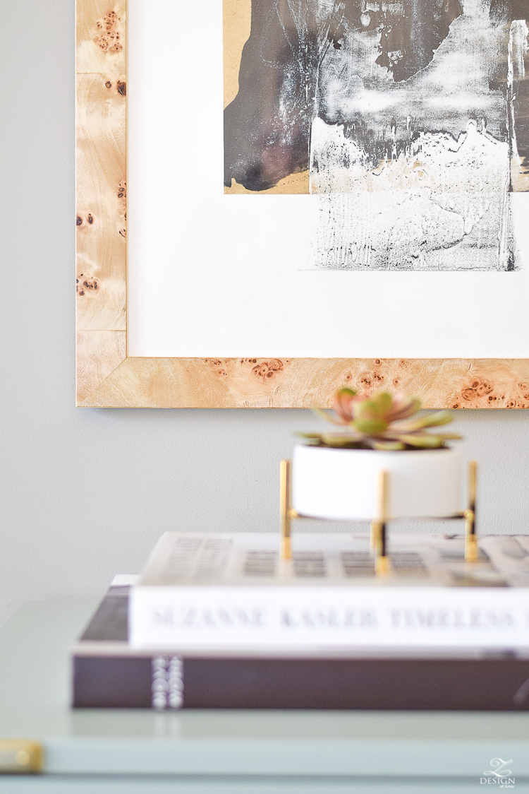
I restyled the top of my bar cabinet and moved a lamp from another room in here and I think it turned out great being much more fitting for the space…what do you think? One other issue I had with the previous piece in this spot is that it was the exact same width as my bar cabinet which is technically incorrect. Your art in theory should be at least be slightly smaller in width than the piece of furniture that it is hanging over so this art piece works much better all the way around since the width is less (I’ll cover more on this point later in this post).
Again, here is the piece that used to be here in it’s new home on the opposite side of the room (we LOVE it here!)…
And here is the new piece from Minted with the Framebridge burl wood frame. I’m loving this new arrangement and love how it’s getting our home ready for spring this year!!

Next I’d like to show you where the piece went that used to hang in the corner over the fig. I recently updated my guest room (you can catch that HERE & HERE if you haven’t seen it yet) and moved art around in there as well removing some of the wall decor from the space that I no longer loved, which left an open spot. This is the spot between the windows and what it used to look like.
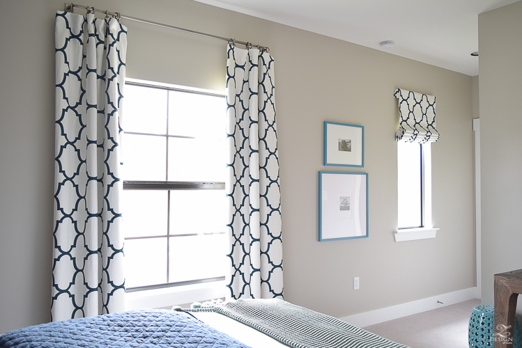
It lacked a little personality and I hated the color that I sprayed the frames when we first moved in a few years ago but just hadn’t ever had the chance to respray them until I completed the updates to this room last year. This time I sprayed them in navy blue (Rust-Oleum Navy) and moved them to the other side of the room creating an empty spot between the window. Here is where the newly painted navy frames went to replace a clock that I wasn’t loving any more. In case you were curious, I love to use these gallery frames for family photos and other things around my home and I picked up the black and white prints I believe at Hobby Lobby some years ago.
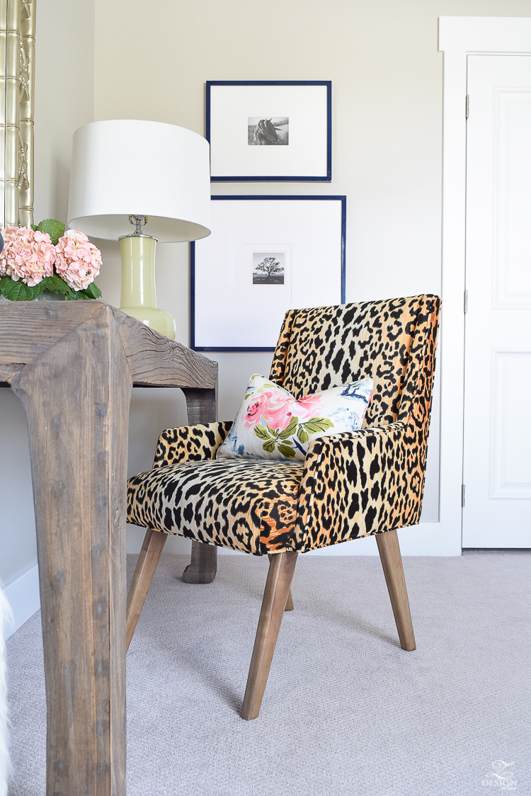
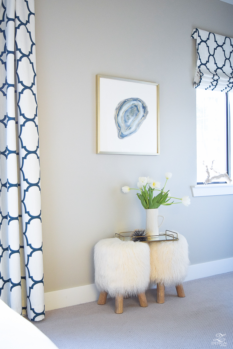
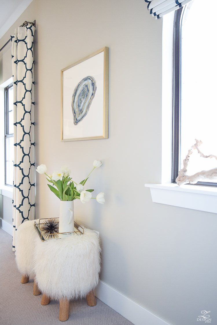
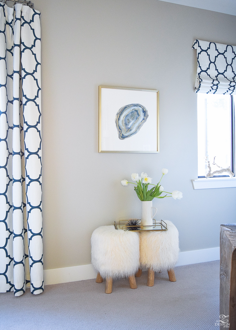
This piece that was formerly in the dining room (seen HERE) works much better in this space and blends well with the aforementioned prints in navy frames. I love this on trend agate art piece from Minted.com by Amy Lighthall framed in Minted’s matt brass frame and I’m super excited to have it in this space now to completely finish off this room! (Leopard chair fabric and other resources for previous photo available HERE).

And the last art change but certainly not the least is a beautiful new addition to the master bedroom! I have seen the Juju hats around for a while now and sometimes it takes me to warm up to a trend (I want to make sure they are going to stick first sometimes) but when I ran across Juju Boutik on Instagram and Etsy I finally decided to take the plunge for a Juju hat since I knew it would work perfectly in the master bedroom over the bed. Here is a quick glimpse…
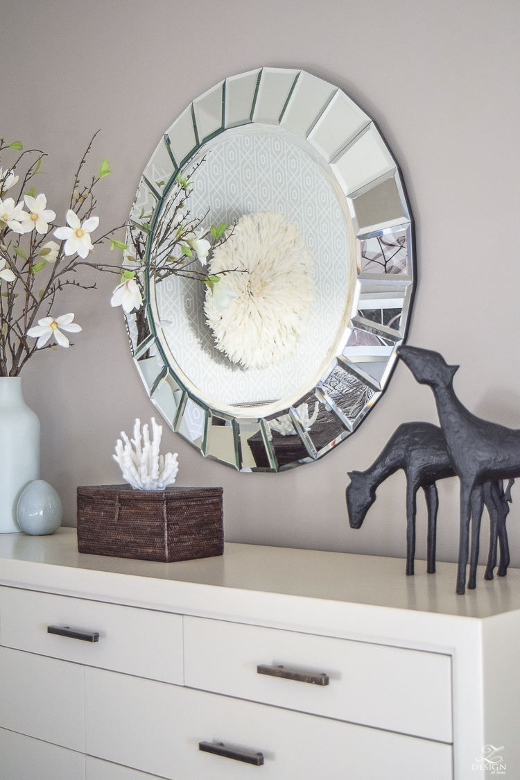
Juju Boutik hats (mind found HERE) come from Cameroon and have a rich history in the Bamileke tribes of Cameroon with each headdress taking 2-3 days to hand sew and, they symbolize prosperity and wealth. This global trend has also had a positive impact on creating jobs and wealth in the Cameroon community. Additionally, Juju hats come in multiple colors and is probably one of the most interesting pieces of art I’ve ever had the pleasure of hanging on my wall.
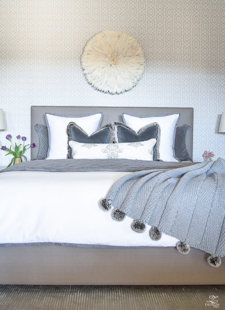
The feathers are so soft and it comes complete with a hanging instructions, instructions for care, and a sturdy wire on the back for easy hanging.
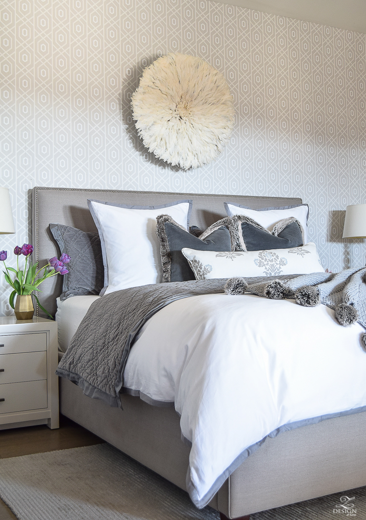
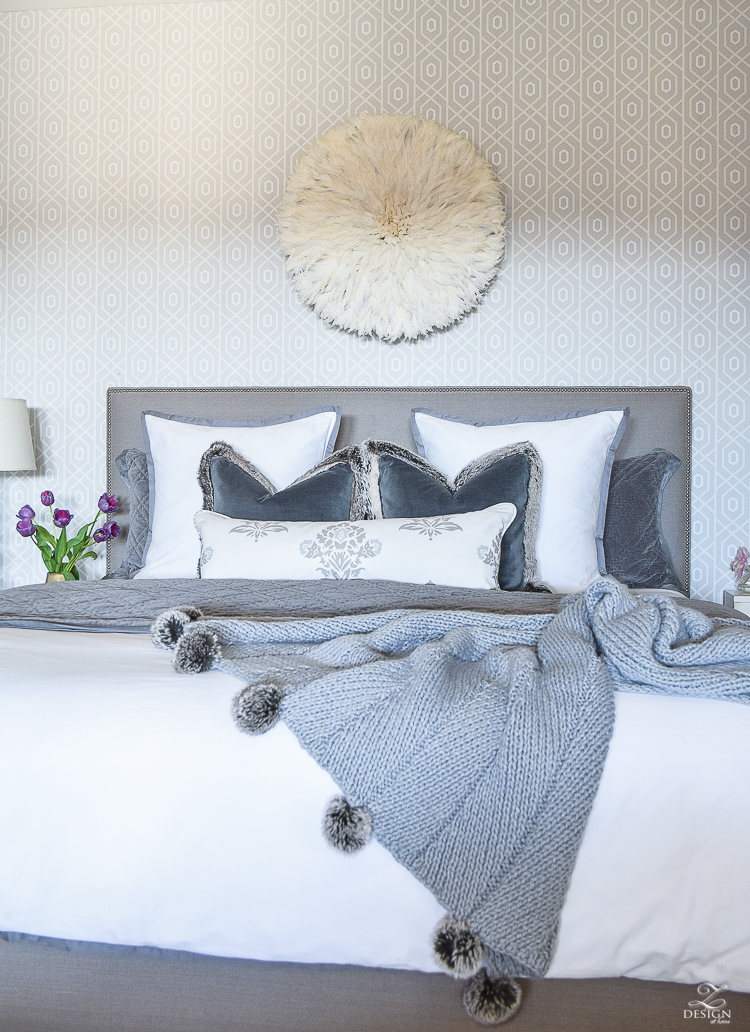

I hope you’ve enjoyed the art updates around the house and now here are some simple tips that I go by for hanging art in the home.

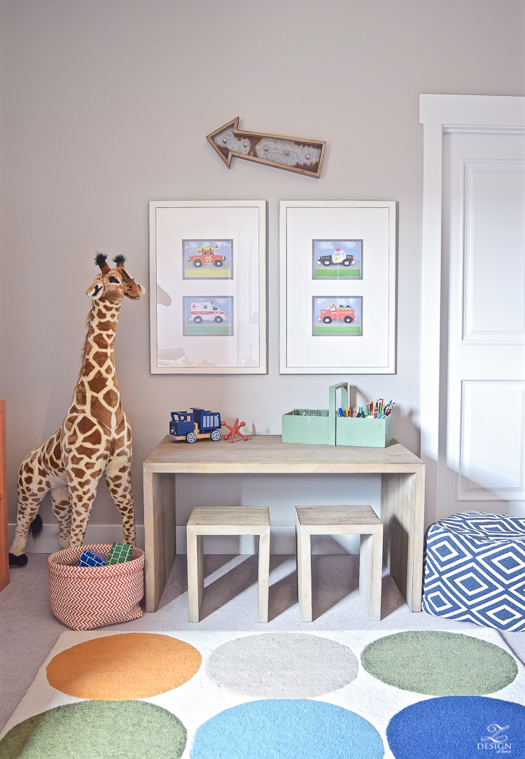
- 1st rule of thumb that I always go by (which is pretty standard) is to hang art at eye level (and definitely not too high!). Eye level generally speaking is 60″ above the ground to the center of the art (which you’ll have to do some math on to reach this point). Sometimes however you may need to adjust the height up or down depending on the situation. For example, if the room is used mostly for sitting and/or if you have low ceilings you might want to adjust that down an inch or two by playing with the measurements (lower is always better than too high). Art in a kid’s space is another time where you might want to adjust down a bit as well like I did here in my son’s play room (which is in serious need of an update as well…hopefully soon for that one!) so that art is more at a little one’s eye level.

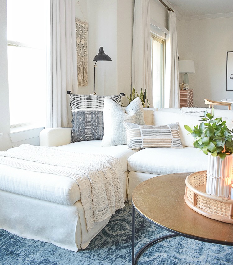
2. Hanging art over a sofa – You may need to adjust the height up or down from 60″ at the center for furniture underneath such as a couch so that there is not a large gap between the bottom of the art and the top of the couch. Generally speaking, your frame should hang about 8-10 inches above the back of the sofa and you may have to play with your measurements a bit for a grouping or gallery wall in this scenario but just remember that you don’t want to hit your head on said art when you sit down.
3. Grouping or gallery wall – Keep about 2-3 inches of space between frames when doing a grouping or gallery wall.
4. Hanging art over a piece of furniture such as a console, credenza or buffet – I like to hang art about 4-6 inches above this type of furniture. You don’t want it so high that it no longer relates to what is below it but then again you don’t want it so low that your accessories or lamps cover it and/or get lost in it. 4-6″ will give you room for items on top of your furniture to shine but not so high that it’s floating on the wall.
5. Hanging a mirror or art above a mantle – Depending on the height of the mantle hang your wall decor anywhere from 4-12 inches above. If your wall decor is higher than 3 to 4 feet then lean it against the wall vs. hanging it. This will make a more casual yet interesting statement to cozy up the room and will provide a different look from just the typical look of hanging something on the wall.
6. Art should be half to two-thirds the width of whatever it’s hanging over, unless it’s flanked by lamps or the like to help fill in the space on either side of the art or mirror.
7. In keeping with #6, make sure your art is the correct orientation for the spot you are hanging it in, especially if it is going to stand alone on the wall not being surrounded other pieces to fill in gaps, etc.
8. To use all the same frames or not? – for a grouping or gallery wall, if you are going to go with all one color print or photo (for example – all black and white or all color) then mixing and matching your frames is perfectly fine. However, if you are using a mix of colors in your prints then to keep a more cohesive look, go for using all the same style frame and mat color. Regardless, when doing a grouping I always like to keep my mat color & texture the same to bring continuity to the gallery.
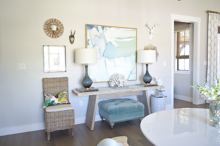
9. Mix items into your grouping such as small mirrors, candle holders, or antler heads like I did here to allow this area to come to life by popping off the wall a bit (full tour of the space below HERE)

10. Always choose art that speaks to you!! Not to sound crass but don’t just run into the nearest store available to purchase something just because it’s available. Art for your home should be a well thought out decision and should be something that moves you. I’ve even heard some designers say that art doesn’t necessarily need to blend with the rest of the decor in the room and I don’t necessarily hold to that philosophy but, the point is that art should be chosen with purpose and meaning for your humble abode like the Minted/Frambridge piece that I can’t get enough of…

And last but not least, remember that rules are made to be broken and sometimes you just have to play with measurements to get it right for your particular situation. From time to time I just use command hooks for hanging (found here) so that when I’m testing art on a wall I don’t destroy my walls in the process (when using command hooks make sure to use a hook that is appropriate for the weight of your frame).
I’m sure I haven’t completely covered all scenarios in this post so if you have a questions please don’t hesitate to leave me a message in the comments below. I read each and every one and am always happy to answer anything I can!
Thanks for stopping in and don’t forget to sign up for my weekly newsletter below to get all the latest each week:)!
For a full tour of the dining room go HERE & HERE
For a full tour of the guest bedroom go HERE
For a full tour of the master bedroom go HERE

Dining Room
Guest Bedroom
Master Bedroom


Beautiful new pieces! How fun to add the juju hat! I’ve been admiring them for years and I’m surprised I’ve never found one to bring home! Enjoy your spring look. It’s fabulous!
I really do love the Juju hat and I love that it’s something a little different from a traditional piece of art. Thanks for stopping in dear friend!!! Xoxo
Bree I love that we are both daughters of artists! Your mama sure did rub off on you! You have incorporated art beautifully into your home. She must be so proud of you! Xo
Randi, thank you so much for stopping in to check out this post!! And I am not surprised at all that we are both daughters of artists!!! Thanks my friend Xoxo
I’ve always loved Juju hats and one above our bed would be awesome! Which size do you have and what size is your bed?
Hi Debbie, My bed is a king and I ordered the 30″ Juju! I hope you like it just as much as I do if you get one!! Thanks for stopping in!!
Beautiful artwork. Love your style! Your newly painted navy gallery frames look wonderful! A little paint can make such a big change. I’ve been looking for a nice art piece for my son’s room. Minted.com sounds like a site I need to explore.
Hi Michelle, you will absolutely love Minted.com. There are so many choices in art and frames that I’m certain you will be able to find something you love for your project. Thanks so much for stopping in!!! Xo
Such a great post Bree! I’ve always struggled with art, but every time I see a print in your home it inspires me to keep looking for something I love! Your prints are beautiful and I especially love the way they bring out the colors you use in your decor. SO pretty!! xo
Thank you so much, Erin!! And thanks for stopping in!!! Xoxo
Fabulous article Bree! I never really knew/thought of exact measurements but since I’m just over 5′ tall, I’ve been running around measuring myself against the center of my art…lol! I can always seem to tell (as I’m sure many of us can if we really listen) when something just doesn’t look right or is spacially off. Right now I’m dealing with the same situation you addressed…a landscape photo orientation where the space demands a portrait style. Still waiting for the perfect piece to change out and you’ve linked to great options. Loving that burl wood frame!!
Thank you so much ladies!! I really appreciate you stopping in and that you found this post helpful! I love that frame too and I know you will as well if you decide to try it…it couldn’t be more fabulous! Take care!! Xo