A Transitional Master Bedroom Tour
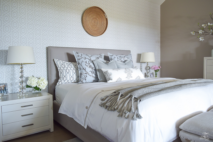
Thank you for stopping in today for a tour of our transitional master bedroom but first I have a question for you…is your bedroom one of the first designs you put together in your home or was it the very last? When we first moved into our home 3 years ago I wanted this room to feel like a peaceful retreat for us to head to at night so I put this room as my first order of business on the design agenda. With my husband under the stress of new employment and me trying to figure out a new town in regard to schools, doctors, grocery stores, etc., etc., I realized this would be one of the most important spaces in our home to get completed before I did too much else in the way of design around here. I’ll talk more about that at the end of this post but with all of that in mind, I put together a scheme of muted colors that aren’t distracting and that envelope you into a restful sleep, leaving you feeling fresh and ready to go the next morning. The feature wall behind the bed even just has a subtle pattern that ties into the bedding and other textiles in the space. The rest of our home has pops of color throughout but this space is very neutral which was perfect in accomplishing a peaceful place for us to head to at the end of a long day. This room truly explemplifies the term ‘collected over time’ and I hope you will stay a while and enjoy the tour of this transitional, classic space.
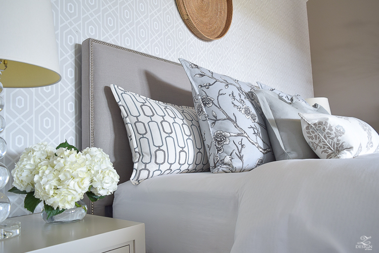
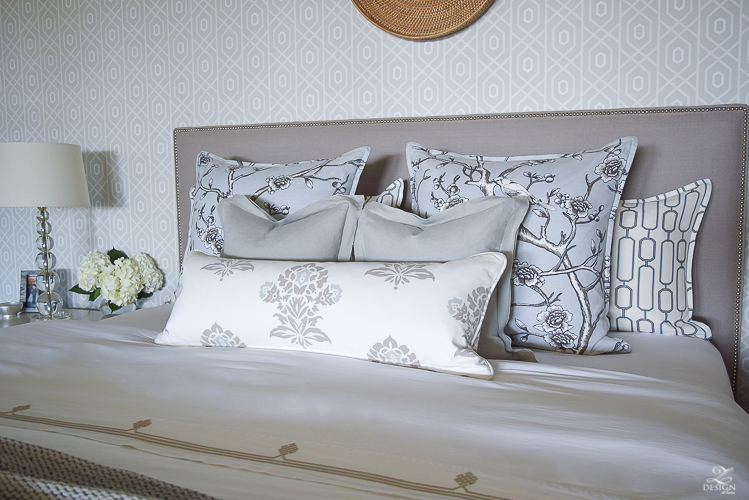
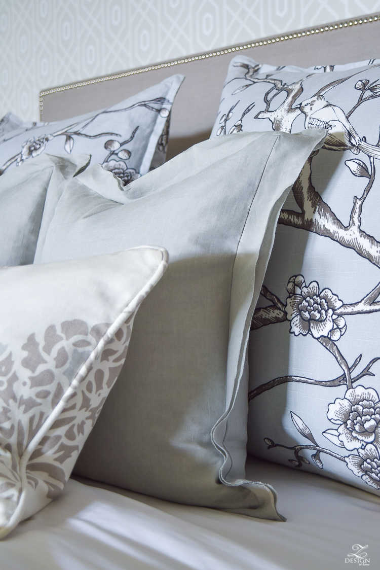
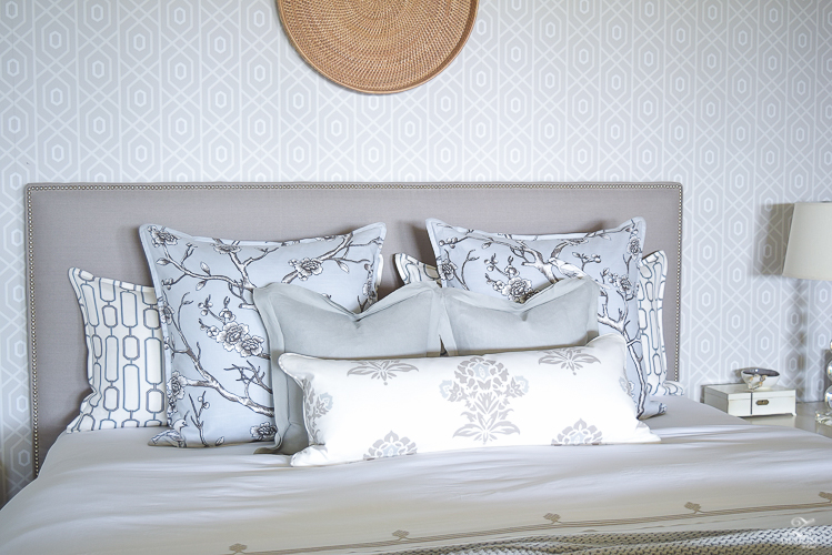
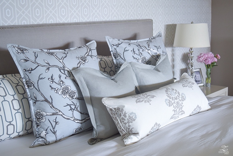
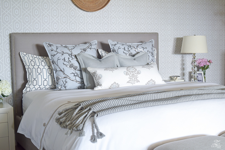
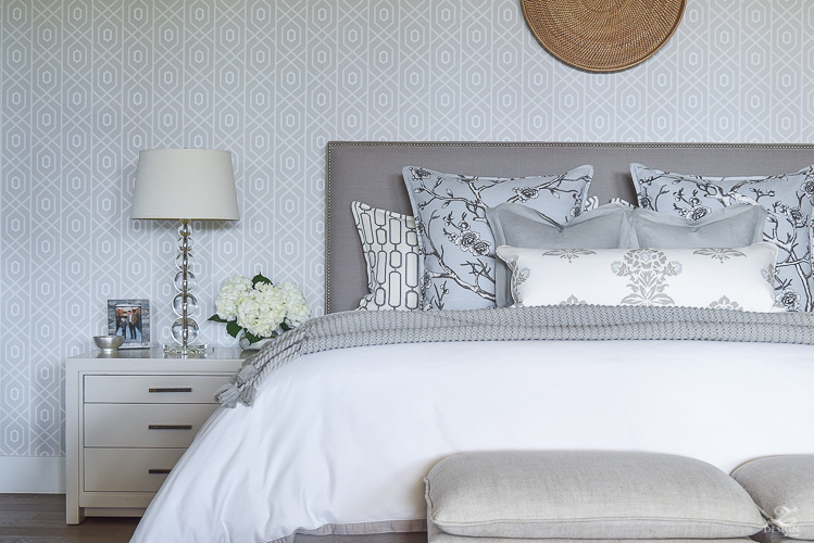
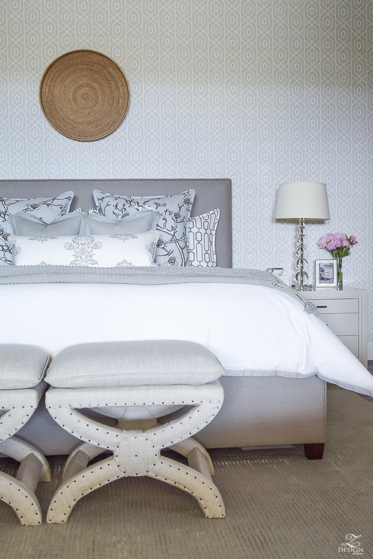
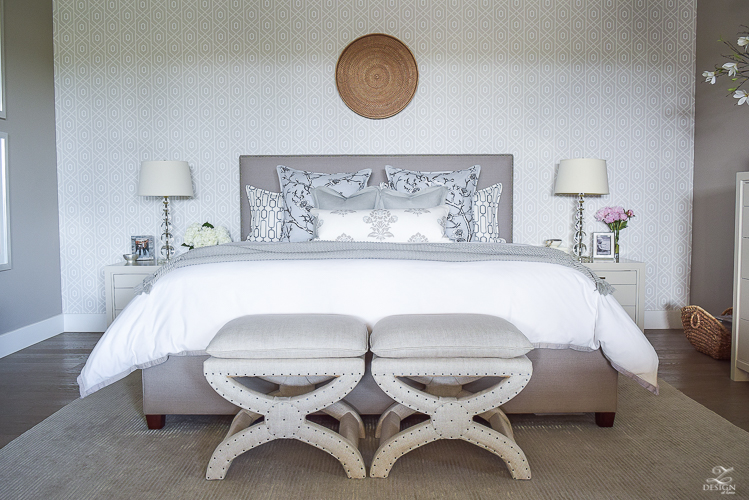
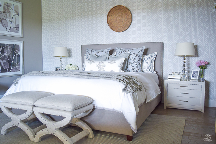
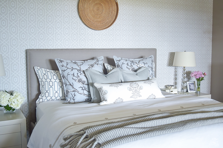
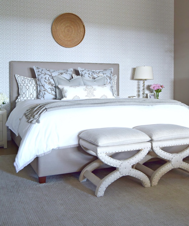
If you know anything about me and/or my design style by now you probably know that my inspiration piece(s) for this space was some of my favorite fabrics. This floral with a blue/gray background really spoke to me as a peaceful relaxing base from which to start. I then carefully selected one of my favorite geometric contrasting prints that I love and then combined both of those with a lovely medallion print that has all of my room colors in it. I also included a great neutral solid to have the bed reupholstered in. To start, the bed was this basic bed done in a boring beige fabric but I took it up several notches when I had it reupholstered in a warm gray linen and then added some chrome nailheads to create a little sparkle. The result of these fabrics together (along with the wallpaper which I’ll talk more about later) was the base for a peaceful palette for the space and then the rest of the components that were still needed came together quite easily from there. 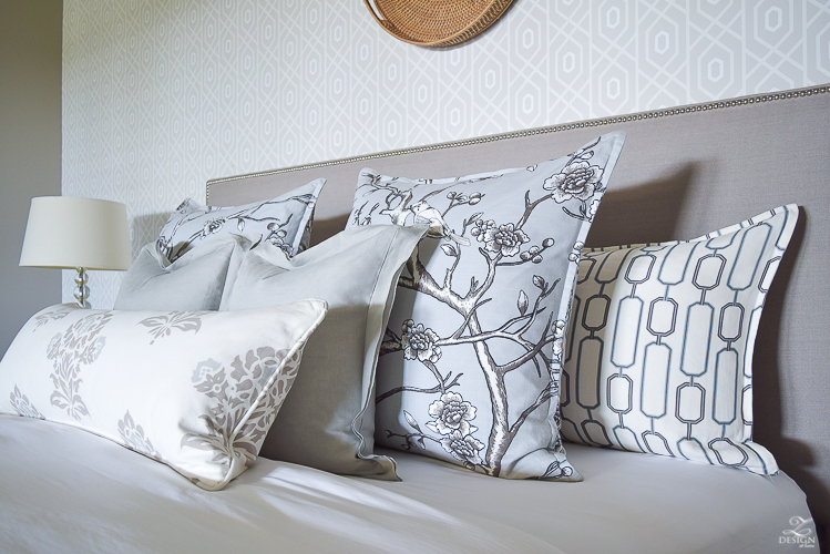
Get the Look
For the sheets & duvet I chose white cotton with a contrasting design that blends with my pillow fabric choices. I use this brand of sheets & duvet in two of the rooms in my home and love them for many reasons but one big reason is because they seem to fit any mattress well, but they also make a great foundation for layering color and pattern throughout the room and are a great classic (with a twist) to my bedding ensembles. And, thanks to the 300-thread-count pure-cotton sateen they’re also fabulously comfortable.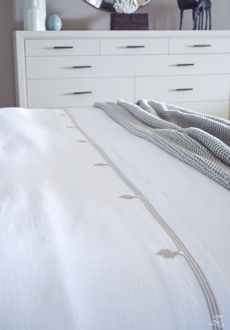
I don’t often change out anything in my bedroom because I’m perfectly content with it the way it is for the most part but for this summer I did change out some of my decorative pillows. I changed out my chunky basket weave linen pillow covers for these soft, lightweight linen pillow covers. They give the bed a lighter look and feel for the summer months and I’m loving the new look! It often amazes me how one simple, inexpensive change like this can have such great impact.
 Get the Look
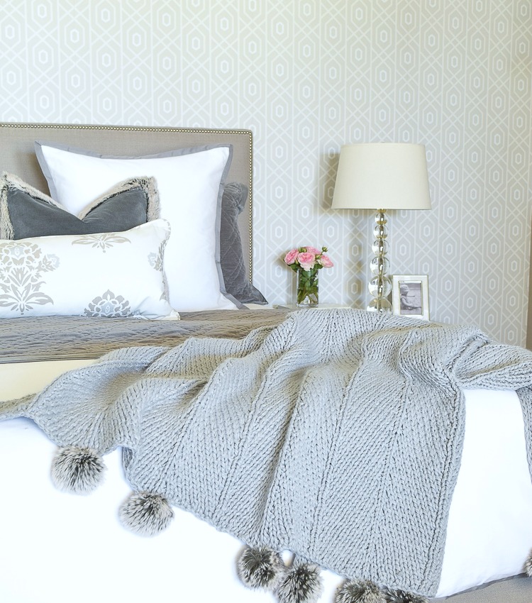
A favorite staple of mine in our bedroom that really makes the bed ensemble is this large tasseled, chunky throw that I’m sure you’ve seen in many of my photographs. It is no longer available unfortunately but I’ve sourced a similar one here & here since I get asked about this piece often.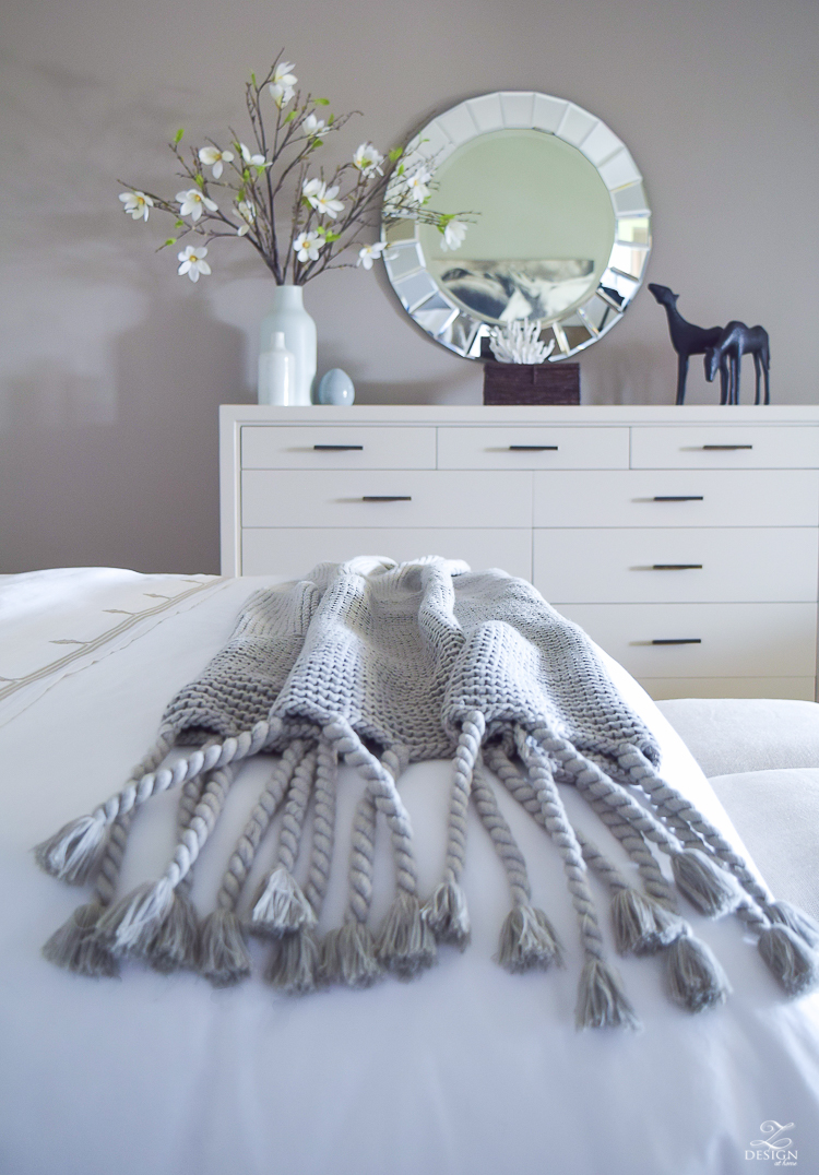
 Get the Look
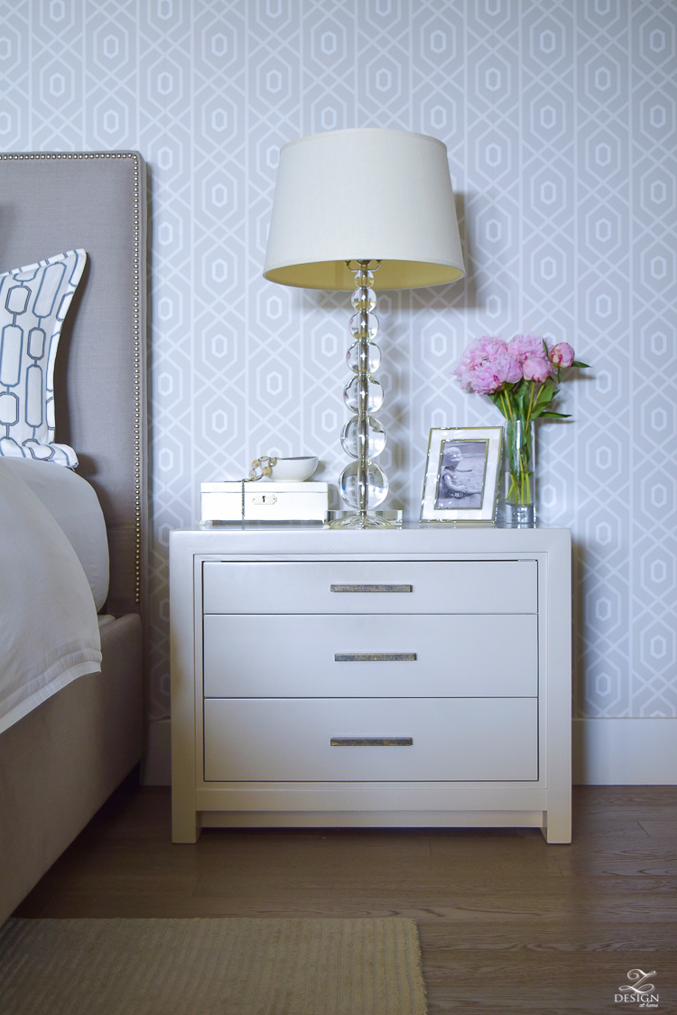
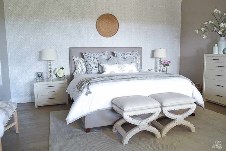
Another thing I get asked about a lot is my furniture…which definitely has a story behind it. The short version is that I found this furniture at the Restoration Hardware outlet (it’s been about 8 years ago now) and it was all beat up and was actually stained, not painted like it is now. Additionally, the outlet closest to me only had the nightstands so I had to call several other outlets in other areas of the country and ended up finding the dresser several states away in upstate New York. I contracted with a shipper to have it picked up and had it delivered to a furniture restoration company where I lived at the time, outside of Washington D.C. I knew I wanted to paint it my favorite color of gray which is Benjamin Moore’s Revere Pewter and I did just that. This is probably something I could have done myself but I didn’t have a ton of experience at painting furniture and my husband and I both wanted it to be something that would look amazing and last forever so we had it professionally sprayed, which I highly recommend by the way. All 3 pieces had some badly damaged spots and those spots needed to be fixed anyway by a professional so we figured why not just have them to spray the furniture in the process, and boy am I happy we did because the result was stunning and we are still loving our furniture to this day, 8 years later. The aged brass hardware is pretty beat up as well (probably hard to tell in the photos) but we love it that way and now that we’ve lived with it for a while wouldn’t have it any other way. The amount of money we saved on the furniture by buying it at the outlet more than made up for what it cost to have all three pieces sprayed so it was well worth the life we will get out of it over time. Since this furniture is no longer available and since I get asked about these pieces often, I’ve sourced something similar here, here and here or, you can find several items listed for the dresser and nightstands on the Shopping Resources page of my site under Master Bedroom.
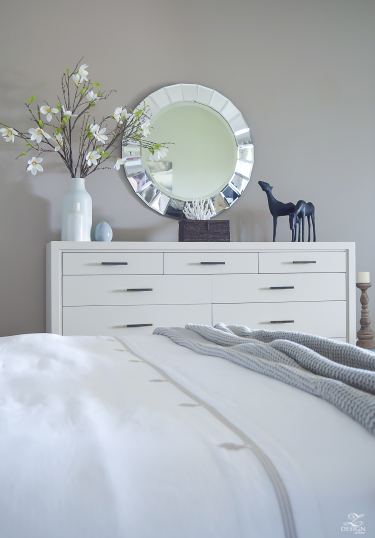
The large dresser holds sheets and towels and during the day it holds the pillows that we sleep on at night. Clothes are stored in the closet so it’s basically being used for linen storage, which has worked out great since the shower and tub are right around the corner in the bathroom.
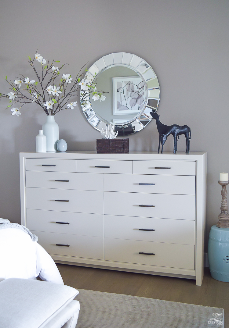
On top of our dresser I’ve carefully placed things that have meaning to me and/or us. The horse statues have meaning because I used to ride, train, and show horses throughout my child hood and young adulthood. These gorgeous, majestic animals will always hold a spacial place in my heart and the little statues bring back sweet memories for me of those times spent riding and training. I also have coral and magnolia stems displayed in some of my favorite vases and both hold memories of home to my husband and me. The mirror (similar here) was purchased at a little shop in D.C. during our time there several years back.
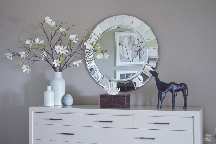
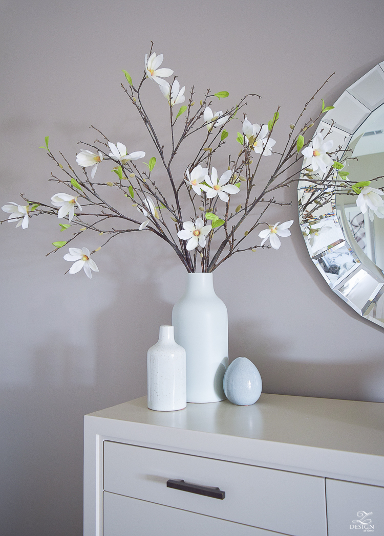
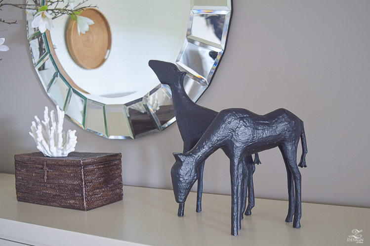 Get the Look
Tip Time: Normally I would never have matching furniture pieces in a space but, the bedroom is the one room where I make an exception to that rule. Continuity and flow in the bedroom are so important in creating a relaxing space so I’m A ok with these pieces in particular matching in the bedroom. However, the dresser and nightstands are the only pieces I would allow to match. I believe everything else within the space should be pieces that are different but that blend and compliment one another. For example, mixing in an upholstered headboard here is key in breaking up all of the wood so that things don’t become too matchy/matchy. And, if you have a sitting area those items should be individual pieces as well that blend with the rest of the space. The end of bed ottomans are from Restoration Hardware and are a staple in my home that I move from room to room as needed/wanted. I’ve also sourced a similar option on the Shopping Resources page of this site.
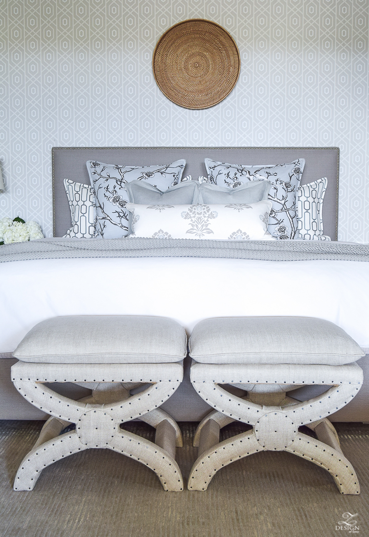
Another slight change I made in our room for summer is to switch out the starburst mirror that was above the bed with this rattan tray I’ve had for years as well. Nothing says summer to me like rattan and this little tray gives us more of that summery feeling in here. Again, it’s amazing what a small change like this does for a space and all I had to do was shop my own home, which is a win/win for me!!
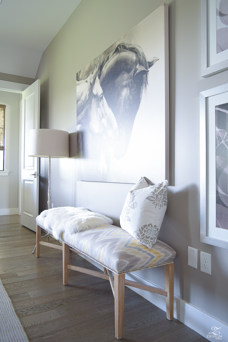
Next I’d like to turn my attention to an area of the room I haven’t shared much before. This long wall drove me a little nuts until I found this bench, which is one of my favorite pieces in the room. I ordered it brand new because it was just the right size and style that I was looking for but the fabric on the seat was rather boring so I had it reupholstered right away to add a little pazzaz to this side of the room. I also added the nailheads again here to repeat what I did with the headboard. Additionally, my husband and I assembled a collection of art pieces that were of the right size and scale for this large wall but that also have meaning to us (sometimes a big awkward wall calls for big pieces of art and a long bench!). This floor lamp was a splurge years ago but is a favorite of mine and will always be somewhere in my home, if not remain in here indefinitely. The sheep skin was an addition for summer to lighten things up over here.
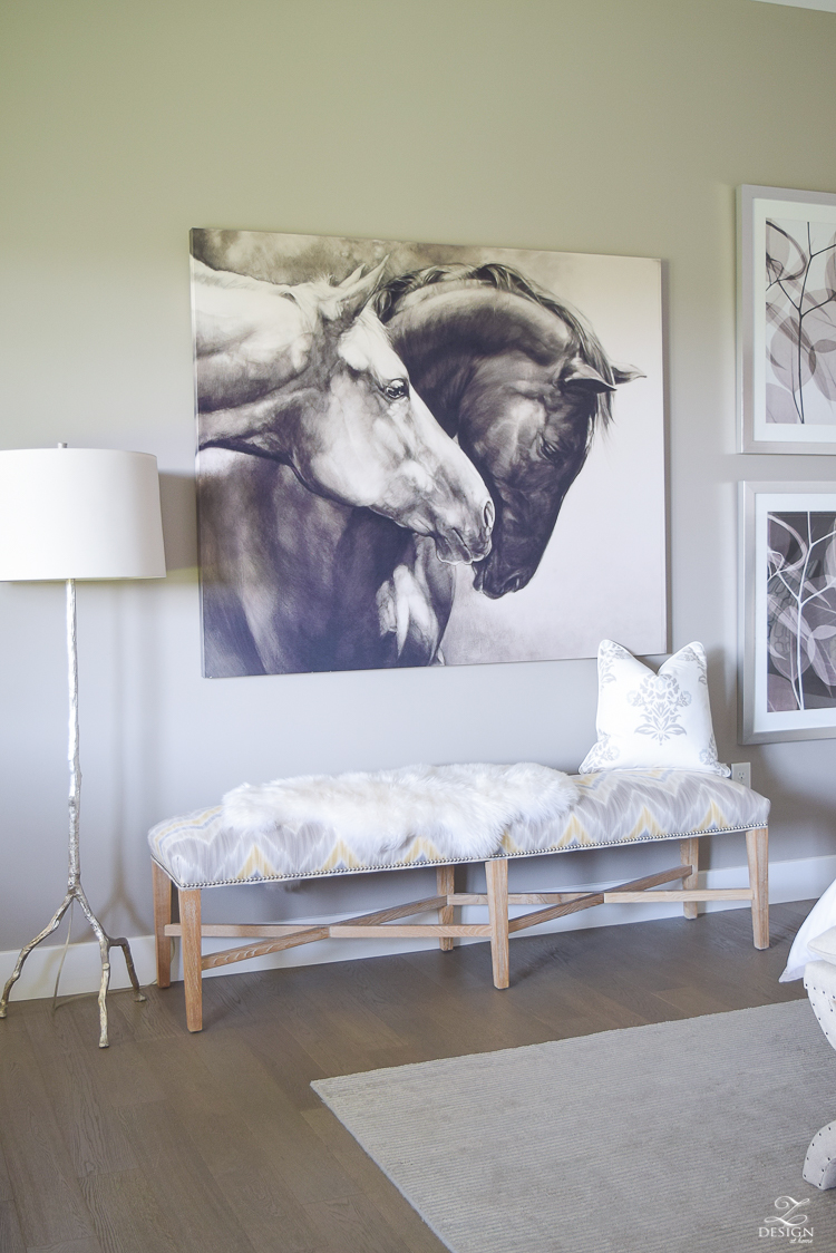
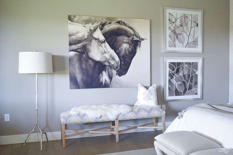
Tip Time: If you can’t find exactly what you are looking for when designing a space, don’t be afraid to take something new and make it exactly what you want it to be with fabric, paint, and/or accessories such as reupholstering a piece or changing out knobs on a dresser, etc.
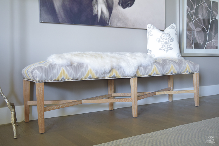
 Get the Look
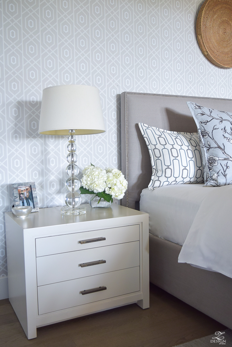
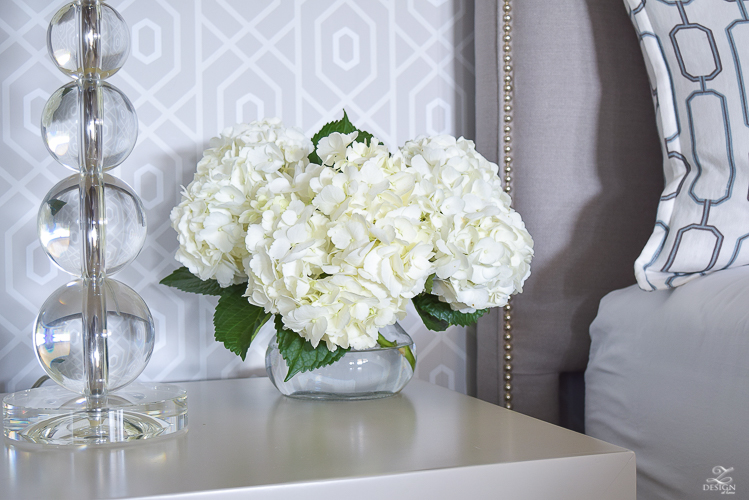
On my nightstand I have things again that mean something to me and this photo of my little boy is one of the the most special photos I’ve captured I believe since we’ve become a family. This was a shot of my little boy during his first trip to the beach. He was clearly amused by the sand and I’m so thankful I caught it on camera. This is such a sweet memory of him that I don’t think I’ll ever be able to remove this photo from my nightstand. He’s now 8 but this precious photo is here to stay!
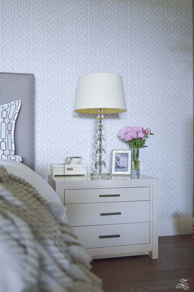
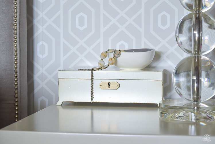
Some other important items are this jewelry box that has sentimental value along with some other knick knacks that have special meaning.
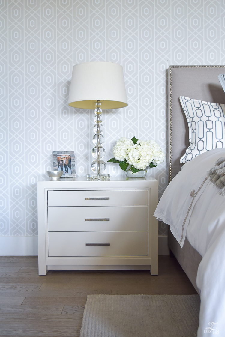
And on my husband’s side there is a special picture of him and our son. Every year we have a tradition of getting a photo of them together walking while holding hands. I especially loved the one we got last year since the photographer was able to catch them at a moment when they were looking at each other. It’s so special to see how our son looks at his father in complete admiration and again, I’m so thankful to have this in a photograph to help us always remember these times. These lamps are also lamps I’ve had for years that were originally in another area of our previous home. I love their light, airy, transitional feel and they work perfectly in our room since we moved into this home.
 Get the Look
I’m sure by now you are also probably wondering about the wallpaper behind the bed. It played a major roll in this whole design process and was picked out at the same time as my fabrics. It’s by Thibaut and I chose it for the pattern which loosely mimics the pattern in my geometric pillows, I also chose it for the soft grays it sports. You can find it here and I’ve also sourced some similar papers here and here. And in case you are wondering why I would put a hole in this lovely wallpaper to hang something, no worries because I didn’t damage the wallpaper at all by using these command hooks however, I do have a post coming soon on how to not damage your wallpaper if you need to use a screw or nail to hang something heavier than what I’ve hung on the wall here.
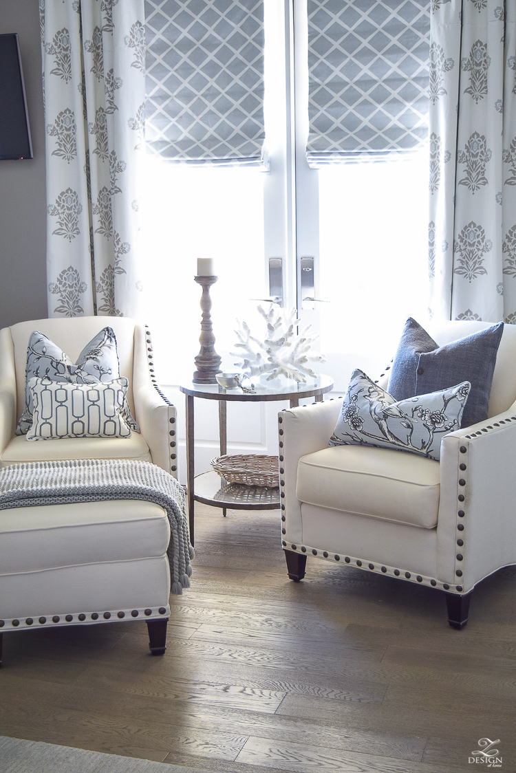
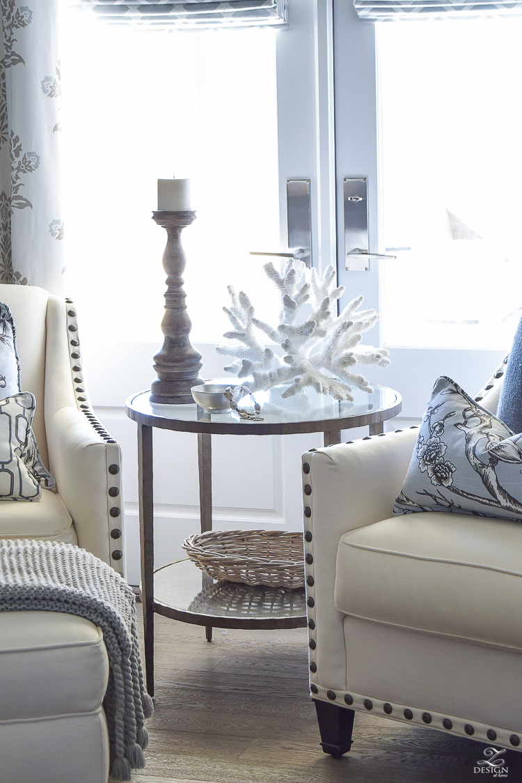
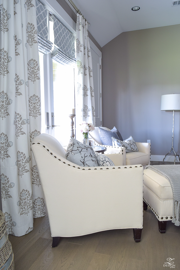
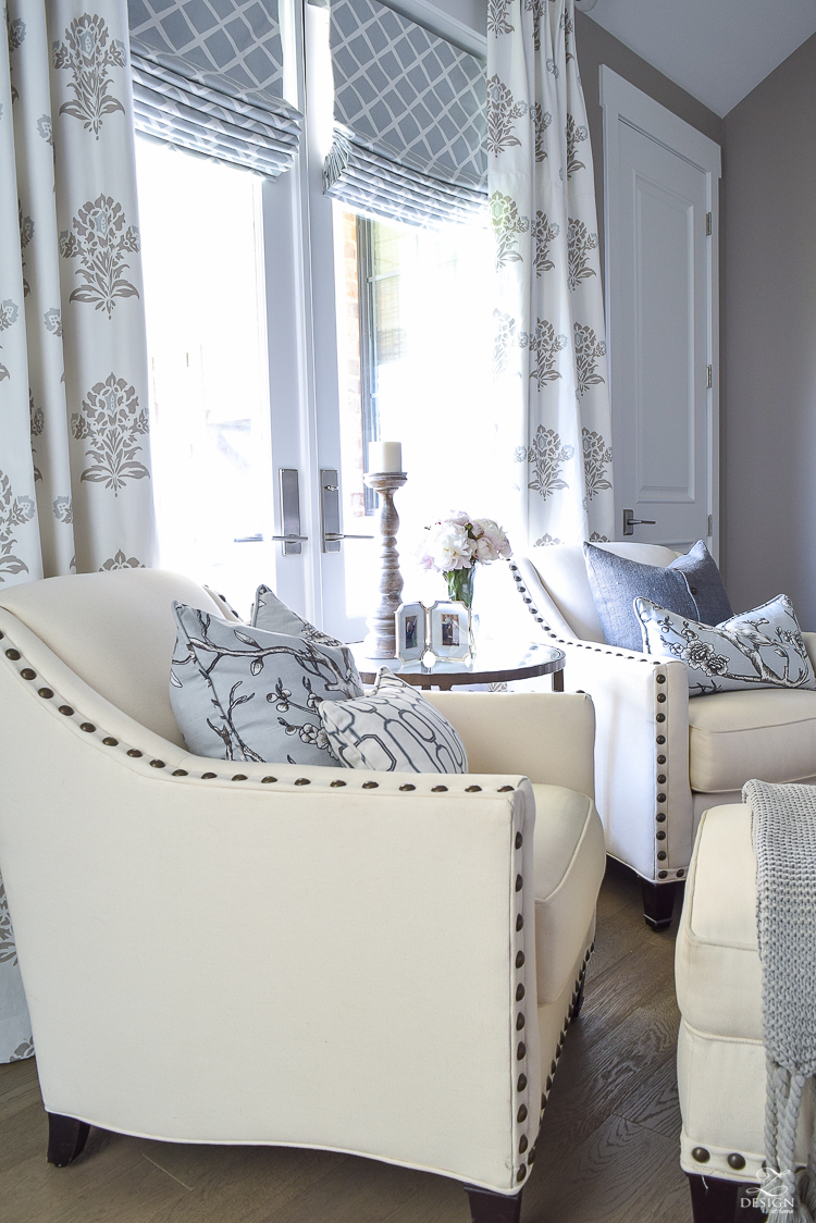
Next I’d like to turn your attention to the master bedroom sitting area. I wish I could say that I sit here and read or that my husband and I sit here and have conversation but I don’t and we don’t like most people, if I’m being honest;). However, this area is great for fancy pillow storage at night, if you know what I mean…wink, wink. I found one of these chairs on clearance as a floor model at Pottery Barn several years ago and then found the other through a furniture company in North Carolina (sorry…I didn’t save the info on that chair through our last move). I went to a local furniture store to get swatches to match up to the one I had purchased at PB off the floor and was just very fortunate that they matched perfectly when the second chair arrived (I can assure you I was holding my breath the whole time until it arrived!). The material is slightly different only because they were from a different dye lot but no one would ever know that but me (and now you) and they are perfect together. I get lots of questions about these chairs on Instagram so I’ve sourced some similar ones here and here since these are no longer available.
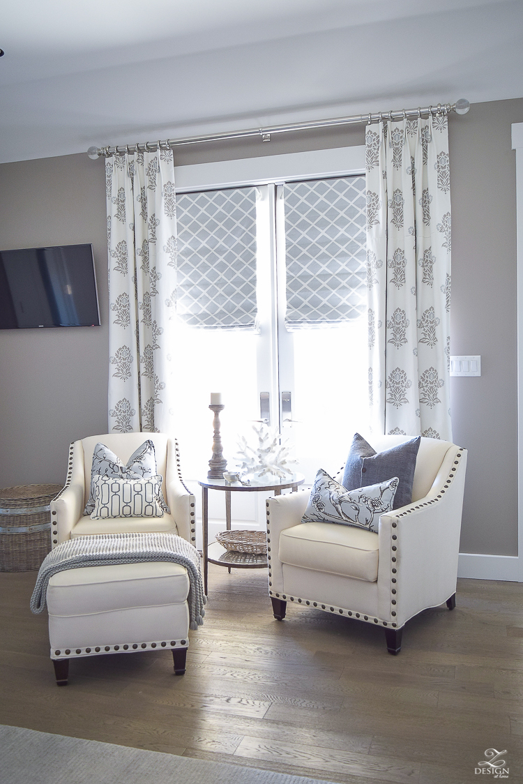
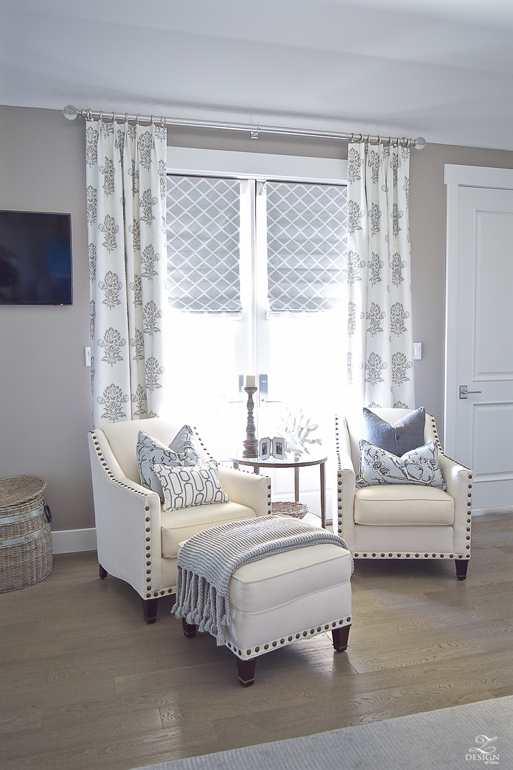
The aged brass side table was a no brainer the first time I laid eyes on it and the window treatments are custom made with a blackout liner since so much light streams into this window (I talk a lot more about window treatments here). For the roman shades I chose this fabric that also has a similar design as my wallpaper on the opposite side of the room to bring these two spaces together, along with using some of the same pillow fabrics (I talk more about the importance of repeating patterns in a space here) on this side of the room. Unfortunately this exact drapery fabric is no longer available but I’ve sourced some similar curtains on the Shopping Resources page of my site. Here you will find the same fabric but in a different color way since this one is no longer available.
 Get the Look
And here is where I would like to give you that pep talk about your bedroom if you haven’t yet taken the time to complete this important space in your home. We all know that most of us put ourselves last and turn our attention to the master bedroom once we’ve completed everything else in our home (which can sometimes take years) but having a place to retreat to at night to wipe the cares of the day away can litterly change your life! As a mom, dad, or whatever else important it is that you do throughout the day you need a place to wind down, read, watch tv or whatever it is that relaxes you at the close of a long, hard day. This should be a place that is beautiful (to you), comfortable, cozy, and luxurious (again, what ever that might mean to you) that you can go to to allow the stresses of the day to melt away and to get some restful sleep (I talk more about beauty and comfort in order to achieve a restful sleep in the bedroom here in case you missed that recently). Having your own personal sanctuary is so important so that you can get recharged to be your best for you and for those around you (most importantly your loved ones) the next day. And if you haven’t yet had the time to do this make time because I promise you will never regret it! I can’t think of one client or friend that I’ve helped with their master retreat that regretted doing this early on in the process of decorating their home, including me. Focusing on this space early on after moving into our home 3 years ago helped to make me a better mom and wife because I felt rested and knew that I had a wonderful place to retreat to at night to relax with my spouse and to have sweet dreams. I truly cannot express this importance of this so I hope you’ll follow this advice if you haven’t done so already!
With that I’ll share with you a few more shots of this space and then talk a little about what I’ll be sharing with you next week. My hope is that you’ll feel inspired by this transitional classic space.
 Get the Look
And last but not least I’ll leave you with a shot into the adjacent master bathroom. Next week I’ll take you through how I came up with it’s color palette and why I used certain fabrics where to cozy up the space. This room is truly a retreat and I can’t wait to share it with you as well. Thanks for stopping by this week and I look forward to seeing you again soon. Don’t forget to leave your comments and questions in the comment section and/or you can always reach me via the contact page of my site.
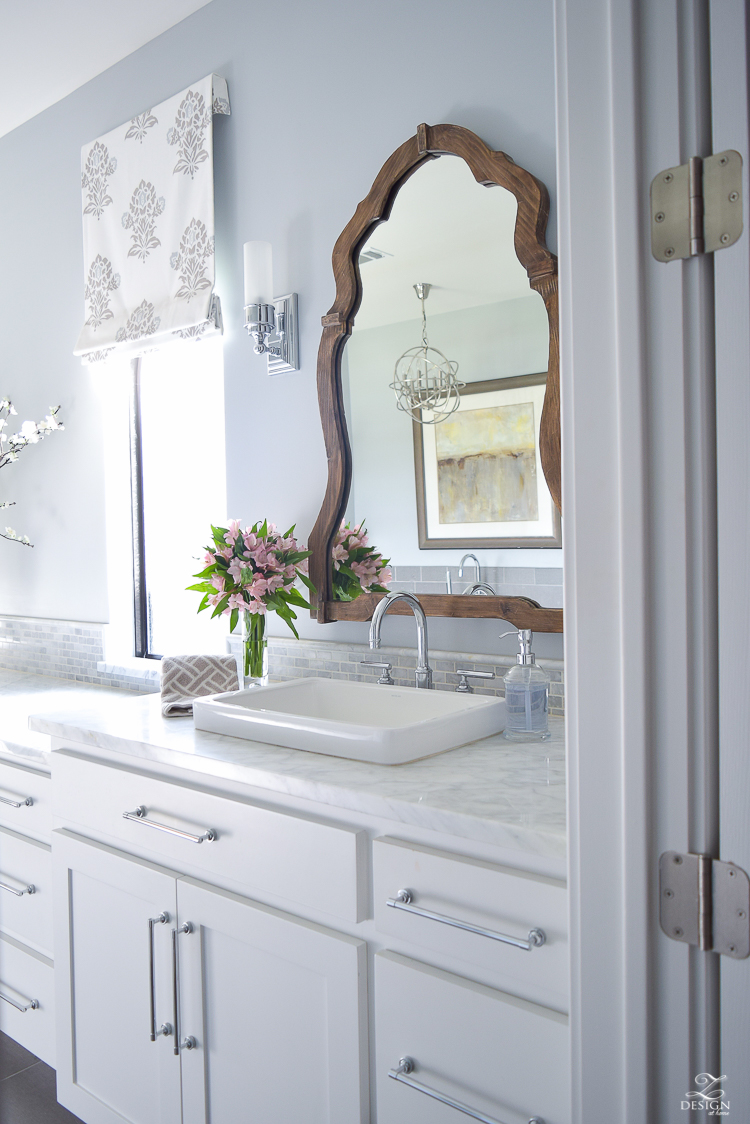
UPDATE: You can now tour the master bath HERE. Enjoy!
*Wall color is Requisite Gray by Sherwin Williams
**A more comprehensive source list for this room can be found HERE OR, you can shop the clickable images below:

Furniture:
Bedding:
Lighting, Mirror & Rug:
Similar Accessories:
Similar Wallpaper:
Similar Window Treatments:



Bree, I do NOT see this space enough. Thank you for sharing so I could take in each and every detail. As usual, I am so inspired! You are right on about making the master a priority. It was for me, and then I switched focus. Now, it is only half finished. Dang it. And, you have no idea how much I admire your fearlessness when it comes to making new furniture exactly how you want it. Your master bedroom is absolutely fantastic.
Kelley, you are so sweet and I’m so glad you like it!! Your approval means more to me than you know!! Thanks so much for stopping by and for taking the time to read all of my crazy details…you’re the best, sister!! Hugs Xoxo
Beautiful tour Bree!!! I absolutely love the attention to detail! I noticed a pretty basket in the room…we have the same one, but mine is filed with dog toys…I’m sure yours is filled with something much prettier!
Thanks so much, Jen!! I’m truly honored we have something the same…that validates some of my decisions as far as I’m concerned!! And you really don’t want to know what’s in that basket, haha;). Big hugs to you and thanks for stopping by as always sweet friend !! 🙂
These pics are amazing, Bree!! You’ve used the loveliest, calming color palette for your beautiful bedroom!! Always, one of my favorites!! ?????????xo
Thanks so much, Debi! You’re always so sweet for stopping by and I appreciate it more than you know!! Have a wonderful rest of your week:)
I also like the light, calming colors for a master bedroom. Interesting that you say not to have too matchy-matchy furniture and I do like the way that looks. Unfortunately, when we bought our bed it came as a set with large and small dresser as well as 2 nightstands. The matchy-matchy look isn’t bad but it would be nice to have a different headboard. Your sitting area looks fabulous and loving those chairs. We have a sitting area on our loft much like it that we hardly use either. I wish our bedroom was big enough to have a sitting area….maybe if we get rid of the dressers :-). It’s so hard to fill a huge wall with great artwork. We like the big canvas look to fill a wall but they’re definitely expensive. I like how you mixed it up by hanging two smaller prints with one big print. We’re still on the lookout for our living room wall.
Thank you for sharing these tips, Brie. May I request to have black print instead of grey for the texts on your blog? It looks pretty with grey, but it is harder to read.
Hi Debbie! Thanks for the lengthy comment and for all of the compliments. I’ll have to get with my web person to see about changing that font color and thanks for the tip. Hope to see you back soon and thanks again!!!
Hi Bree,
I love your bedroom tour, it’s a beautiful space. Would you mind sharing the paint color on the walls in your bathroom? Thank you!
Hi Michelle! Absolutely!! I have a full blog post coming today on the bathroom but the color is Silver Lake by Benjamin Moore. Thanks for the sweet comment and for stopping by and don’t forget to check back for the bathroom tour later 😉
Thank you so much for generously sharing so many details about your gorgeous home. It is refreshing to have someone ‘in the know’ who is just as excited about other people’s projects and is willing to help source those special pieces. Lisa
Thanks for stopping in, Lisa! I’m so glad you like the bedroom and that the resources were helpful. Have a great day!!
Wow….so Classic , Timeless & Classy…
Absolutely Stunning!!!!
Thank you so much Bernadette!! Have a great day! Xo
Finally, after months and months of search on net, I’ve found out real inspiration for my bedroom, ideas that will go along with furniture I have and shell chandelier that I personally made and love a lot…. Now I know, which type of curtains, pillows, nightstands to made…. I’ve finally imagined everything and can go on with making my personal heaven Thank you for inspiration.
Hi! I’m so glad you like it and that you left feeling inspired! Take care and thanks for following along!! 🙂